Last Updated on April 20, 2026 by DSNRY
Your brand should feel like your training.
Most fitness professionals spend years refining how they coach, cue, motivate, and lead. They know how they want clients to feel in a session. They know whether their style is high-accountability, deeply supportive, data-driven, no-nonsense, playful, technical, or transformational. Then they send people to a website that feels like it was built for somebody else.
That disconnect matters more than a lot of coaches realize.
Your website is not just a place to list services, collect leads, and upload a few testimonials. It is your digital first impression, your sales environment, and, in a lot of cases, your most consistent brand representative. If your coaching is sharp, personal, and premium, but your site feels generic, cluttered, or overly corporate, people notice. Maybe not consciously at first, but they feel it. And in marketing, what people feel tends to shape what they do next.
The strongest fitness brands are not always the loudest. They are the most aligned. When someone lands on your site, the experience should make immediate sense. It should feel like an extension of your sessions, your communication style, your values, and your client experience. Not a template. Not a trend chase. Not a copy of what five other coaches in your market are doing.
If you want better-fit leads, stronger conversions, and a brand that actually sticks, your website has to reflect the way you coach.
Your website is already saying something about you
Whether you have been intentional about it or not, your website is making an argument.
It is telling visitors what kind of professional you are, what level you operate at, who you are best suited for, and what it might feel like to work with you. The problem is that many fitness websites make the wrong argument. They say “I’m available” instead of “I’m excellent at this.” They say “I do a bit of everything” instead of “I know exactly who I help and how.”
That usually happens when coaches build sites around information instead of identity.
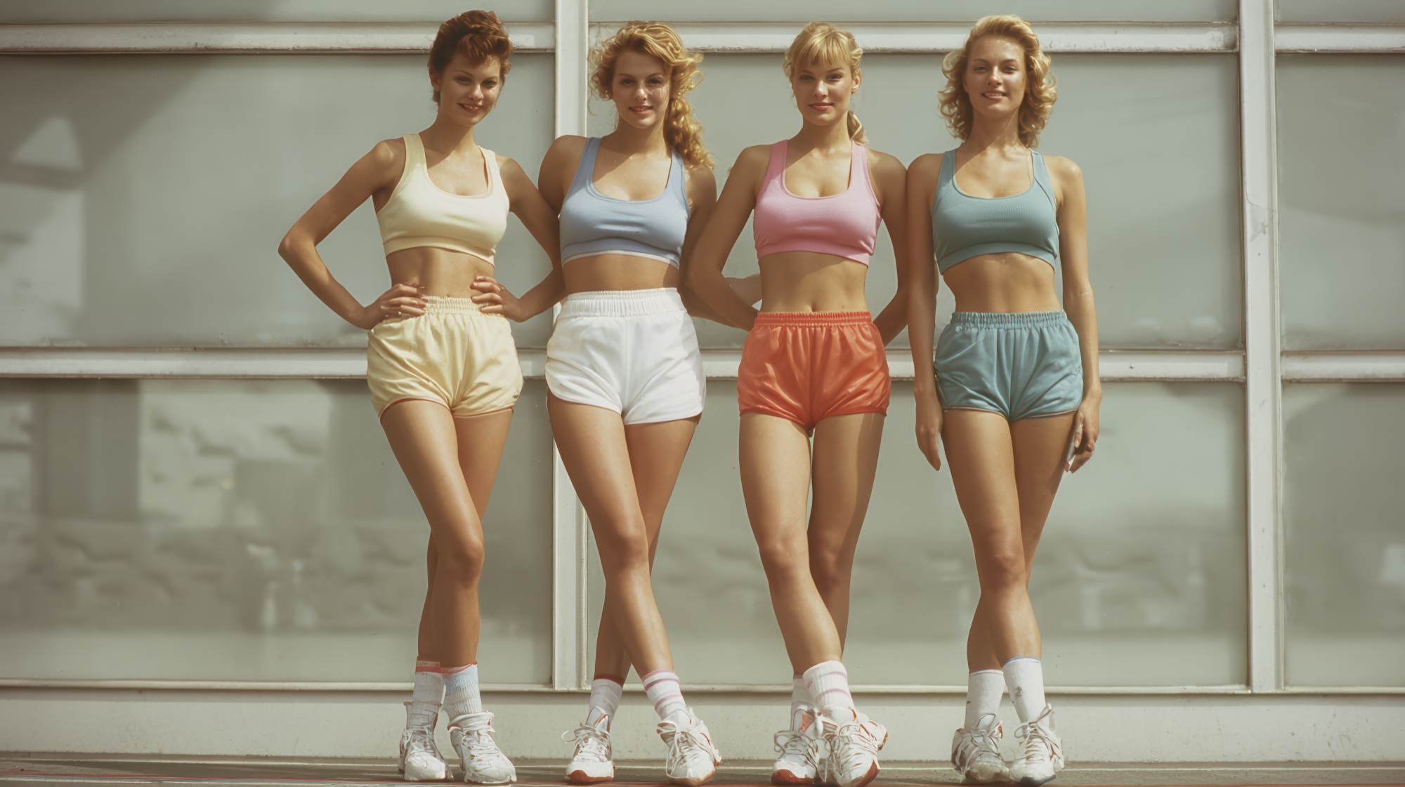
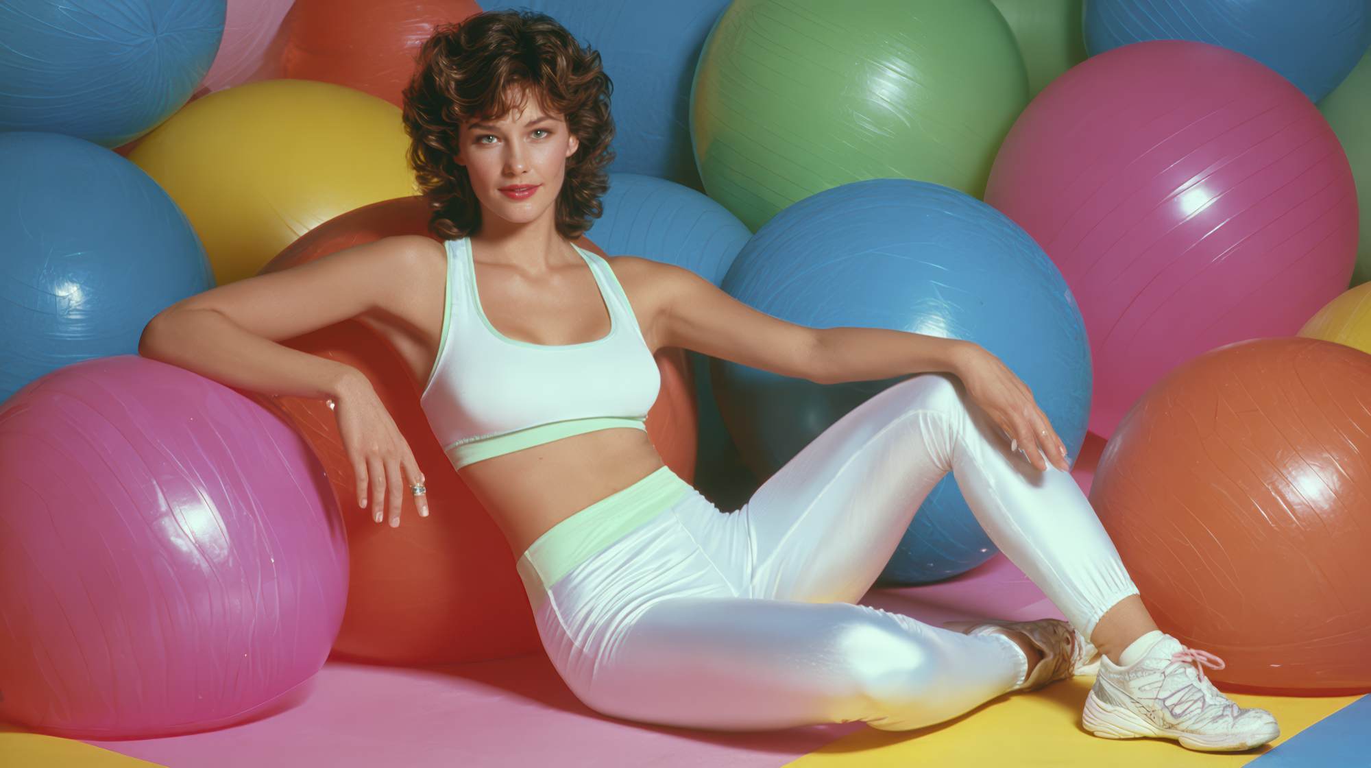
So the homepage ends up stuffed with long service menus, vague promises about transformation, stock photos of smiling people doing lunges, and copy that sounds like it was pulled from every fitness site on the internet. Functional? Maybe. Persuasive? Not really.
Good marketing is not just clarity. It is congruence. If your in-person style is warm and encouraging, the language on your site should not feel cold and clinical. If your coaching is elite and performance-driven, your website should not read like a discount bootcamp flyer. If your value comes from customization and deep client care, your website should not feel rushed, confusing, or transactional.
People do not need a perfect website. They need a believable one. A site that feels true tends to convert better than one that simply looks polished.
Coaching style is part of your positioning
One of the biggest branding mistakes fitness professionals make is treating “style” like decoration. It is not. Your coaching style is part of your market position.
Think about how different two equally qualified coaches can be. One might build trust through empathy, patience, and relationship. Another wins clients through structure, discipline, and precision. Both can be exceptional. But they should not market the same way, and they definitely should not have websites that feel interchangeable.
Positioning is not just what you offer. It is how you offer it and why people choose you over somebody else.
That means your website should communicate things like:
How direct or supportive you are
How much structure clients can expect
Whether your approach is rooted in habit change, performance metrics, lifestyle integration, or accountability
What kind of client tends to thrive with you
What your standards are
This is where strong fitness brands separate themselves from the crowded middle. The crowded middle uses generic language like “I help you become your best self.” Distinct brands say, in effect, “This is how I coach, this is who it works for, and this is what you can expect.”
That kind of specificity does not push the right people away. It pulls them closer.
A website that reflects your coaching style helps prospects pre-qualify themselves. They can tell if your tone matches what they need. They can get a sense of whether your pace, philosophy, and personality fit them. That saves time, improves lead quality, and creates better client relationships from the start.
Design should support the feeling, not distract from it
Let’s be honest: a lot of fitness websites are trying way too hard.
Too many animations. Too many fonts. Too many blocks. Too much visual noise. It is often an attempt to look modern, but the end result is that nothing feels grounded. And if your actual coaching is focused and disciplined, that kind of design works against you.
Your website design should support the emotional tone of your brand.
If your coaching style is calm, expert, and highly personalized, your site should feel spacious, clear, and confident. If your brand is energetic and community-driven, it can carry more motion and vibrancy, but it still needs structure. If your offer is premium, the design should communicate restraint, not chaos. Premium rarely looks busy.
Design is not about showing taste for its own sake. It is about shaping perception. The right visuals reinforce trust before a visitor reads much at all.
A few practical ways to align design with coaching style:
Use photography that reflects your real environment, real coaching, and real clients when possible. Staged stock imagery weakens credibility fast.
Choose colors that match your brand personality instead of whatever is trendy in wellness right now.
Keep layouts clean and intuitive. If people have to hunt for your offer, they are already losing confidence.
Use typography that fits your tone. Strong and modern is different from elegant and minimal. Pick intentionally.
Let whitespace do some work. A site that breathes feels more confident than one that shouts.
The right design does not make people think, “Nice website.” It makes them think, “This feels like the kind of coach I want.”
Your messaging should sound like you, not like the industry
This is the part where a lot of good coaches flatten themselves.
They write website copy in what I can only call “fitness internet language.” Everything becomes empowering, transformative, results-driven, and personalized. Technically fine. Totally forgettable.
If your real coaching voice is more direct, be direct. If you are naturally conversational, write that way. If your edge is education, explain things clearly and intelligently. If your clients love you because you blend honesty with encouragement, your copy should do that too.
Brand voice is not fluff. It is one of the clearest ways to communicate fit.
Your homepage, service pages, about page, and calls to action should all sound like they came from the same person clients will actually work with. That matters because people are not just buying sets, reps, check-ins, or packages. They are buying your way of leading them.
A few areas where voice matters most:
Your headline. Skip vague inspiration and say something meaningful.
Your about page. This is not a biography dump. It is a trust-building page.
Your service descriptions. Explain the experience, not just the deliverables.
Your CTA buttons. “Apply now,” “Book a consult,” and “Start here” all create different expectations.
The goal is not to be clever. The goal is to be distinct and clear. Most fitness websites do not need better adjectives. They need more personality and more conviction.
The best websites pre-frame the client experience
One of the smartest things your website can do is reduce uncertainty.
People are often interested in coaching before they are ready to commit to coaching. They have questions. They are assessing risk. They are trying to figure out whether this will be awkward, too intense, too expensive, too generic, or simply not for them.
Your website should answer those questions before they become objections.
That means showing people what it is like to work with you, not just telling them you get results. Walk them through your process. Explain how onboarding works. Share what kind of support is included. Clarify what you expect from clients. Spell out who your coaching is best for and who it is not for.
This is especially important if your style is strong, specialized, or intentionally selective. If you pride yourself on accountability, say so. If you are not the coach for people looking for hand-holding, say so professionally. If your superpower is helping busy adults build sustainable routines without all-or-nothing thinking, make that obvious.
Good pre-framing does two things at once: it builds trust and filters leads.
That is the kind of marketing fitness professionals should want. Not maximum volume. Better fit.
If your site feels outdated, your brand probably feels diluted
Here is a blunt take: if your website has not been meaningfully updated in years, there is a good chance it no longer represents the level you operate at.
And that is more damaging than many coaches think.
As you grow, your standards sharpen. Your methods evolve. Your niche gets clearer. Your confidence improves. But if your website still reflects an earlier version of your business, your marketing will keep attracting people for the old version of you.
This is one reason established coaches often complain about poor-fit inquiries. Their real brand matured, but their website did not.
Sometimes the fix is not a total redesign. Sometimes it is a tighter message, stronger visuals, cleaner navigation, better client language, and a more intentional sales journey. But something has to change if the gap between your actual coaching and your digital presence keeps widening.
A strong website should feel current not because it follows trends, but because it accurately reflects your business now.
What to review if you want better alignment
If you are looking at your website and realizing it does not really sound or feel like you, start with a simple audit.
Ask yourself:
If someone landed here without knowing me, what kind of coach would they assume I am?
Does that match how clients actually experience me?
Do my visuals reflect my real brand personality?
Does my copy sound like my actual voice?
Is it obvious who I help best?
Am I selling a list of services, or a clear coaching experience?
Do my calls to action fit the type of client journey I want?
Would my best clients feel immediately understood here?
If the answers are fuzzy, that is useful. It means your website is due for sharper positioning, not just cosmetic edits.
The coaches who market best are not always the ones doing the most. They are the ones communicating themselves most clearly and consistently.
Alignment is what makes a fitness brand feel credible
At the end of the day, people want reassurance that what they see is what they will get. That is the real job of your website.
Not to perform. Not to impress other coaches. Not to cram every certification, every offer, and every possible message onto one screen.
Its job is to create confidence.
When your website reflects your coaching style, your brand feels more honest. More memorable. More credible. Prospects do not have to work as hard to understand you. They can feel the fit faster. And when that happens, selling gets easier because you are no longer trying to persuade the wrong people with the wrong presentation.
Your coaching has a personality. Your website should too.
Because the best marketing for fitness professionals is not louder branding. It is branding that feels true the second someone lands on the page.