Last Updated on April 20, 2026 by DSNRY
Design communicates before you speak.
In fitness marketing, people love to talk about messaging, offers, funnels, and social media strategy. All of that matters. But before any of it has a chance to work, design has already made an impression. It tells people whether you’re professional, current, trustworthy, premium, approachable, intense, calming, clinical, fun, or forgettable. And it does that in seconds.
That’s why design is not the “nice to have” layer you add after the real marketing work is done. For fitness professionals, design is part of the marketing work. It shapes how your brand is perceived before a prospect reads a caption, opens an email, or hears your sales pitch. If you coach in a competitive space—and fitness is absolutely that—your visual presentation is doing more heavy lifting than most people realize.
I’ve seen great coaches lose attention because their brand looked inconsistent, dated, or chaotic. I’ve also seen solid, not extraordinary businesses grow faster because their design made everything feel clear and credible. That’s the blunt truth: people often experience your professionalism visually before they experience it personally.
Your brand is being judged instantly
Fitness is a high-trust purchase. Whether someone is hiring a personal trainer, joining a gym, booking a nutrition consult, or enrolling in an online coaching program, they’re making a decision that involves money, vulnerability, and hope. They want results, yes—but they also want confidence that they’re in the right hands.
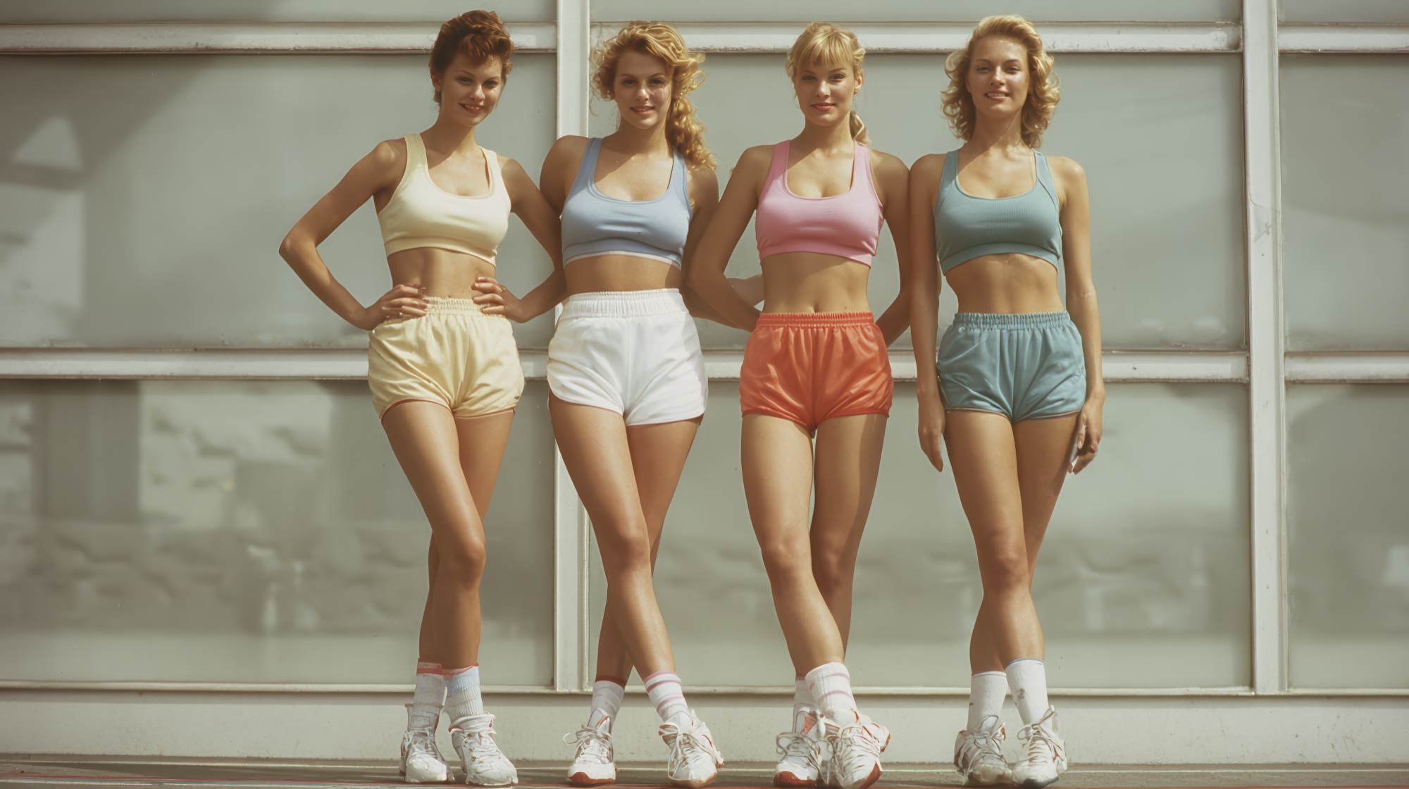
Design influences that confidence almost immediately. If your website looks cluttered, your social graphics are all over the place, your logos feel homemade, and your colors change every other post, the brand signal is instability. It may not be fair, but it’s real. People assume the business experience might be just as messy as the visuals.
On the flip side, clean and thoughtful design suggests structure. It suggests attention to detail. It suggests that this coach, studio, or fitness brand knows what it’s doing. That doesn’t mean you need a luxury aesthetic or a massive creative budget. It means your design needs to feel intentional.
In fitness, intentionality matters because clients are buying a process. They want to believe there’s a plan. Design becomes evidence of that plan.
Good design makes your offer easier to understand
One of the biggest marketing problems in fitness is not lack of effort. It’s poor clarity. Coaches often know too much about what they do, which makes them explain it badly. They overpack landing pages, overload Instagram graphics, write dense service descriptions, and expect prospects to sort through the noise.
Good design fixes part of that problem by organizing information in a way people can actually process. It guides attention. It creates hierarchy. It answers the silent question every prospect has: what am I looking at, and what should I do next?
A strong design system helps simplify your message without dumbing it down. Headings stand out. Calls to action are obvious. Packages are easy to compare. Testimonials are presented cleanly. Your most important points don’t get buried in visual clutter.
This is especially important for fitness professionals because so many services can sound similar on paper. Personal training. Group coaching. Habit coaching. Strength programs. Online accountability. Mobility sessions. Nutrition support. If your presentation doesn’t quickly clarify the difference, people tune out.
Design helps your offer feel digestible. That matters because overwhelmed people rarely convert.
Bad design creates friction you can’t always see
Here’s the thing about weak design: it doesn’t always fail loudly. It often fails quietly. A person lands on your site and leaves. They skim your Instagram and don’t follow. They click your email and don’t book. They don’t send a DM. They don’t ask a question. Nothing dramatic happens. You just lose momentum.
Fitness professionals sometimes misread this as a lead generation problem when it’s really a presentation problem. If your visuals create confusion, make reading harder, or feel low-effort, people hesitate. They may not consciously think, “this design is turning me off.” They just feel uncertain and move on.
Common friction points show up everywhere:
Poor typography that’s hard to read on mobile. Busy graphics with too much text. Inconsistent photography styles. Random brand colors with no visual logic. Websites with no spacing, no flow, and no clear next step. Social posts that look like they were made by three different businesses in the same week.
None of these issues seem catastrophic on their own. Together, they create drag. And in marketing, drag is expensive.
If someone has to work to understand your brand, you’re already making the sale harder than it needs to be.
Design shapes positioning more than most fitness brands admit
Positioning isn’t just what you say about your business. It’s how the business feels. Design is a big part of that feeling.
If you want to attract high-ticket coaching clients, your design needs to support a premium experience. If you run a family-friendly gym, your visuals should feel welcoming, energetic, and accessible. If you focus on post-rehab or older adult fitness, your brand should communicate safety, competence, and trust—not generic hard-core gym culture.
This is where many fitness brands get lazy. They use whatever templates are trending, borrow aesthetics from influencers who serve a different audience, or piece together branding based on personal taste instead of business strategy. That’s how you end up with visuals that look polished enough but say the wrong thing.
Good design aligns with the client you actually want. It doesn’t just make your business look attractive; it makes your business look appropriate to the right buyer.
That distinction matters. A polished brand that attracts the wrong audience still creates sales friction. You want design that helps pre-qualify people. The right prospect should look at your website or social profile and think, “This feels like it’s for me.”
Consistency beats creativity when it comes to trust
Fitness professionals often feel pressure to constantly reinvent their content. New post styles, new color treatments, new reels aesthetic, new promotional graphics every month. I get the instinct. You want to stay fresh. But from a branding perspective, inconsistency is usually more damaging than repetition.
People trust what they can recognize. Recognition comes from consistency.
That means using the same core fonts, colors, photography style, design layouts, and tone across your website, email marketing, sales pages, and social channels. It means your brand should feel like itself wherever someone encounters it.
This doesn’t make you boring. It makes you memorable.
In fitness marketing, repetition is not the enemy. Confusion is. You do not need every post to feel like a design experiment. You need your brand to become visually familiar enough that people start associating it with a certain level of quality and a certain type of experience.
The businesses that look “established” are often just the businesses that stopped changing their visual identity every week.
Practical design priorities for fitness professionals
If you’re not a designer, this can all sound abstract. So let’s make it practical. You do not need a huge rebrand to improve how design supports your marketing. You need better decisions in the areas that matter most.
Start with these priorities:
First, make mobile readability non-negotiable. Most prospects will find you on their phone. If text is too small, layouts are cramped, or buttons are hard to tap, you’re losing people where attention is shortest.
Second, tighten your brand basics. Pick a small set of fonts, 2–4 core colors, and a few repeatable layout styles. Most fitness brands use too many of everything. Restraint usually looks more professional.
Third, invest in better photography if you can. Real images of your space, your sessions, your team, and your clients will almost always outperform generic stock visuals. Fitness is personal. Your imagery should feel real, not staged beyond recognition.
Fourth, reduce text on graphics. Social graphics are not blog posts. Use them to create interest, not explain your entire philosophy. If everything is shouting, nothing stands out.
Fifth, improve your website hierarchy. Your homepage should quickly communicate who you help, what you offer, why it matters, and what someone should do next. If that takes too long to figure out, the design isn’t doing its job.
And finally, design for the client journey, not just for aesthetics. Your visuals should support action: booking a consult, joining a class, downloading a guide, replying to an email, sending a message. Good design is not decoration. It’s conversion support.
Design is part of the client experience, not just lead generation
One opinion I feel strongly about: design should not stop at acquisition. Fitness brands often focus on front-end marketing visuals but ignore how design shows up in onboarding, client communication, program delivery, and retention. That’s a mistake.
The experience after someone buys is where brand trust compounds.
If your onboarding PDF looks clean, your app assets feel cohesive, your check-in templates are easy to use, and your emails are well structured, clients feel taken care of. The service feels more premium, more organized, and more worth the money.
That has direct marketing value. It increases referrals. It improves retention. It gives clients better language for talking about your business. A well-designed experience makes your service easier to recommend because it feels more legitimate and complete.
In other words, design doesn’t just help people choose you. It helps confirm they made the right choice.
The takeaway for fitness brands that want to grow
If you’re serious about marketing your fitness business, stop thinking of design as surface-level polish. It is part of your positioning, part of your sales process, and part of your customer experience. It communicates quality before you get the chance to explain quality.
That’s why good design matters so much in fitness marketing. Not because people are shallow. Because people are busy. They make fast judgments. They look for signals. They want reassurance. Your design either provides that reassurance or it doesn’t.
You do not need the flashiest brand in your market. You do need a clear, consistent, intentional one. One that reflects the experience you actually deliver. One that makes your value easier to understand. One that removes friction instead of adding it.
Because in the end, your brand is always saying something before you do. The question is whether it’s saying the right thing.