Last Updated on April 20, 2026 by DSNRY
Elevate your brand identity to match the elite results you deliver.
Fitness professionals spend a lot of time refining programming, coaching cues, recovery protocols, and client experience. That makes sense. Results matter. But here’s the hard truth: before a client ever feels your coaching, they see your brand. They make a judgment based on your website, your logo, your photography, your social posts, your typography, and the overall atmosphere your business creates from a screen.
That first impression is not superficial. It is marketing. And in the fitness industry, where trust, authority, and aspiration all drive buying decisions, your visual identity does heavy lifting.
If you position yourself as a high-performance coach, strength specialist, sports therapist, or premium studio, your brand should look like it belongs in that category. Too many skilled fitness businesses still present themselves with generic graphics, inconsistent colors, random Canva templates, and stock visuals that say absolutely nothing about the quality of the service. Then they wonder why they attract price shoppers instead of committed clients.
Visual branding is not decoration. It is signaling. It tells people whether you are casual or elite, broad or specialized, cheap or premium, modern or outdated, trustworthy or forgettable. In a crowded market, that distinction matters.
Your Brand Speaks Before You Do
The fitness space is saturated with competent professionals. That means “I get results” is no longer enough as a marketing message. Everyone says that. Your audience is looking for cues that help them decide who feels credible, focused, and aligned with their goals.
This is where visual language comes in. Every brand communicates something, even when it is not intentional. A cluttered website communicates lack of focus. Weak photography communicates low confidence. Inconsistent social design communicates disorganization. An outdated logo communicates stagnation. None of that may be true about your coaching, but perception always gets there first.
On the other hand, a sharp and cohesive visual identity tells a more powerful story. It says you are disciplined. It says you care about standards. It says your service is considered, structured, and built for serious people. For fitness professionals, that matters because clients are not just buying sessions or programs. They are buying belief. They want to feel they are stepping into an environment where progress is expected.
That is why strong branding often increases perceived value before you change a single offer. It frames your expertise in a way that people can understand instantly.
What High-Performance Branding Actually Looks Like
Let’s be clear: “high-performance” branding does not mean making everything black, adding aggressive slogans, and posting slow-motion sled pushes. That aesthetic has been copied into the ground. Real premium branding is less about trying to look intense and more about looking intentional.
The strongest fitness brands usually share a few qualities.
First, they have visual consistency. Their website, social channels, email design, print materials, and physical space all feel connected. Same tone. Same colors. Same type choices. Same standard of imagery. That consistency builds trust because it makes the business feel stable and professionally run.
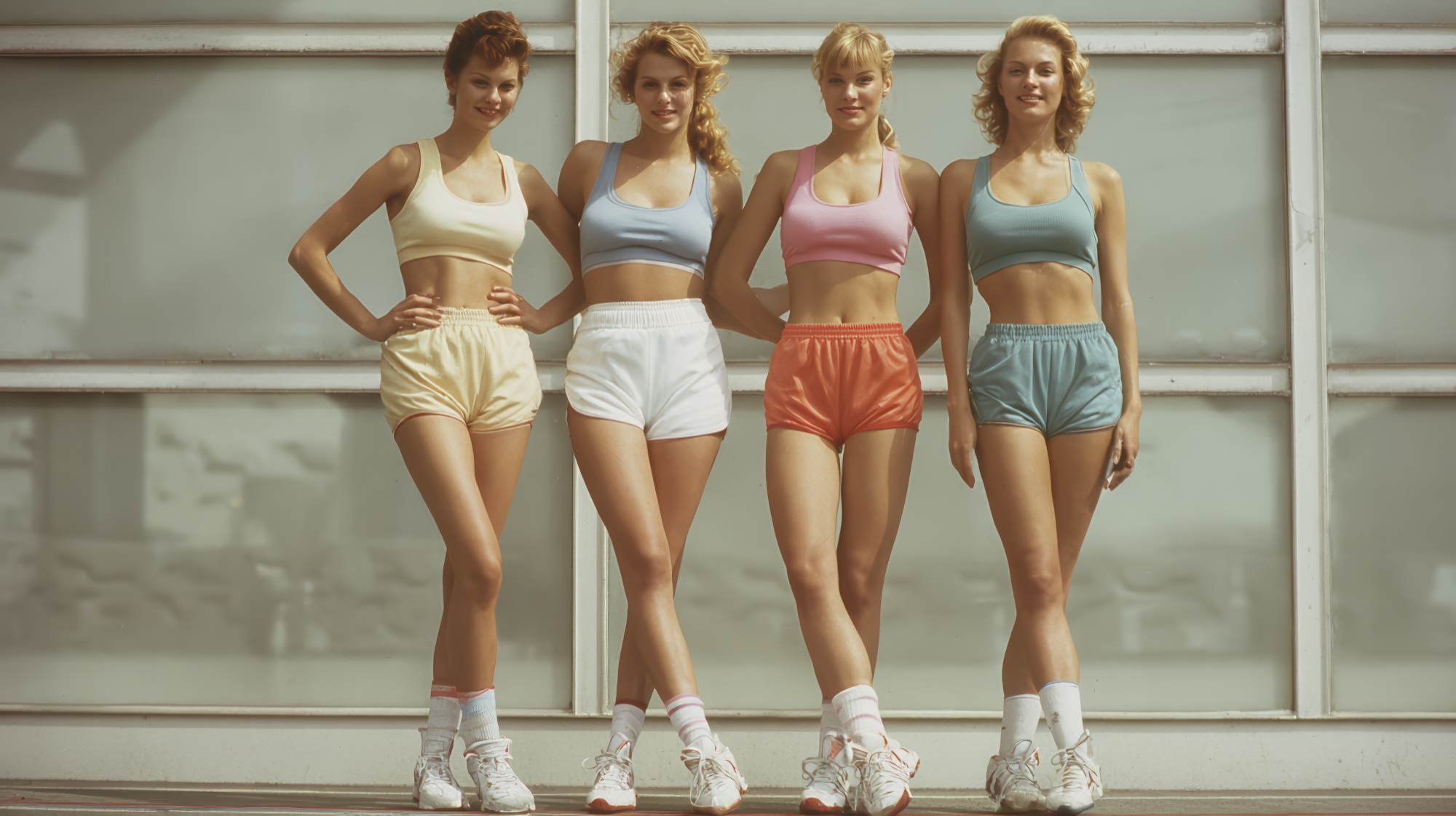
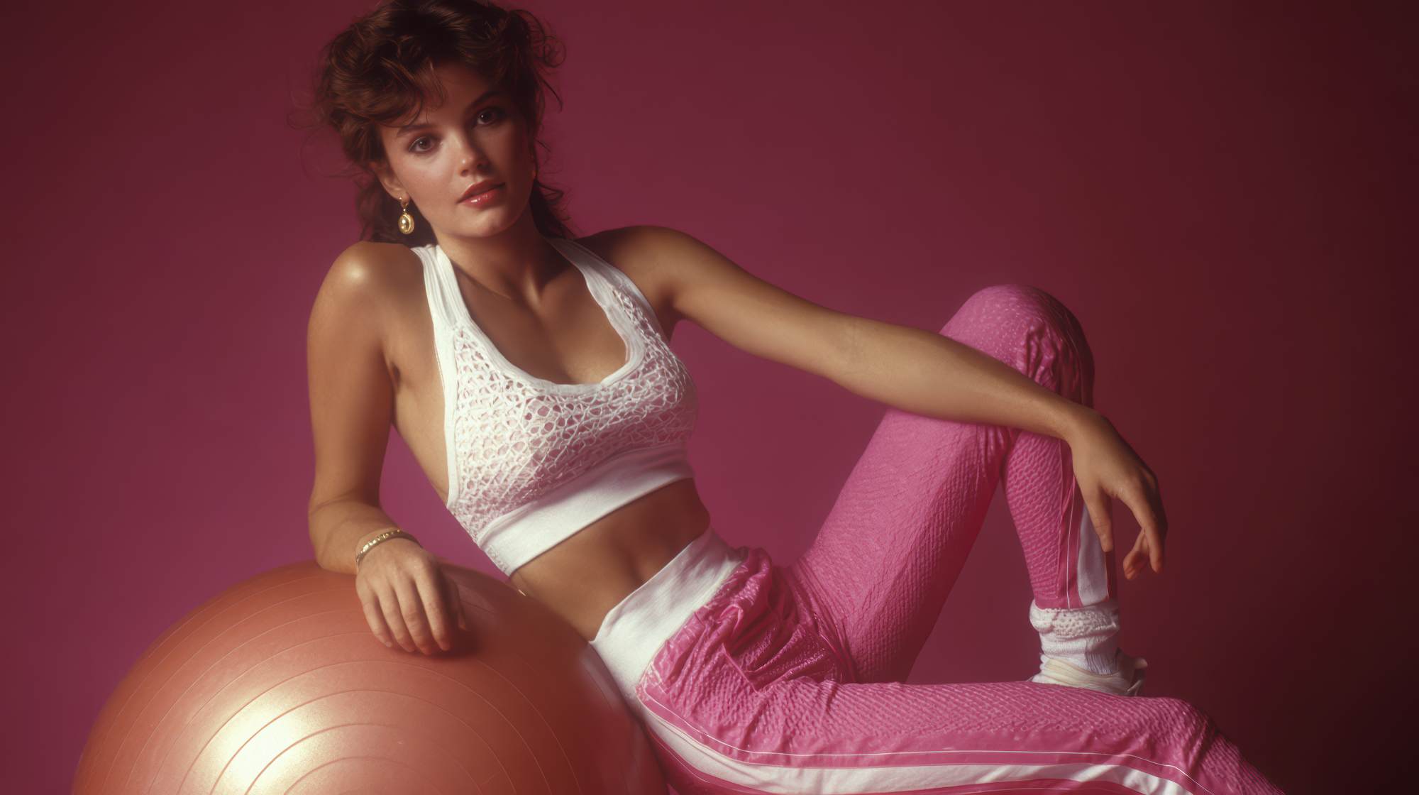
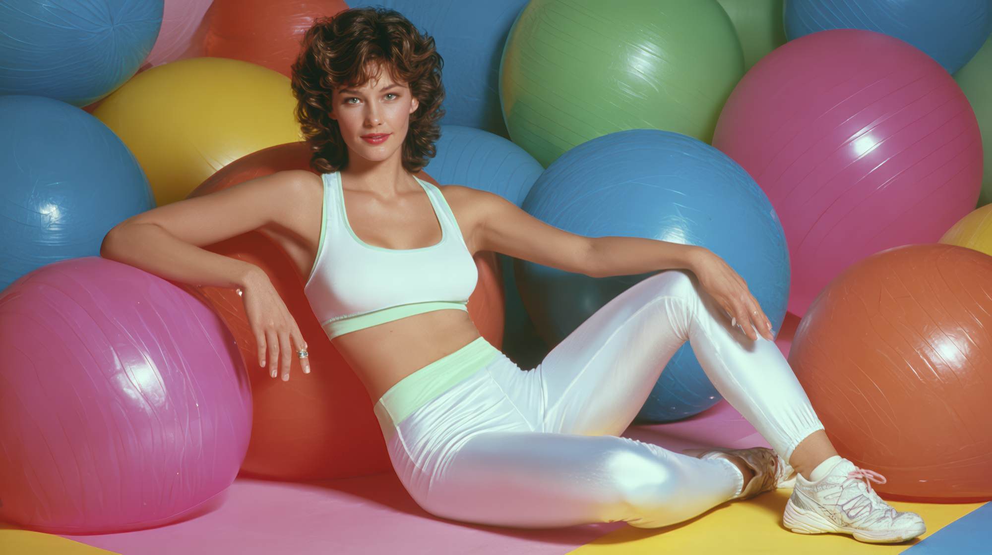
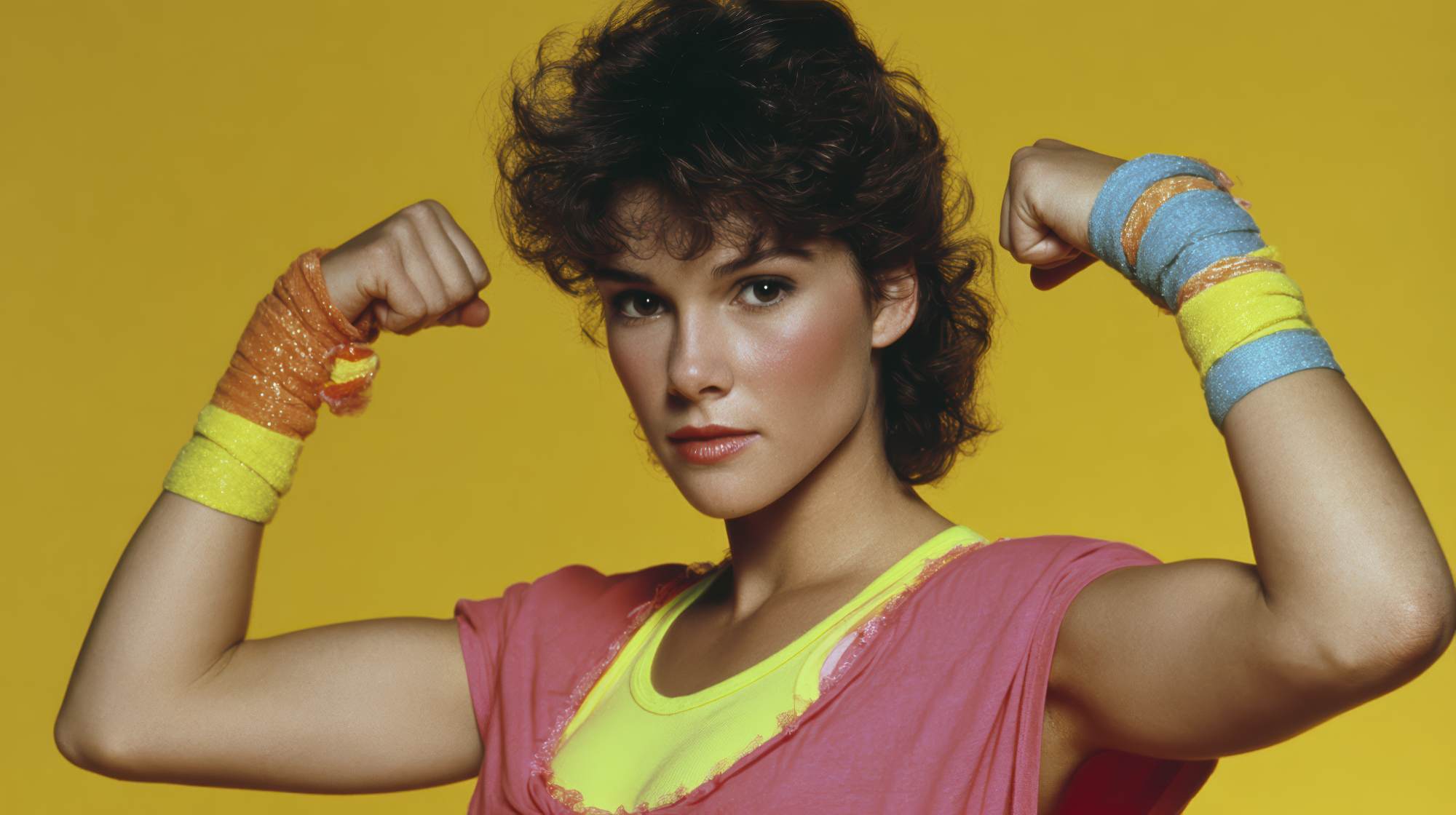
Second, they use photography that reflects the real client experience. Not random gym shots. Not cliché stock images. Not a dozen mismatched iPhone photos with different lighting and styles. They show movement, coaching, effort, detail, environment, and personality in a way that feels specific to the brand.
Third, they understand restraint. This is a major one. A premium fitness brand rarely tries to say everything at once. It does not overload the page with ten fonts, five offers, bright accent colors, and motivational chaos. It edits. It chooses. It leaves room for confidence.
Fourth, it aligns visuals with audience. A private coaching brand for executives should not look like a youth sports camp. A performance rehab specialist should not look like a discount bootcamp flyer. A women’s strength studio should not borrow the aesthetic of a bodybuilding supplement company unless that actually matches the audience. Context is everything.
The goal is not to look trendy. The goal is to look unmistakably like the level of service you provide.
If You Want Premium Clients, Stop Looking Generic
This is where I think a lot of fitness professionals get stuck. They believe branding is either a luxury or a vanity project, so they patch things together as they go. A logo from one freelancer. Instagram templates from another. Website copy written in a rush. Photos pulled from old events. Colors chosen because they “look cool.”
The result is a business that feels fragmented, and fragmented brands struggle to command premium pricing.
High-value clients are not only comparing coaching methods. They are comparing polish. They notice whether your brand feels clear. They notice whether your communication is elevated. They notice whether your visuals suggest expertise or amateurism. Even if they cannot articulate it, they feel it.
Generic branding also weakens referrals. When people recommend a fitness professional, they want to send someone to a brand that looks as strong as the endorsement they are giving. If your online presence feels underdeveloped, it creates friction. People hesitate when the visual side of the business does not reinforce the reputation.
If you are serious about moving upmarket, your visual identity has to support that move. Premium clients expect premium presentation. That is not being shallow. That is how high-trust buying works.
The Most Overlooked Asset in Fitness Marketing: Photography
If I had to point to one area where fitness brands underinvest most often, it would be photography. And honestly, it is not close.
Great photography gives your brand authority. It shows your environment, your standards, your coaching style, your clientele, and your energy in a way that no paragraph of copy can match. It helps potential clients picture themselves in the experience. That matters because fitness is deeply personal. People want to know what it feels like to work with you before they inquire.
Bad photography does the opposite. Dim lighting, awkward angles, inconsistent editing, and random snapshots make even an excellent business feel second-rate. This is especially damaging for coaches and studios selling transformation, performance, or premium service.
Professional brand photography should not just be a collection of headshots and exercise poses. It should be strategic. Capture coaching moments. Details of the space. Equipment textures. Client interaction. Movement sequences. Rest periods. Expressions of focus. All of these elements build a richer visual world around your brand.
And yes, your own presence matters too. People buy coaches, not just programs. You should appear in your brand imagery with confidence and clarity. Not because the brand needs to revolve around you, but because trust in fitness often begins with the person leading the process.
Design Should Support Sales, Not Just Look Nice
There is a practical side to all this that often gets missed. Strong visual branding is not just about aesthetics. It improves conversion.
When your website is visually clean and easy to navigate, people stay longer. When your offer pages feel clear and cohesive, people understand your value faster. When your social content looks recognizable, people remember you. When your lead magnet, inquiry form, and email follow-up all share the same visual identity, the brand feels more trustworthy throughout the buyer journey.
This is where good branding becomes real marketing infrastructure.
A high-performance visual identity should make it easier for someone to take the next step. It should guide attention, highlight key offers, and remove doubt. That means clear hierarchy, readable type, smart use of whitespace, consistent buttons and calls to action, and visuals that support the message instead of distracting from it.
I’ll put it bluntly: if your website looks like it was built for a completely different business era, it is costing you leads. If your Instagram grid has no consistency, it is weakening recall. If your intake materials look pieced together, it is lowering perceived value. The details matter because people interpret them as indicators of how the business itself operates.
How to Audit Your Brand Like a Professional
If your brand needs work, do not panic and do not immediately start changing random things. Start with an audit.
Look at your brand as if you were a first-time buyer. Ask yourself a few uncomfortable but useful questions.
Does this look like the level of service I claim to provide?
Would my ideal client feel immediately understood here?
Is my visual identity consistent across every touchpoint?
Does my photography reflect the current quality of the business?
Does my design feel current, clear, and intentional?
Is there anything on my website or social media that feels DIY in the wrong way?
Then compare your brand to others in adjacent premium categories, not just direct fitness competitors. Look at high-end wellness brands, boutique hospitality, luxury service businesses, performance apparel companies, and modern healthcare providers. Sometimes the best branding references come from outside your exact niche because they reveal a higher standard of visual discipline.
From there, identify the biggest gaps. Usually it is one of these: outdated logo system, weak brand colors, poor photography, template-heavy social design, a cluttered website, or unclear messaging hierarchy. You do not have to fix everything overnight, but you do need a plan.
What to Prioritize First
If budget and time are limited, prioritize the assets that shape perception fastest.
First, invest in professional brand photography. It upgrades almost every channel immediately.
Second, tighten your core visual identity: logo, typography, color system, and image style. Keep it simple and memorable.
Third, update your website homepage and key sales pages so they reflect your current positioning. Most fitness businesses lose momentum right there.
Fourth, create a repeatable content system for social media that feels on-brand without becoming robotic. You do not need every post to look the same. You do need people to recognize your brand in the feed.
And finally, make sure your visuals match your audience’s ambition. That’s the real test. If you coach high-performing adults, your brand should feel refined and intelligent. If you train athletes, it should feel sharp and focused. If you run a premium studio, it should feel elevated from the first click.
Branding Is Part of the Coaching Experience
The best fitness brands understand something important: visual identity is not separate from service. It is part of the service experience. It shapes expectations, builds trust, creates emotional buy-in, and reinforces the value of the work.
Clients want to feel that they are entering a system that knows what it is doing. Strong branding helps create that feeling before the first conversation ever happens.
So if your business delivers elite results, make sure the brand keeps up. Do not let weak visuals undersell serious expertise. Do not let a generic presence flatten what makes your work different. And do not confuse branding with vanity when it is actually one of the clearest ways to communicate quality.
In fitness marketing, people see the standard before they experience it. Your visual language should make that standard obvious.