Last Updated on April 20, 2026 by DSNRY
Stop trading time for money.
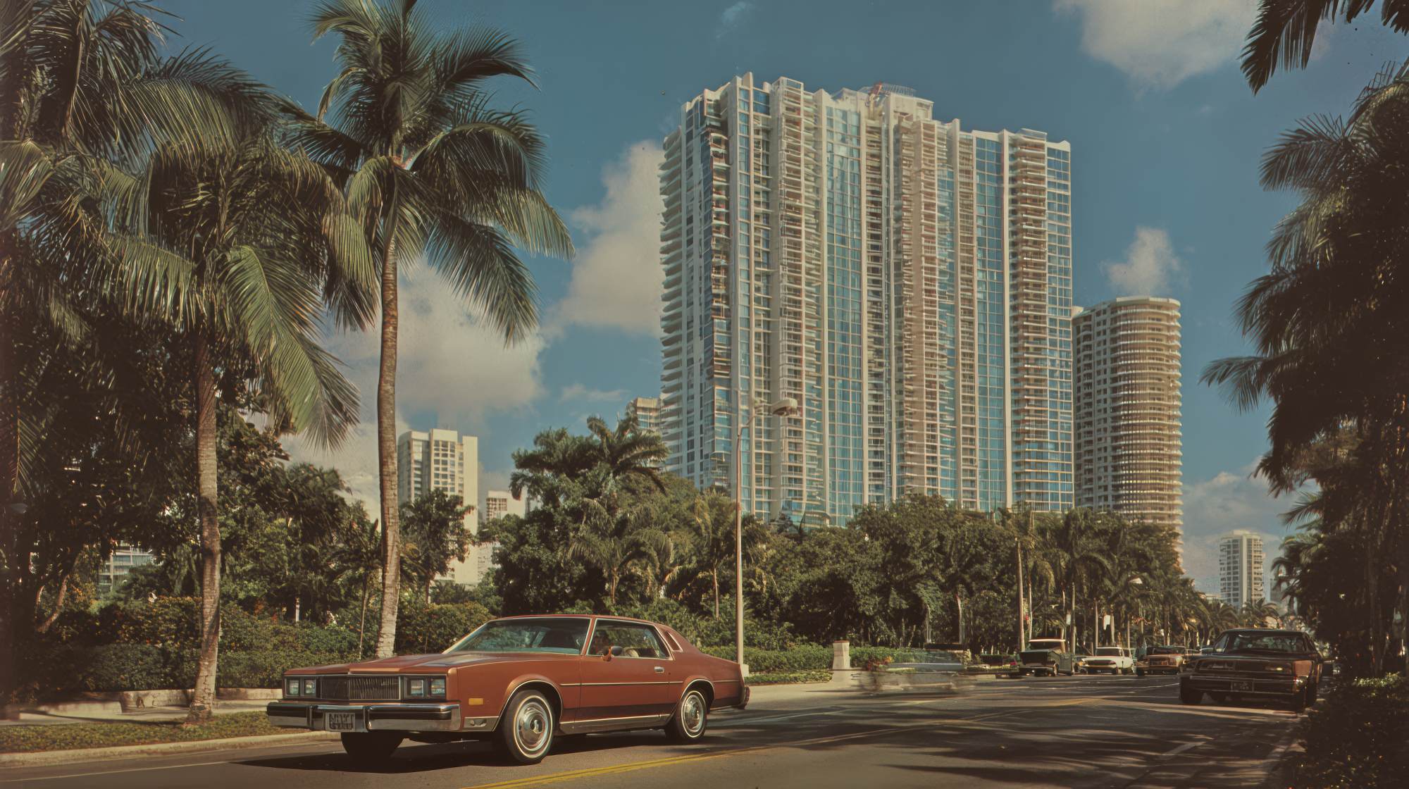
In real estate, people do not just buy homes. They buy confidence. They buy certainty. They buy the feeling that the person guiding them through one of the biggest financial decisions of their life is sharp, credible, and in control. That impression gets formed fast—often before a conversation ever happens. Before the call. Before the showing. Before the follow-up text. It happens in the split second someone lands on your Instagram profile, your listing presentation, your website, your signage, or your latest just-listed postcard.
That is where visual consistency matters more than most agents realize.
I have seen talented agents with real market knowledge lose attention because their brand presence looked stitched together from five different personalities. One font on social, another on flyers, a luxury tone on their website, a casual tone in email, polished headshots paired with low-effort graphics. None of these things seem fatal on their own. Together, they create friction. And in marketing, friction costs trust.
Visual consistency is not about being fancy. It is about being recognizable, coherent, and professional enough that people stop questioning whether you are established. When your brand looks aligned across every touchpoint, your audience relaxes. You feel legitimate. Familiar. Reliable. That is what instant credibility really is.
Why Real Estate Marketing Lives or Dies on First Impressions
Real estate is a trust business disguised as a lead generation business. Yes, you need attention. Yes, you need pipeline. But attention without trust is just traffic. The agents who convert best usually are not the loudest. They are the clearest.
Consumers make all kinds of assumptions based on presentation. They absolutely judge the book by its cover, and honestly, that is not irrational. If an agent cannot manage a clean, cohesive brand, people start wondering what else feels scattered. Will communication be inconsistent too? Will details get missed? Will marketing on my listing feel amateur? Whether fair or not, people connect visual order with business competence.
That is especially true in real estate because the category is crowded. In most markets, every agent says they are dedicated, local, passionate, and client-focused. Those words barely move the needle anymore. Visual branding does what generic claims cannot: it gives people a felt sense of who you are and how seriously you take your work.
And no, this is not just for top producers or luxury teams. In many cases, consistency matters even more for solo agents and growing teams because it helps you look established before your volume catches up to your ambition.
What Visual Consistency Actually Means
A lot of agents hear “consistent branding” and think it means having the same logo in the corner of everything. That is not enough. Visual consistency is the repeated use of a recognizable system. It includes your colors, fonts, photo style, graphic layout, spacing, logo treatment, signage design, video thumbnails, presentation decks, listing materials, email headers, social templates, and even the way your name appears.
It also includes tone. Visual consistency is strengthened when your design and your voice match. If your branding looks premium but your captions sound rushed and random, people feel that disconnect. If your visuals are modern and clean but your website copy feels dated, the brand loses power.
The goal is not to make every asset identical. The goal is to make everything feel like it came from the same credible business.
Think about the agents and brokerages that are instantly recognizable. You can spot their sign from down the street. You know their listing videos before the logo even appears. Their Instagram carousels, market reports, and brochures all feel connected. That familiarity compounds over time. It makes the brand memorable, and memorability is a major advantage in a business where most prospects are not ready to act the moment they discover you.
The Hidden Cost of Looking Inconsistent
Here is the part people do not like hearing: inconsistency makes you work harder for the same result.
If every piece of marketing has to reintroduce who you are, explain your positioning, and earn trust from scratch, you are burning time and energy on repetition. Your audience should not have to decode your business every time they see you. A strong visual identity shortens that process. It tells people, almost instantly, “Yes, this is the same agent. Yes, this is professional. Yes, this feels established.”
When that foundation is missing, you start compensating in other ways. You post more often but get less traction. You over-explain your expertise. You spend extra time customizing materials because nothing is systemized. You keep redesigning instead of marketing. That is the trap a lot of agents fall into: they confuse motion with momentum.
And this is where the CTA matters. Stop trading time for money.
If your brand requires constant manual effort because there is no consistent visual system, you are creating unnecessary labor. Every flyer becomes a one-off project. Every social post becomes a design decision. Every listing launch starts from zero. That is not efficient marketing. That is self-inflicted admin work wearing a creative disguise.
Consistency Builds Credibility Before You Prove Yourself
One of the biggest advantages of visual consistency is that it lets your brand borrow authority from itself. That sounds abstract, but the effect is practical. When someone sees repeated visual signals across your channels, they assume there is infrastructure behind the business. They assume process. They assume experience. They assume reliability.
This matters because most prospects cannot evaluate your skill directly at first glance. They do not know how well you negotiate. They do not know how strong your vendor network is. They do not know how strategically you price listings. So they use proxies. Presentation is one of the biggest ones.
A polished, consistent brand says you care about details. It says you do not wing things. It says clients can expect a level of professionalism from the first impression to the closing table. That is why visual consistency creates credibility so quickly. It reduces uncertainty.
In a category full of sameness, coherence stands out.
Where Agents Commonly Break Brand Trust
The weak spots are usually predictable.
Social media is a big one. Agents often have a decent website and professional headshots, then post graphics that look homemade in the worst way—clashing fonts, inconsistent colors, low-resolution images, random templates, and trend-chasing visuals that have nothing to do with their actual brand. It makes the business feel unstable.
Listing marketing is another problem area. A luxury-looking listing presentation followed by average property brochures creates a disconnect. So does premium branding paired with dark listing photos, sloppy reels, or signs that feel like an afterthought. Clients notice when the marketing promise and the marketing execution do not match.
Email is often ignored too. Agents spend money on logos and photography, then send plain, inconsistent messages with no visual identity at all. But email is one of the most frequent touchpoints in the client journey. If it feels disconnected from the rest of your brand, that chips away at the polished experience you are trying to create.
And then there is the classic issue: every new idea becomes a new aesthetic. New farm campaign, new look. New lead magnet, new fonts. New assistant, new Canva style. Over time, the brand turns into a collection of unrelated experiments. Creativity is good. Randomness is not.
How to Create a Real Estate Brand System That Saves Time
The fix is not complicated, but it does require discipline.
Start by choosing a small, clear visual system: two to three brand colors, one or two fonts, a defined logo treatment, and a consistent photo style. Keep it tight. More options usually create more inconsistency, not more sophistication.
Next, build templates for the assets you use repeatedly. That means listing posts, open house graphics, sold announcements, market updates, email headers, brochures, presentation slides, and print materials. Templates are not boring. Templates are what let you scale quality.
Then define your image standards. What kinds of photos fit your brand? Bright and airy? Editorial and moody? Clean and architectural? Candid and neighborhood-focused? Pick a lane. Your photography style carries as much brand weight as your logo does.
After that, audit your touchpoints. Website, Instagram, Facebook, YouTube thumbnails, signage, postcards, email, digital ads, listing materials, Google Business Profile, everything. Ask one question: does this all feel like the same business? If not, fix the weakest links first.
Finally, document it. Even a simple one-page brand guide can save hours. Include fonts, colors, logo usage, image direction, and examples of approved layouts. If you work with a designer, assistant, marketing coordinator, photographer, or videographer, this becomes essential. Consistency is much easier when the standards are visible.
Good Branding Is Not Vanity—It Is Operational
This is the opinion I will defend all day: branding is not cosmetic in real estate. It is operational.
When your visual identity is systemized, marketing gets easier. Faster approvals. Quicker content production. Less decision fatigue. Better recognition. More cohesion across campaigns. A smoother client experience. That is not fluff. That is efficiency.
The agents who dismiss branding as superficial usually end up spending more time patching together materials, fixing inconsistent output, and trying to manually recreate trust in every conversation. Meanwhile, the agents with clear, consistent brands benefit from momentum. Their audience remembers them faster. Their materials look ready. Their business feels bigger than the individual tasks behind it.
That is the real win. Strong visual consistency helps your business feel established even when you are still growing it.
What to Prioritize If You Want Better Results This Quarter
If you want a practical place to start, do not try to rebrand everything overnight. Pick the four touchpoints prospects see most often and make those consistent first: your website homepage, your Instagram grid, your listing presentation, and your email communication. Those four channels do a lot of heavy lifting in shaping perception.
From there, update your most common marketing assets into reusable templates. Eliminate anything that looks off-brand, outdated, or low quality. Be ruthless. A smaller set of strong assets beats a huge library of inconsistent ones.
And most importantly, stop treating each marketing piece like a separate project. Think in systems. Think in repeatable standards. Think in brand memory. The goal is not to impress designers. The goal is to make it easy for your audience to trust you.
In real estate, credibility is not built only through testimonials, sales volume, or market data. Those things matter, of course. But before any of that gets evaluated, people are reading your brand. They are deciding whether you feel credible. Whether you feel polished. Whether you feel like the kind of professional they want representing them.
That decision happens quickly. Visual consistency helps you win it.
And when your brand does that work for you—quietly, repeatedly, efficiently—you stop spending so much time trying to prove yourself from scratch.
Stop trading time for money.