Last Updated on April 20, 2026 by DSNRY
Pushing past the ordinary to achieve exceptional brand clarity.
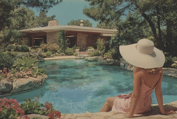
Virtual staging has matured. It is no longer the novelty add-on that agents used to treat like a clever trick for empty listings. It is now part of the visual language of modern real estate marketing, and that means the standard has changed. Buyers are sharper. Sellers are more image-conscious. Brands are built or weakened by details that used to slide by unnoticed.
That is exactly why virtual staging needs a more disciplined approach than it often gets. Too many listings still use it as decoration instead of strategy. A room gets stuffed with trendy furniture, a few aspirational accessories, and suddenly the image says more about the software than the property. That is the failure point. Good virtual staging should help a buyer understand space, mood, and possibility. Bad virtual staging turns a home into a digital fantasy and quietly erodes trust.
If you work in real estate marketing, the goal is not to make a property look “better” in some vague sense. The goal is to make it more legible, more emotionally resonant, and more aligned with the type of buyer you want to attract. That requires design principles, not just editing tools.
Virtual staging should clarify the property, not compete with it
This is the principle that matters most, and it gets ignored constantly. The property is the product. The staging is support. If your eye lands on the velvet accent chair before it notices the light, layout, or architectural details of the room, the staging has become the story. That is usually a mistake.
The best virtual staging acts like a strong editorial layout. It guides attention. It creates hierarchy. It gives structure to the image without overwhelming the content. When done well, buyers are not thinking, “What a beautiful rendering.” They are thinking, “I can see myself living here.”
That means restraint is not boring. It is smart. Use furnishings that reveal function. In a large, open living room, define the seating area so scale becomes easier to read. In a smaller bedroom, choose pieces that show usability without making the room feel cramped. In a dining space, a properly sized table can solve the buyer’s unspoken question: what actually fits here?
Marketers sometimes overcompensate because empty rooms can feel cold in photos. True. But filling every corner is not the answer. Space itself sells. Breathing room sells. Proportion sells. Virtual staging should make those strengths easier to perceive, not bury them under decorative noise.
Design for the buyer profile, not your personal taste
One of the biggest advantages of virtual staging is flexibility, and one of the biggest risks is using that flexibility carelessly. Just because you can create a dozen looks does not mean you should. A listing needs a visual point of view, and that point of view should come from positioning, not preference.
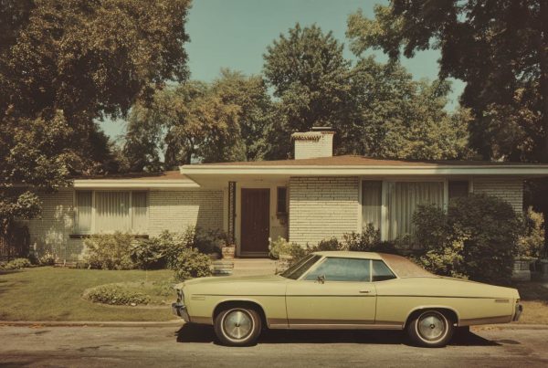
Real estate marketing works best when the visual presentation matches the likely buyer. A downtown condo targeting young professionals should not be staged like a suburban family home. A luxury coastal property should not feel like a generic furniture catalog. A transitional-style home in an established neighborhood may need warmth and polish, while a newly renovated modern property might benefit from cleaner lines and a more pared-back approach.
This is where brand clarity comes in. Every listing exists within a market context, and every agent or brokerage exists within a brand context. Virtual staging should support both. If your brand promises elevated taste and strategic presentation, your staging choices need to reflect that. If your listing campaign is speaking to move-up buyers, empty nesters, or investors, the visuals should make immediate sense to those audiences.
A practical way to approach this is to create a simple staging brief before production starts. Define the target buyer. Define the mood. Define the level of formality. Define what the room needs to communicate. Is this office meant to signal work-from-home functionality? Is this bonus room better shown as a media lounge or a guest bedroom? The answer should come from marketing logic, not random inspiration.
Scale, proportion, and realism matter more than style trends
There is a persistent temptation to use virtual staging as a shortcut to trendiness. Bouclé chairs. Oversized pendant lights. Aggressively curated coffee tables. It is all fine in moderation, but trend-forward does not automatically mean effective.
The real make-or-break issue is realism. If furniture is improperly scaled, buyers notice. If a rug floats awkwardly in the room, buyers notice. If lighting direction does not match the actual space, buyers may not know exactly what feels off, but they will feel it. And in marketing, “something feels off” is deadly.
Believability is what protects the image from looking artificial. That means respecting architectural cues and physical constraints. A compact room should not be staged with bulky pieces just to make it feel luxurious. A low-ceiling space should not feature visually heavy fixtures that fight the structure. A narrow bedroom should not have a king bed if a queen is the truthful fit. These may sound like small decisions, but they are exactly the details that shape credibility.
Strong virtual staging also pays attention to material logic. If the home has a clean, updated interior, the furnishings should feel consistent with that level of finish. If the home has traditional bones, there should be some dialogue between the staging and the architecture. You do not have to go fully period-specific, but visual coherence matters. It keeps the property from feeling like a backdrop for borrowed furniture.
My opinion here is simple: realism is not the enemy of aspiration. In fact, realism is what makes aspiration believable. Buyers do not need perfection. They need confidence that what they are seeing is an honest enhancement of what is actually there.
Use virtual staging to answer buyer objections before they surface
This is where virtual staging becomes a true marketing tool instead of just a visual service. The smartest use of staging is not to beautify a room. It is to solve confusion.
Most listings have at least one area that buyers struggle to interpret. Maybe the living room is large but awkward. Maybe the den lacks a clear purpose. Maybe a finished basement looks disconnected from the rest of the house. These are not just design issues. They are sales issues. Unclear rooms create friction, and friction slows decision-making.
Virtual staging can reduce that friction by assigning purpose with confidence. A strange nook becomes a reading corner. An open landing becomes a compact desk area. A spare room becomes a nursery, home gym, or guest room depending on what best suits the buyer profile. The key is not to invent fantasy uses that the room cannot reasonably support. The key is to reveal the strongest plausible use case.
That practical mindset is especially important in real estate marketing today because buyers are highly attuned to utility. They want beauty, yes, but they also want lifestyle efficiency. They are asking whether a home works for remote work, hosting, storage, multigenerational living, or flexible routines. Virtual staging can help answer those questions visually, and visual answers tend to be faster and more persuasive than copy.
If you want a simple standard, use staging to resolve hesitation. If an image creates more questions than it answers, revise it.
Consistency across the listing matters more than one standout image
A surprisingly common problem in virtual staging is inconsistency. One room is staged in soft organic modern. Another leans industrial. A third looks like a luxury hotel suite. Individually, each image may be attractive. Together, they suggest a lack of intention.
Listings are not consumed as isolated photos. They are experienced as sequences. Buyers move through images quickly, forming impressions about quality, flow, and identity. If the design language keeps changing, the home starts to feel less coherent. That weakens the emotional arc of the listing.
This matters at the brand level too. Great real estate marketing is cumulative. Every touchpoint should reinforce the sense that the property has been presented with care and intelligence. That includes photography, copy, staging, social assets, and listing pages. Virtual staging should not feel like a bolt-on effect. It should feel integrated into the broader campaign.
For teams and brokerages, this is a place to get more operational. Build a standard. Create staging guidelines by property type and price point. Define your acceptable design styles. Establish quality controls for scale, lighting, and realism. Have someone review images not just for beauty, but for strategic consistency. The more repeatable your standards, the stronger your visual brand becomes over time.
Disclosure and trust are not optional extras
Let’s say this plainly: if you are using virtual staging, disclose it. Not because it is a legal footnote to get through, but because trust is a marketing asset worth protecting. Buyers are not offended by virtual staging when it is used responsibly. They are offended when they feel misled.
Clear disclosure does not reduce impact. In most cases, it actually strengthens it, because it signals professionalism and transparency. It tells buyers that the image is meant to illustrate potential, not disguise reality. That distinction matters.
There is a broader brand issue here that many real estate marketers underestimate. Every listing teaches the market how to interpret your brand. If your visual presentation feels inflated or misleading, that reputation compounds. If your listings feel polished, honest, and thoughtfully composed, that compounds too. Virtual staging sits directly inside that equation.
Good marketing is not about squeezing short-term attention from a listing. It is about building long-term confidence in how you present properties. The agents and brands that understand this tend to market better across the board because they stop chasing superficial impact and start investing in clarity.
The best virtual staging feels inevitable
That is the bar. Not flashy. Not technically impressive. Not trendy for the sake of trendiness. Inevitable. As if the room was always meant to be seen this way. As if the furnishings simply helped the buyer notice what was already valuable.
When virtual staging reaches that level, it does something powerful for real estate marketing. It sharpens the message without distorting the product. It creates emotional accessibility without sacrificing credibility. It helps a listing stand out not because it is louder than the competition, but because it is more resolved.
That is a better standard for visual marketing in real estate, and frankly, the industry needs it. We do not need more staged images that show off software tricks. We need more listing visuals that respect the buyer, support the brand, and make the home easier to understand.
Done right, virtual staging is not about adding something artificial. It is about revealing what the property is capable of communicating when presentation is guided by taste, discipline, and actual marketing intelligence.