
Last Updated on April 20, 2026 by DSNRY
Fonts influence perception more than you realize.
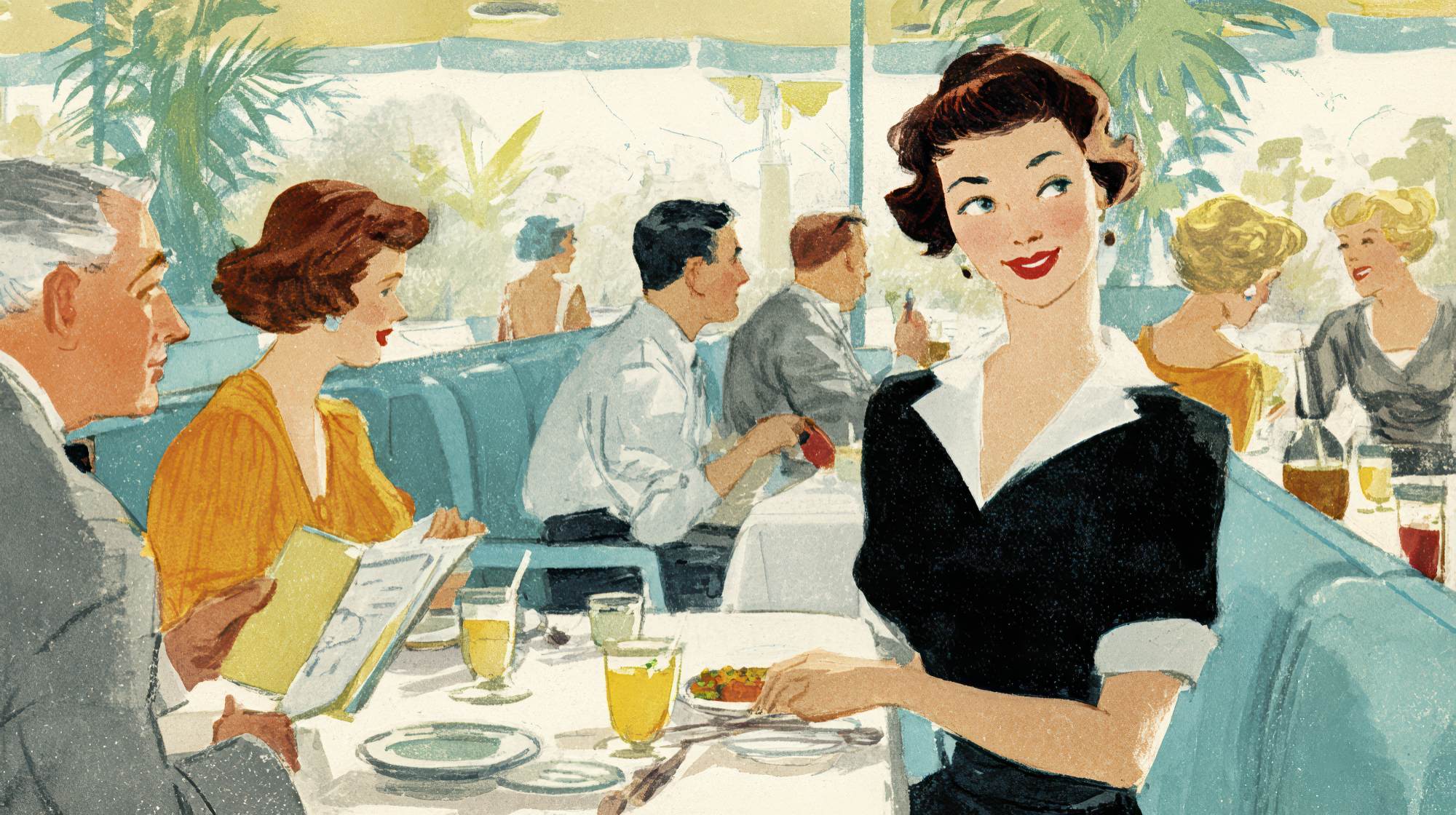
Restaurant owners tend to obsess over the obvious branding choices first: logo, color palette, photography, plating, interiors, maybe even the playlist. Fair enough. Those are visible, emotional, immediate. But typography often gets treated like a technical afterthought, as if fonts are just containers for the “real” message. They’re not. In restaurant marketing, type is part of the message.
The font on your menu, website, takeout packaging, social posts, email headers, signage, and gift cards is constantly signaling something to guests before they read a single word. Is this place polished? Approachable? Expensive? Playful? Trendy? Heritage-driven? Trustworthy? Generic? Typography answers those questions faster than most restaurant teams realize.
And here’s the uncomfortable truth: many restaurants are accidentally branding themselves with type choices that undermine everything else they’re trying to communicate. A chef-driven concept uses tired default fonts and suddenly feels less thoughtful. A neighborhood café with real personality looks interchangeable because its menu design feels templated. A premium steakhouse uses trendy display fonts everywhere and loses the sense of confidence and restraint that premium diners expect.
Good typography is not about being fancy. It’s about being aligned. If your restaurant brand promises a certain experience, your type should reinforce it at every touchpoint.
Typography is branding, not decoration
One of the biggest misconceptions in restaurant marketing is that typography lives in the design bucket while branding lives somewhere else. That split is a mistake. Type is branding because it shapes tone, pace, readability, and emotional expectation.
Think about the difference between a crisp serif font and a rounded sans serif. One might suggest heritage, refinement, ritual, and a little formality. The other might feel modern, casual, efficient, and friendly. Neither is universally better. The point is that each creates an atmosphere before the guest engages with your offer.
That matters because restaurants don’t just sell food. They sell context. A burger is never just a burger. It’s indulgent, nostalgic, elevated, quick, craft, family-friendly, local, late-night, or luxury depending on how the brand frames it. Typography is one of the quietest but strongest framing devices you have.
I’ve seen restaurants spend heavily on interiors and photography, then throw the entire impression off with menus and websites that feel visually disconnected. It creates friction. Guests may not consciously say, “This font choice is inconsistent with the stated positioning,” but they absolutely feel when a brand lacks cohesion.
If you want a simple test, look at your menu and website with all the food photos removed. Does the typography still sound like your restaurant? If not, your brand is leaning too hard on visuals and not enough on structure.
What your fonts are communicating to diners
Every font carries baggage. Some of it is cultural. Some of it is generational. Some of it comes from overuse in certain industries. That’s why choosing a font because it “looks nice” is usually not enough. In restaurant marketing, the better question is: what does this typeface imply?
A tightly spaced all-caps serif can imply luxury, seriousness, and confidence. Used well, it can make a fine dining brand feel timeless. Used poorly, it can feel cold or self-important.
A soft, rounded sans serif can signal warmth and accessibility. That may be perfect for a family restaurant, bakery, or fast-casual concept. But if the rest of the brand is trying to communicate exclusivity and elevated service, that same type choice can pull the perception downmarket.
Handwritten or script fonts are especially tricky in hospitality. They can add charm, personality, and a human touch. But they can also kill readability fast and make a brand feel dated if overused. Script should usually be an accent, not a workhorse.
Minimalist modern fonts are popular for a reason. They photograph well, work across digital platforms, and feel current. But there’s now a sameness problem in restaurant branding. If every concept in your market uses the same clean sans serif with muted colors and airy spacing, being “modern” stops being distinctive. It just becomes safe.
The real goal isn’t to choose a font with the strongest personality. It’s to choose one with the right personality for your concept, audience, and price point.
Menus are where typography directly impacts revenue
Let’s be blunt: menu typography is not just a brand issue. It’s a sales tool. A menu that looks beautiful but slows people down, confuses hierarchy, or creates visual fatigue is underperforming.
The best menu typography does three jobs at once. It reinforces brand identity, improves readability, and guides decision-making. If it only does one of those well, it’s not doing enough.
This is where restaurant operators can get too precious. They want the menu to look “elevated,” so they reduce contrast, shrink type sizes, or use ornate fonts that become annoying in low light. That’s a bad trade. Dining rooms are practical environments. Guests are skimming, comparing, deciding, and often doing it quickly. Readability is not a compromise. It is part of hospitality.
A few strong rules:
Choose a font size people can comfortably read without effort. This sounds obvious, but plenty of menus still fail here.
Use typographic hierarchy intentionally. Section names, dish names, descriptions, and prices should each be visually distinct.
Don’t use too many fonts. Most restaurants need two, maybe three at most. More than that usually starts looking undisciplined.
Watch spacing. Tight leading and cluttered layouts make menus feel stressful, while thoughtful spacing can make even a dense menu feel approachable.
Use emphasis sparingly. If everything is bold, oversized, italicized, or in all caps, nothing stands out.
And perhaps most importantly, match the menu type to the dining experience. A quick-service restaurant should not force guests through a dense, literary-looking layout. A tasting menu should not feel like an airport kiosk. The format should support the pace of service.
When typography is handled well on a menu, guests move with more confidence. They understand categories faster, notice high-margin items more naturally, and feel a greater sense of polish overall. That affects both check averages and brand trust.
Your digital presence needs typographic consistency
Restaurant branding no longer lives primarily in physical space. For many guests, the first interaction happens on Instagram, Google Business Profile, a reservation platform, a website, or an email. If your typography changes dramatically across those touchpoints, your brand starts feeling fragmented.
This is one of the most common restaurant marketing mistakes: the in-house menu has one personality, the website has another, social graphics use three more, and online ordering looks like a completely different business. The guest may not articulate the issue, but inconsistency weakens memorability.
Consistency does not mean rigidity. Your website can use a more functional font for body copy than your printed menu. Social graphics may need a bolder, simpler system for mobile viewing. But the family resemblance should be obvious. The brand should still feel like itself.
If your restaurant uses typography intentionally, digital marketing becomes stronger across the board. Ads feel more recognizable. Email campaigns feel more premium. Seasonal promotions can shift creatively without losing identity. Even a simple announcement post can feel like branded communication rather than filler content.
And in a crowded market, recognizability matters. Restaurants are competing not just on taste but on recall. People scroll fast. A consistent visual language gives them one more reason to remember you.
How to choose fonts that actually fit your concept
Here’s my opinion: most restaurant teams start the font selection process too late and too superficially. They look at inspiration boards, pick something stylish, and move on. A better process starts with the actual experience you’re selling.
Ask these questions first:
What should a first-time guest feel before they walk in?
What is our price point, and what level of polish should the brand suggest?
Are we trying to feel timeless, current, playful, artisanal, efficient, indulgent, or refined?
Who is our core customer, and what visual language already feels familiar or appealing to them?
How will this type perform on menus, signage, mobile screens, packaging, and social graphics?
That last question matters more than people think. A font can look amazing in a logo and fail everywhere else. Restaurant branding is highly operational. Your typography has to survive real-world use, not just design presentations.
In practical terms, I usually recommend building a simple type system rather than fixating on a single “perfect” font. That system may include a display font for headlines or logo applications, a reliable font for body text, and maybe one accent style used sparingly. The point is to create order.
And test before committing. Print menus. View layouts on phones. Put mock signage at distance. Look at how prices, allergen notes, and long dish descriptions behave. Typography is one of those areas where tiny decisions have major consequences in live environments.
Common typography mistakes that cheapen a restaurant brand
Some font-related errors are so common they’ve become almost invisible. That doesn’t make them harmless.
First: using trendy fonts without considering longevity. If your type choice is built entirely around what feels current this year, don’t be surprised when your brand starts aging early. Restaurants need enough flexibility to stay relevant without constant reinvention.
Second: over-decorating. Too many restaurants confuse personality with clutter. Multiple scripts, novelty fonts, excessive italics, and inconsistent capitalization don’t make a brand feel expressive. They make it feel unresolved.
Third: ignoring accessibility. Low contrast, tiny text, and overly stylized letterforms frustrate guests. Hospitality should remove friction, not add it.
Fourth: letting vendors break the system. Promo flyers, event graphics, table tents, third-party ordering pages, and social templates often drift away from the main brand. Over time, this creates a visual patchwork that weakens your positioning.
Fifth: defaulting to generic. A safe, clean font is not automatically a bad choice. But if there’s no distinctive usage, no point of view, and no consistency around it, the brand becomes forgettable. In restaurant marketing, forgettable is expensive.
Strong restaurant brands sweat the small stuff
The most compelling restaurant brands understand something that weaker ones miss: guests build perception from accumulation. They notice the room, the service, the menu language, the music, the photography, the packaging, the reservation confirmation, the host stand, and yes, the typography. Every detail either supports the promise or chips away at it.
Fonts are not magic. A better type system won’t save weak food or bad service. But strong typography can make a great concept feel more coherent, more trustworthy, and more intentional. And in a business where margins are tight and competition is relentless, that kind of edge matters.
If your restaurant’s branding feels a little off, a little flat, or a little less premium than the experience you’re actually delivering, don’t just look at the logo or the photos. Look at the type. It may be doing more talking than you think.
And if it’s sending the wrong message, fix it. Because in restaurant marketing, perception starts before the first bite.


