
Last Updated on April 20, 2026 by DSNRY
See how disciplined design maintains brand strength through menu and promotion changes.
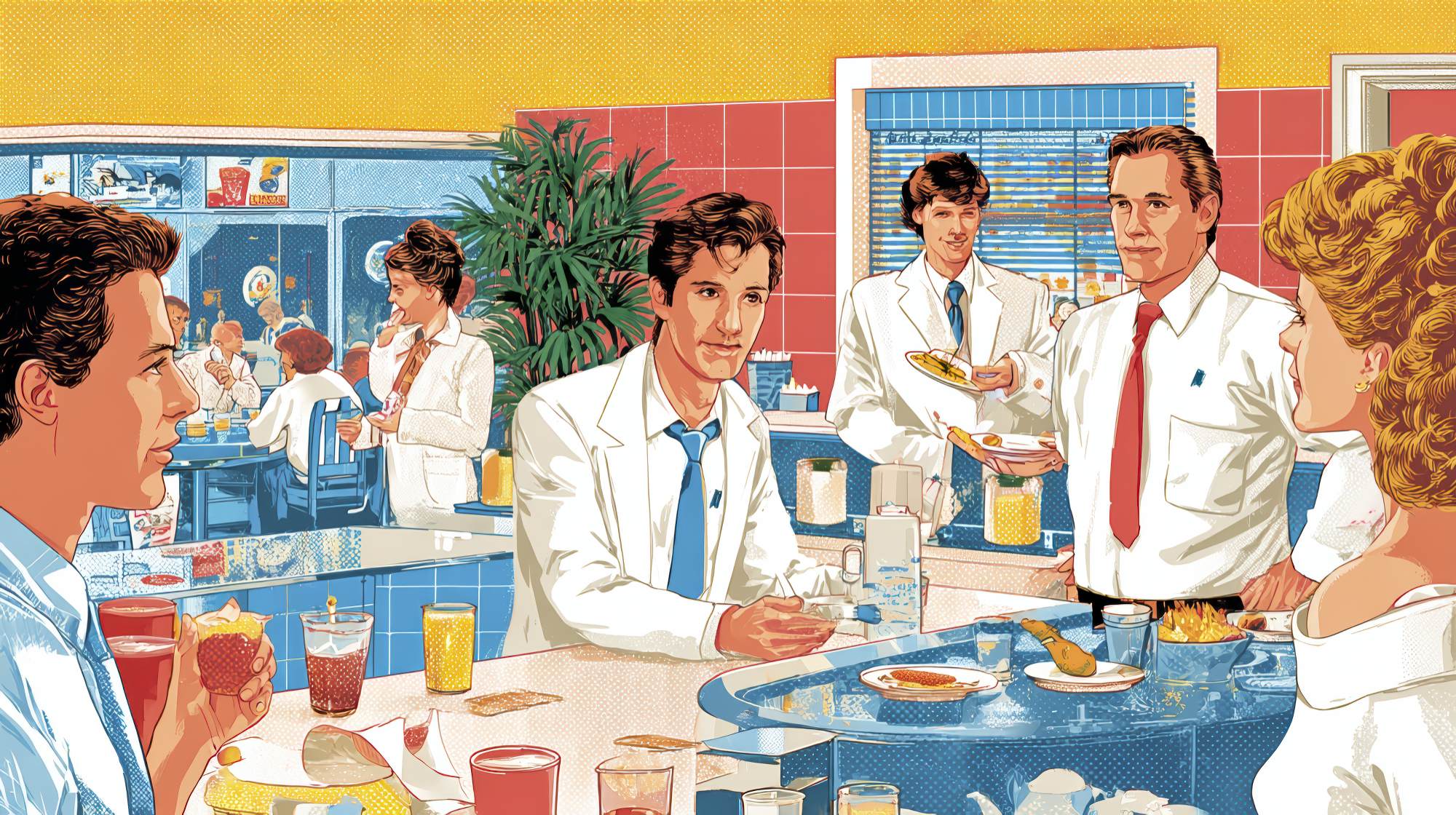
Seasonal marketing is where a lot of restaurant brands accidentally get sloppy. A spring menu arrives, so the colors change. Summer patio season starts, so the typography gets playful. Fall promotion? Suddenly there are rustic textures, script fonts, and a completely different tone of voice. By the holidays, the brand barely looks like itself.
I’ve seen this happen in independent restaurants, multi-unit groups, and even well-funded hospitality brands with talented internal teams. The issue usually isn’t creativity. It’s the lack of discipline around how creativity gets expressed. Restaurants want their campaigns to feel fresh, but in chasing novelty they often trade away recognition. That’s a bad bargain.
The strongest restaurant marketing doesn’t reinvent the brand every quarter. It adapts the brand to the moment. That’s a very different move. Guests should feel the energy of the season without losing the visual cues that make your restaurant instantly identifiable across menus, email, social, signage, paid ads, table tents, and packaging.
If your seasonal campaigns feel disconnected, the problem usually isn’t that they need more design. It’s that they need a tighter system.
Why seasonal campaigns often weaken restaurant brands
Restaurants are naturally drawn to seasonal storytelling. That instinct is right. Food is seasonal. Dining habits are seasonal. Promotions are seasonal. The challenge is that many teams treat each campaign like a standalone event rather than a chapter in one ongoing brand story.
That’s where visual consistency starts to break down.
One month, the social team is using templates made in a rush. The print vendor adjusts colors for a menu insert. A beverage supplier contributes promotional artwork that doesn’t match the restaurant’s style. Someone decides this campaign should “feel premium,” so they introduce a new font and photography direction. None of these decisions seem huge in isolation. Together, they create a fragmented guest experience.
And guests do notice, even if they don’t consciously articulate it. Consistency builds trust because it signals confidence and professionalism. Inconsistency makes marketing feel temporary, improvised, or overly promotional. For restaurants, that matters. People aren’t just buying a meal; they’re buying an experience, a mood, and an expectation of quality. If your campaign visuals look unstable, the brand starts to feel unstable too.
Seasonal marketing should create momentum, not identity drift. If every campaign introduces a new design language, you’re training customers to remember the promotion instead of the restaurant.
What should stay consistent, no matter the season
This is where a lot of teams get too vague. They say they want consistency, but they don’t define what exactly needs to remain fixed. In practice, every restaurant should identify a core set of visual assets that stay recognizable across all campaigns, whether you’re promoting a prix fixe Valentine’s dinner, a limited-time summer cocktail menu, or a game-day special.
At minimum, those assets usually include:
Typography: Your primary fonts should not rotate with the seasons. You can introduce subtle supporting treatments, but your core type system should remain stable.
Color hierarchy: Seasonal accents are fine. Replacing your brand palette every few months is not. Use seasonal colors as supporting players, not the whole cast.
Logo usage: Keep size, spacing, and placement rules consistent. Don’t let the logo become decorative.
Photography style: The editing, lighting, framing, and mood should still feel like your brand, even if the food or occasion changes.
Layout structure: Guests may not consciously see grid systems and spacing patterns, but they absolutely feel when a brand’s materials look cohesive.
Tone of voice: This is often overlooked because it sits between design and copy. Your seasonal offer can sound celebratory, cozy, bright, or indulgent without suddenly sounding like a different company.
In my view, restaurants should be far more protective of these foundational elements than they usually are. Seasonal campaigns should flex around the brand spine, not replace it. If your visual identity only works in one “evergreen” form and falls apart as soon as you promote something timely, it’s not a strong identity. It’s just a static look.
How to make campaigns feel seasonal without losing recognition
The smartest seasonal design work is usually the most restrained. That may sound less exciting, but restraint is what separates an intentional brand from a collection of promotions.
A good approach is to define a small set of “seasonal variables” that can change while everything else remains anchored. For example, maybe your summer campaign introduces warmer accent colors, more natural daylight photography, and lighter illustrative details. Meanwhile, your type system, logo treatment, page structure, and baseline copy voice stay exactly where they should.
This allows the campaign to feel timely without becoming unrecognizable.
I’m a big believer in restaurants using seasonal motifs as overlays rather than rebuilds. Add context, don’t replace identity. If autumn means deeper tones, textured backgrounds, and harvest-driven menu photography, great. But that doesn’t mean your steakhouse suddenly needs a handwritten font and a farm-market aesthetic if that was never part of the brand in the first place.
The same goes for holiday marketing, where restaurants often get especially undisciplined. Every December, brands that normally look polished and modern start producing visuals that feel crowded, overly festive, and generic. Snowflakes, metallic gradients, red-and-green overload, ornamental scripts—it all starts to look like supplier collateral instead of restaurant branding.
The better move is to interpret the season through your own brand lens. A minimalist restaurant should still look minimalist during the holidays. A playful neighborhood concept should still feel playful in spring. A refined fine-dining brand should not suddenly become visually loud just because there’s a New Year’s Eve package to sell.
That’s what consistency really means: not resisting the season, but filtering it.
Build a campaign system, not one-off assets
If you want consistency at scale, especially across multiple channels or locations, you need more than good taste. You need a usable system.
Most restaurant marketing problems that show up as “design inconsistency” are actually operations problems. The team is moving fast, promotions are frequent, and different people are producing assets under deadline pressure. Without templates, rules, and approvals, inconsistency is inevitable.
That’s why I recommend creating a seasonal campaign framework that includes:
Template families for email, social posts, stories, menu inserts, table signage, paid ads, and web banners.
Defined seasonal accent rules so teams know what can change and what cannot.
Photography guidelines for food styling, editing, composition, and environmental shots.
Copy guidance that clarifies voice, offer framing, and promotional language.
Approval checkpoints to catch visual drift before campaigns go live.
This doesn’t make your marketing rigid. It makes it repeatable. And repeatability is what allows restaurants to move quickly without looking chaotic.
There’s also a financial case for this. Rebuilding assets from scratch every season burns time and budget. A system reduces revision cycles, speeds production, and improves cross-channel quality. It also makes onboarding agencies, freelancers, and internal hires much easier. When the brand logic is documented, fewer decisions get made emotionally or inconsistently.
In restaurant marketing, speed matters. But speed without structure usually creates mediocre work faster.
Consistency across channels matters more than most restaurants think
One of the biggest mistakes I see is treating each channel like its own mini-brand. The Instagram campaign feels one way, the in-store signage looks another way, the website promotion uses different messaging, and the printed menu insert seems to belong to a different restaurant entirely.
Customers don’t experience your marketing in silos. They move across touchpoints quickly and casually. They might see a seasonal cocktail on Instagram, click to your website, book a reservation, and then arrive to find table signage and menu design that barely connect visually to what they saw online. That disconnect chips away at confidence.
A restaurant brand feels stronger when every touchpoint confirms the same identity. Not identical execution, but clear family resemblance.
This is especially important for limited-time offers. Seasonal promotions already come with urgency, so they can easily drift into “salesy” territory. Consistent design keeps the offer elevated. It helps guests feel that the campaign is a natural extension of the dining experience, not a bolt-on ad.
If you want a practical test, lay out all campaign materials side by side before launch: social graphics, printed collateral, website hero, email header, paid ad creative, menu inserts, and any in-store signage. If they don’t obviously belong to the same restaurant, keep refining. This simple review catches a surprising amount of brand slippage.
How strong design discipline supports long-term restaurant growth
Consistency is not just a branding preference. It’s an asset builder. Restaurants that maintain visual coherence over time become easier to recognize, easier to remember, and easier to trust. Those things drive repeat visits more than many operators realize.
When your seasonal campaigns are visually disciplined, you get several advantages at once. Guests learn to identify your brand faster. Promotions feel more premium. New menu launches become more efficient to market. Multi-location execution gets cleaner. Your team spends less time debating aesthetic direction and more time improving performance.
Most importantly, the brand keeps compounding. That’s the real win.
Too many restaurants think of branding as the thing you establish once and marketing as the thing you keep changing. I think that’s backwards. Good marketing should reinforce the brand every single time it appears. Seasonal campaigns are not interruptions to brand building. They are one of the clearest opportunities to strengthen it.
So yes, bring in the freshness of the season. Let the food, mood, and moment shape the campaign. But do it with standards. Do it with consistency. Do it in a way that makes the restaurant more recognizable, not less.
Because in a crowded market, the brands that win are rarely the ones shouting the loudest. They’re the ones that know exactly who they are, even when the menu changes.


