Last Updated on April 20, 2026 by DSNRY
Stop capping your revenue with a brand that looks entry-level.
One of the fastest ways fitness professionals sabotage their own growth is by trying to charge premium prices with a bargain-bin brand presence. I see it constantly: a brilliant coach with real results, a strong client roster, and a genuinely valuable offer hiding behind a visual identity that feels rushed, inconsistent, or cheap. Then they wonder why leads hesitate, why price objections pile up, or why they keep attracting people who want “something affordable.”
Here’s the blunt truth: people do judge your business by how it looks. In fitness, where trust, confidence, and perception matter so much, your aesthetic is not some fluffy extra. It is part of the sales process. It tells potential clients whether you operate like a premium professional or like someone piecing things together as they go.
If you want high-end clients, higher retention, and pricing power, your brand cannot look like a side hustle from 2018. Premium pricing requires visual proof. Not perfection. Not hype. Proof.
Your Brand Is Making a Pricing Argument Before You Ever Speak
Before a prospect reads your coaching philosophy, checks your certifications, or books a consultation, they are already making decisions. They are scanning your website, your Instagram grid, your stories, your logo, your typography, your color choices, your photography, your offer presentation, and the overall level of polish. All of that communicates something immediate: “This is worth serious money,” or “This feels basic.”
Fitness is a high-trust purchase. People are not just buying workouts. They are buying leadership, certainty, identity change, accountability, and expertise. If your visual presentation feels scattered, amateur, or generic, it creates friction. Even if your service is excellent, the brand experience creates doubt.
And doubt kills conversions.
That’s the part many coaches miss. Premium buyers are not just evaluating your program. They are evaluating the total environment around your offer. They want to feel they are stepping into a business that is organized, elevated, and intentional. They want signs that you’ve thought through the details. A premium aesthetic does exactly that. It reduces perceived risk.
When your brand looks elevated, your prices feel more believable. When your brand looks inconsistent, your prices feel inflated.
“Premium” Does Not Mean Flashy, Luxury, or Overdesigned
Let’s clear something up, because this is where people go wrong. A premium aesthetic is not about pretending to be a luxury fashion house. It is not about slapping gold on everything, using dramatic black backgrounds, or making your website look like an expensive nightclub.
Premium means intentional. Clean. Cohesive. Confident.
For fitness professionals, a premium aesthetic usually comes down to a few essentials: strong and consistent visual identity, quality photography, smart typography, a clear offer structure, refined messaging, and an online presence that feels current. That’s it. It should feel distinct, not busy. Elevated, not overproduced.
The most effective premium brands in fitness understand restraint. They are not trying to scream. They are trying to signal. They know that polished simplicity often reads as more credible than a crowded, over-styled brand full of random design trends.
If your aesthetic feels like you added a new idea every six months without a system, it will not support premium pricing. If your website, social media, and sales materials all feel like they belong to different businesses, that is a problem. Premium brands feel unified. They have a point of view.
Entry-Level Branding Attracts Entry-Level Buyers
This is the hard conversation a lot of fitness professionals need to have with themselves. If your brand looks entry-level, you are going to attract entry-level buying behavior.
That means more ghosting. More shopping around. More “I just need something simple.” More discount questions. More leads who compare you to low-cost trainers, workout apps, or generic online plans. Not always because your service is equal to those things, but because your presentation places you in the same visual category.
Branding shapes who feels like your offer is for them. If your pages are cluttered, your content graphics look templated beyond belief, your photos are low quality, and your messaging is vague, serious buyers will hesitate. They may not say, “The kerning feels off” or “The website lacks hierarchy,” but they will feel that something is underdeveloped. And feeling is enough.
On the other hand, when your brand feels premium, better buyers tend to self-select in. They assume structure. They assume expertise. They assume results are taken seriously. They come into the conversation expecting a real investment rather than hoping for a deal.
That shift is powerful. Better branding does not just help you look more expensive. It helps you attract people who are already more mentally prepared to buy at a higher level.
Where Fitness Brands Usually Break Down
If you’re wondering whether your aesthetic is capping your revenue, the answer usually lives in a few obvious places.
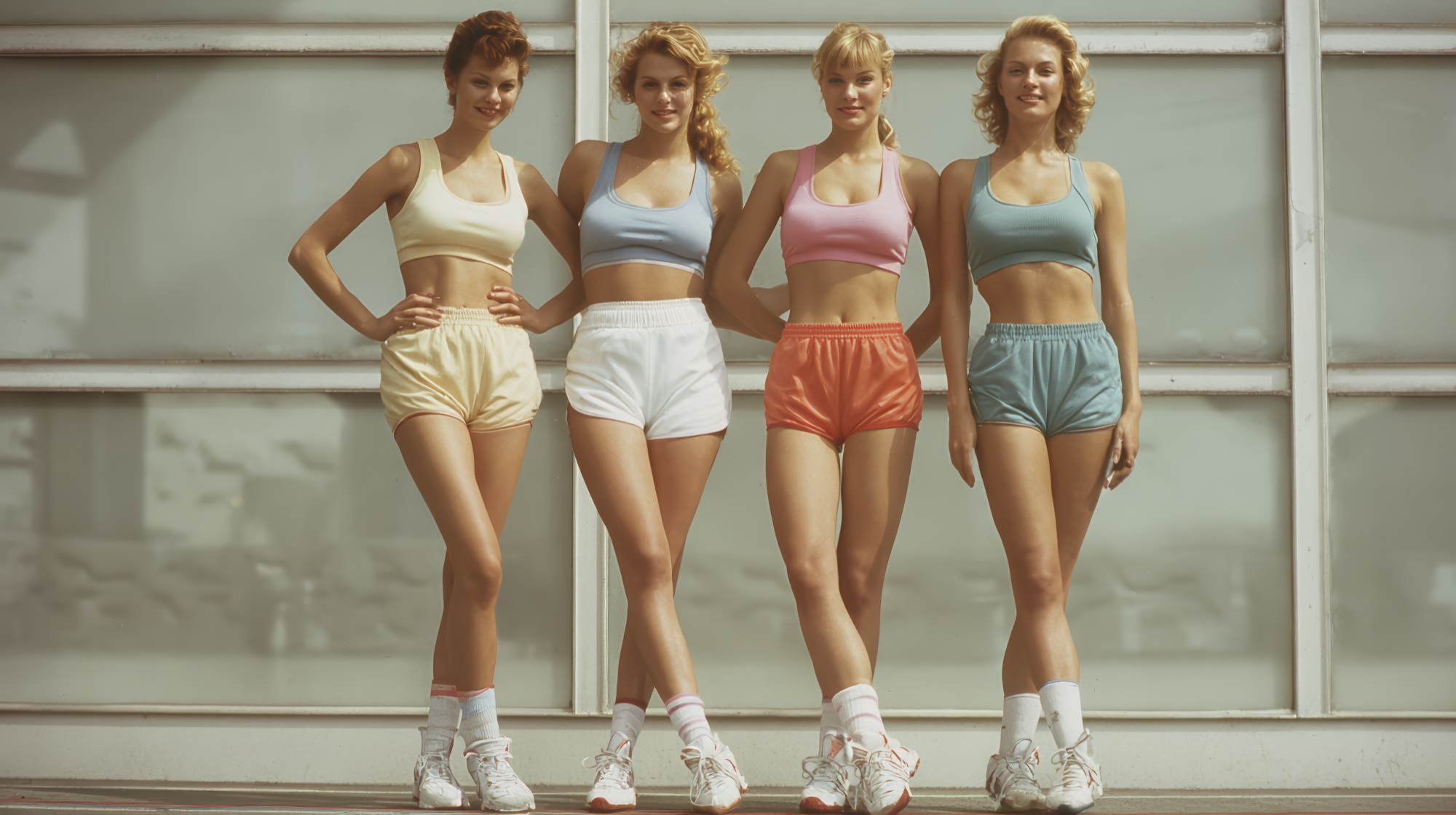
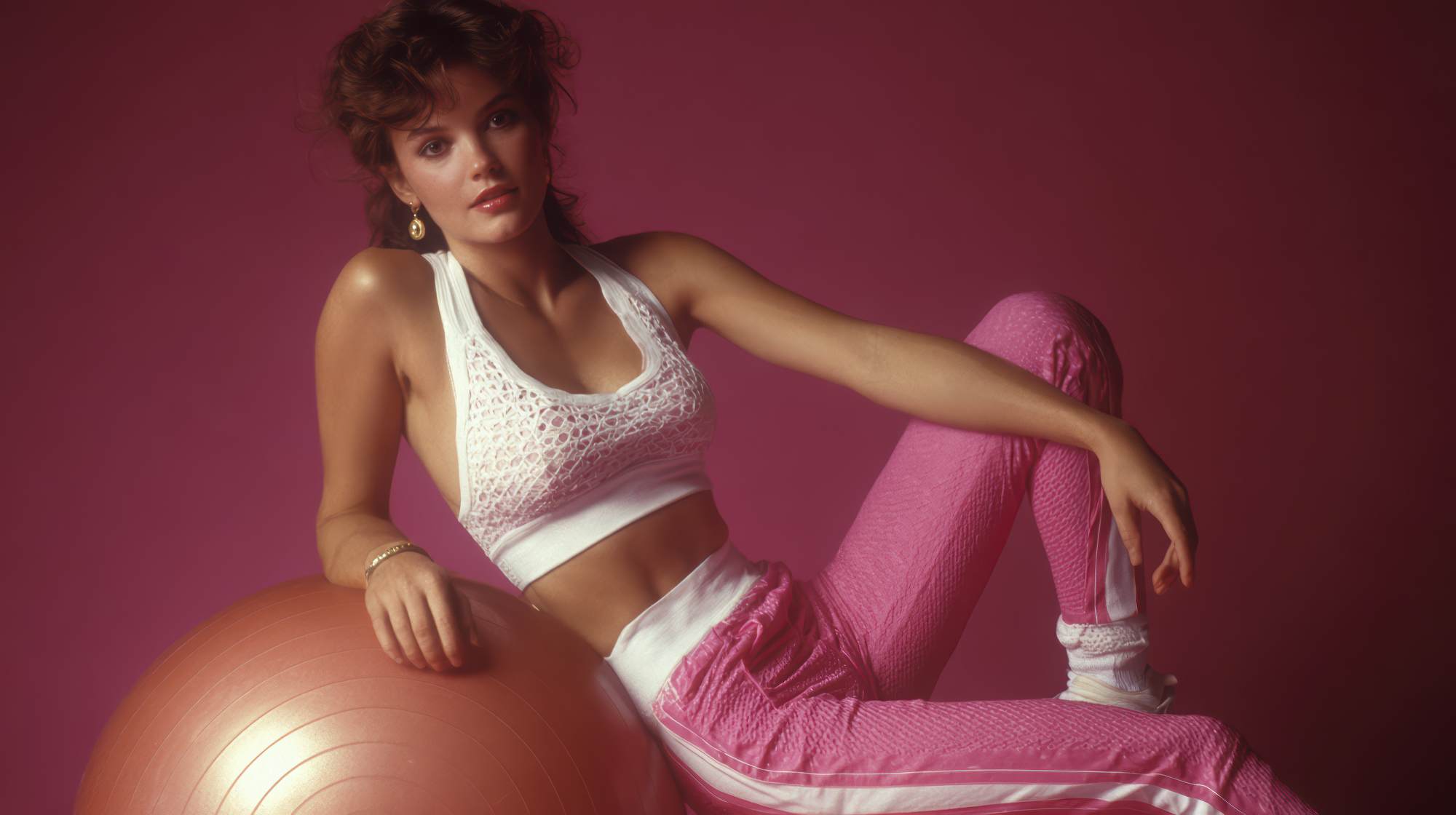
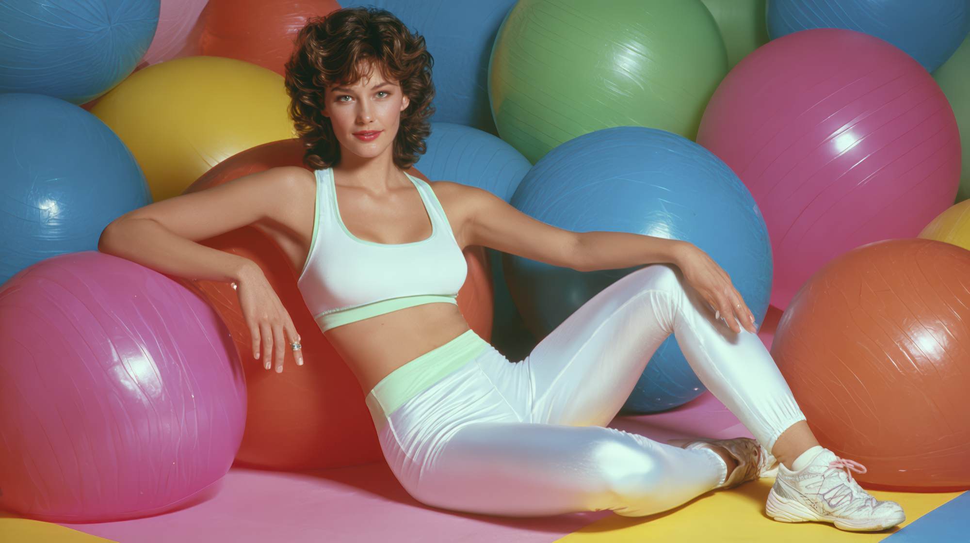
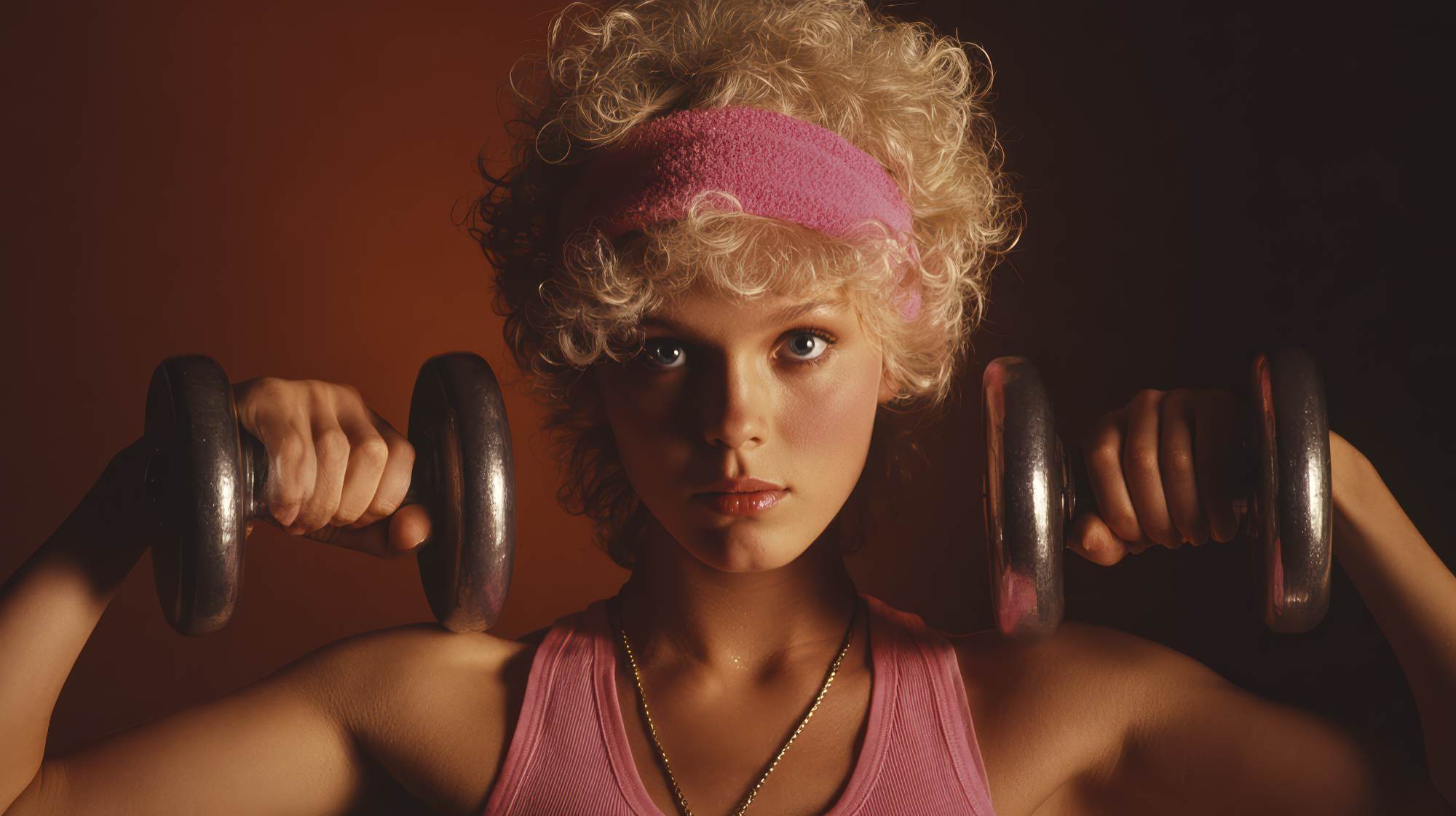
First, photography. Nothing drags down a fitness brand faster than random, dimly lit gym photos, screenshots, badly cropped selfies, or a mix of styles that have no visual consistency. You do not need a massive shoot budget, but you do need intentional imagery. Your photos should reflect the caliber of your service and the kind of client experience you’re selling.
Second, logo obsession. Too many fitness professionals think the logo is the brand. It isn’t. A logo matters, but a premium aesthetic comes from the whole system: typography, color palette, layout, image style, graphic consistency, offer design, and messaging tone. A decent logo sitting inside a messy brand does not solve anything.
Third, social media inconsistency. Your Instagram should not feel like three different people are running it. If one post looks sleek and editorial, the next looks like a Canva panic attack, and the next is a blurry mirror selfie with six different font styles, the overall impression is unstable. Premium brands build trust through consistency.
Fourth, weak offer presentation. Even strong coaches often present their services in a way that feels casual and underdeveloped. If your premium program is described in two vague sentences and a “DM me for details,” you are making people work too hard. Premium offers need premium packaging. Clear transformation. Clear structure. Clear deliverables. Clear fit.
And fifth, outdated websites. If your site feels neglected, clunky, or visually stuck in another era, it directly undermines your pricing. A modern buyer expects a clean digital experience. If your site looks cheaper than your rates, your rates will feel harder to defend.
How to Build a Brand That Supports Higher Prices
If you want your aesthetic to support premium pricing, start by acting like your brand is part of the product. Because it is.
Begin with clarity. What category do you want to own? Strength coaching for executives? Postpartum performance? High-touch body recomposition? Boutique online coaching for women over 40? Premium aesthetics work best when they are attached to a specific identity and market position. Generalist branding usually looks generic because it is trying to appeal to everyone.
Next, refine your visual system. Choose a small number of brand colors. Pick typography that feels current and readable. Standardize how you present graphics, testimonials, educational content, and promotional material. Consistency creates authority faster than endless reinvention.
Then invest in better photography and content direction. This matters more than most fitness professionals want to admit. Professional images instantly elevate perceived value, especially if they show your process, your environment, your client experience, and your personality in a polished way. Premium buyers want to see who they’re trusting. Give them visuals that feel intentional.
After that, tighten your messaging. Premium brands are rarely the loudest, but they are often the clearest. Stop hiding behind generic phrases like “helping you become your best self” or “customized coaching for your goals.” Those say almost nothing. Be more specific. What result do you create? For whom? Through what method? Why does your approach command a higher investment?
Finally, upgrade your touchpoints. Your inquiry form, consultation booking page, onboarding materials, welcome email, program guide, and client dashboard all contribute to perceived value. If you want premium pricing, your brand cannot stop at the Instagram grid. The whole client journey should feel considered.
Premium Aesthetic Is Really About Congruence
Here’s my strongest take on this: the point is not to “look expensive” for the sake of appearances. The point is congruence. Your visual brand should match the actual quality of your service.
If you’re delivering a high-touch, results-driven, expertly designed coaching experience, your brand should reflect that reality. Otherwise, you’re forcing prospects to connect the dots themselves, and most won’t. People trust what feels aligned. If your prices, your claims, and your aesthetic all support one another, the buying decision gets easier.
That’s what premium branding really does. It closes the gap between the value you know you provide and the value a stranger can instantly perceive.
And yes, that can feel unfair. Plenty of incredibly skilled coaches are held back because they never built a brand around their expertise. But fairness is not the market. Perception matters. Positioning matters. Presentation matters.
You do not need to become a different business. You need to stop visually underselling the business you already are.
Raise the Standard Before You Raise the Price
If you’re planning to increase your rates, look at your brand first. Not because you need everything to be perfect, but because your pricing strategy should be supported by your presentation. Otherwise, every sale becomes an uphill argument.
Ask yourself a few honest questions. Does my brand look current? Does it feel cohesive? Does it reflect the level of transformation I provide? Would a high-value client see my business and immediately understand why I cost more? Or would they need a long explanation to get there?
If the answer is the second one, your aesthetic is probably limiting your growth.
The good news is this is fixable. You do not need a full rebrand overnight. You need better standards. Better visuals. Better consistency. Better packaging. Better alignment between the caliber of your work and the way that work is presented to the market.
Fitness professionals love to talk about leveling up. Here’s one of the most practical ways to actually do it: stop asking premium prices from inside an entry-level brand. Your business will only scale as far as the market believes it deserves to.
Make your brand look like the investment you’re asking clients to make. When the aesthetic matches the value, your pricing stops feeling like a stretch and starts feeling like the obvious next step.