
Last Updated on April 20, 2026 by DSNRY
Explore unified design languages that reinforce recognition at every customer touchpoint.
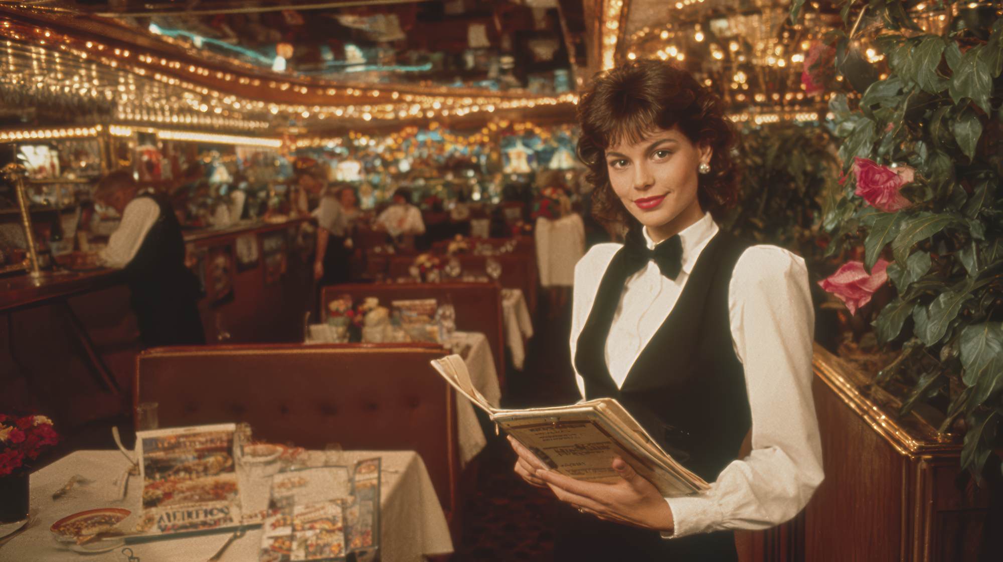
Restaurant marketing gets talked about in fragments. The logo lives with one person. Menus live with another. Social posts are made on the fly. Signage is ordered when something wears out. Email campaigns get built from whatever template is handy. None of this feels especially dramatic in the moment, but over time it creates a brand that looks and sounds inconsistent depending on where a guest encounters it.
That inconsistency is expensive.
Restaurants do not get unlimited chances to make an impression. Most guests experience a brand in quick, practical moments: walking by the storefront, scrolling Instagram, opening an online ordering page, glancing at a takeout menu, seeing a table tent, clicking a promo email, or spotting a catering flyer on an office counter. If those touchpoints feel disconnected, the restaurant starts to look less established, less memorable, and frankly less trustworthy.
A cohesive brand system fixes that. Not by making everything identical, but by making everything recognizable. That is the real goal. Guests should feel like your print materials, digital presence, in-store assets, and promotional campaigns all come from the same place, with the same standards, the same personality, and the same point of view.
Why restaurant brands fall apart across channels
Most restaurant operators are not neglecting brand on purpose. They are busy. Brand drift usually happens because marketing gets built reactively. A new seasonal special needs a poster by Friday. A manager makes a social graphic in Canva. A printer suggests a slightly different color. An online ordering platform limits fonts. A local agency writes email copy in a tone that does not sound like the in-store experience. Each individual decision seems minor. Collectively, they create a patchwork brand.
Restaurants are especially vulnerable to this because they operate in both physical and digital environments all day, every day. A retail brand may have a little more time to refine packaging or campaign rollouts. Restaurants have menus changing, promotions rotating, labor stretched thin, and location-level improvisation happening constantly. That is exactly why a system matters so much.
And yes, guests notice more than operators assume. They may not articulate that your Instagram stories feel trendy while your menu board feels outdated and your catering PDF looks like it came from a different business entirely. But they feel it. Consistency signals competence. Inconsistency introduces friction.
In restaurant marketing, friction kills momentum. It makes people hesitate when you want them to order, visit, remember, recommend, and return.
What a cohesive brand system actually includes
When people hear “brand system,” they often think of a style guide collecting dust in a shared drive. That is not enough. A useful brand system is practical. It helps real people make better marketing materials faster, without reinventing the wheel every week.
At minimum, a restaurant brand system should define:
Visual identity: logo use, color palette, typography, graphic elements, photography style, iconography, layout rules, and spacing standards.
Voice and tone: how the restaurant sounds in menu descriptions, social captions, emails, promos, signage, and customer-facing messaging.
Core brand cues: the distinctive details people come to associate with you, like a certain illustration style, a headline format, a recurring phrase, a framing device, or a signature use of color.
Asset applications: templates for menus, flyers, table tents, social posts, email headers, paid ads, digital ordering banners, and event materials.
Operational rules: who approves what, where current files live, what vendors should use, and how local teams can customize materials without breaking the system.
This is where I think many restaurant brands miss the point. They obsess over the logo and ignore the applications. But guests do not interact with your logo in isolation. They experience your brand through use cases. The menu is the brand. The loyalty email is the brand. The sandwich board is the brand. The promo graphic for Taco Tuesday is the brand. If those pieces are inconsistent, the logo cannot save you.
Start with your highest-traffic touchpoints, not your dream rebrand
Not every restaurant has the budget or appetite for a full identity overhaul. That is fine. You do not need to start there. In fact, I usually think it is smarter not to.
Start with the touchpoints guests encounter most often and the materials your team produces most frequently. For most restaurants, that means some version of the following:
Website and online ordering pages. Social media templates. Printed menus. In-store signage. Email marketing. Takeout packaging or inserts. Local store marketing materials.
If those six or seven areas can be brought into alignment, the brand starts to feel significantly stronger very quickly.
This is a practical restaurant marketing truth: consistency beats novelty. A polished but flexible system will almost always outperform a constant stream of one-off creative experiments that do not build memory. Restaurants often chase “fresh” when what they really need is recognizable.
That does not mean boring. It means disciplined. Your seasonal campaign can still feel new. Your limited-time offer can still have energy. But it should look and sound like your restaurant, not like a random designer’s side project.
How to build recognition across print and digital
If you want customers to recognize your restaurant instantly, you need repeated signals across formats. The best restaurant brands do this almost subconsciously. They create a few distinctive cues, then use them relentlessly.
One cue might be color. Another might be a headline style. Another might be the way food is photographed. Another might be the tone of short copy: clever, straightforward, indulgent, neighborhood-friendly, chef-driven, whatever is true to the brand.
The key is repetition with control.
For print, focus on materials people hold, see in-store, or encounter locally: menus, direct mail, table tents, window clings, posters, loyalty cards, catering one-sheets, event collateral, and packaging inserts. These should share the same visual rhythm. Similar type hierarchy. Similar use of color. Similar voice. Similar image treatment.
For digital, apply those same cues to social graphics, stories, website banners, ordering pages, display ads, SMS graphics, and emails. A guest should not feel like your print materials are warm and premium while your digital presence is loud and generic. That gap weakens the whole experience.
A useful test is this: remove the logo. Would a regular customer still know it is your restaurant? If the answer is no, your brand system probably depends too much on one element and not enough on a broader design language.
That broader language is what creates recognition at speed.
Where restaurant marketers should be opinionated
Here is the take: too many restaurant brands let platforms dictate the brand. The online ordering system, the delivery app listing, the social template tool, the email platform, the print vendor—each one pushes the brand toward default settings. If nobody pushes back, the result is sameness.
Restaurant marketers need to be more stubborn than that.
If your brand is playful, do not let your email read like corporate software. If your brand is elevated, do not use sloppy food photography on flyers just because it is convenient. If your restaurant is built around hospitality and neighborhood personality, your digital copy should not sound sterile.
Being cohesive does require flexibility. Platform constraints are real. But flexibility is not surrender. Strong brands adapt their system to the medium without abandoning themselves.
This matters even more for multi-location restaurants. Without a clear system, every location starts improvising. One store makes event posters in neon colors. Another uses old logos. Another runs Facebook graphics that feel off-brand. Another updates menus with mismatched fonts. Pretty soon the brand stops scaling and starts splintering.
If you want local marketing without local chaos, give teams templates, rules, examples, and guardrails. Make it easy to stay on-brand.
Practical ways to tighten your system this quarter
You do not need a six-month initiative to make meaningful progress. A lot can happen in one quarter if you focus.
First, audit your existing materials. Pull together screenshots, PDFs, print pieces, packaging, social posts, and emails from the last 90 days. Put them side by side. The gaps become obvious fast.
Second, identify your non-negotiables. Choose the brand elements that must remain consistent everywhere: primary colors, font pairings, logo treatments, image style, key messaging pillars, and tone principles.
Third, build templates for repeatable assets. This is one of the highest-leverage moves in restaurant marketing. A good template system reduces approval bottlenecks, improves speed, and protects consistency. Start with the assets used most often.
Fourth, simplify your copy voice. Many restaurants overcomplicate this. You do not need a manifesto for every social caption. You need a clear sense of how your restaurant sounds. Confident? Warm? Witty? Craveable? Direct? Pick the lane and train people on it.
Fifth, standardize photography and art direction. If your food looks moody and premium on the website but bright and chaotic in social posts, your brand loses coherence. Create a simple shot list and style reference for internal teams and outside photographers.
Sixth, create one central source of truth. Not five folders and three outdated versions. One place with current logos, templates, approved images, brand rules, and export-ready files.
Seventh, revisit vendor relationships. Printers, freelancers, agencies, and platform partners can either strengthen consistency or undermine it. Give them better inputs and clearer standards.
The payoff is bigger than aesthetics
A cohesive brand system is not just about looking polished. It improves performance.
When your restaurant is more recognizable, marketing works harder. Guests identify your content faster in crowded feeds. In-store promotions feel more credible. Direct mail has a better shot at recall. Email campaigns feel like an extension of the actual dining experience. Seasonal campaigns launch faster because the system already exists. Multi-location teams spend less time guessing and more time executing.
There is also a compounding effect. Brand consistency builds familiarity, and familiarity lowers resistance. In a category where people make quick choices and often default to what they know, that matters a lot.
And from a management perspective, systems reduce waste. Fewer one-off designs. Fewer revisions. Fewer rogue materials. Fewer situations where someone says, “Can you just make something quick?” and the result quietly chips away at the brand.
The strongest restaurant marketing does not feel improvised, even when it moves fast. It feels intentional. That is what a unified design language gives you: speed without sloppiness, flexibility without fragmentation, creativity without confusion.
Consistency is not glamorous, but it wins
Restaurant marketers are often under pressure to chase the next campaign, the next trend, the next platform feature. I get it. But some of the most valuable work is less flashy. It is the discipline of making sure the guest experience feels connected wherever it shows up.
That means your print and digital presence should not compete with each other. They should reinforce each other. Every flyer should make the website feel familiar. Every social post should echo the in-store experience. Every menu, email, poster, and promo should contribute to the same memory structure in the customer’s mind.
That is how recognition gets built. Not through one big moment, but through repeated, coherent ones.
For restaurants, that is not just a branding exercise. It is a practical marketing advantage. And in a crowded market, practical advantages are usually the ones worth taking seriously.


