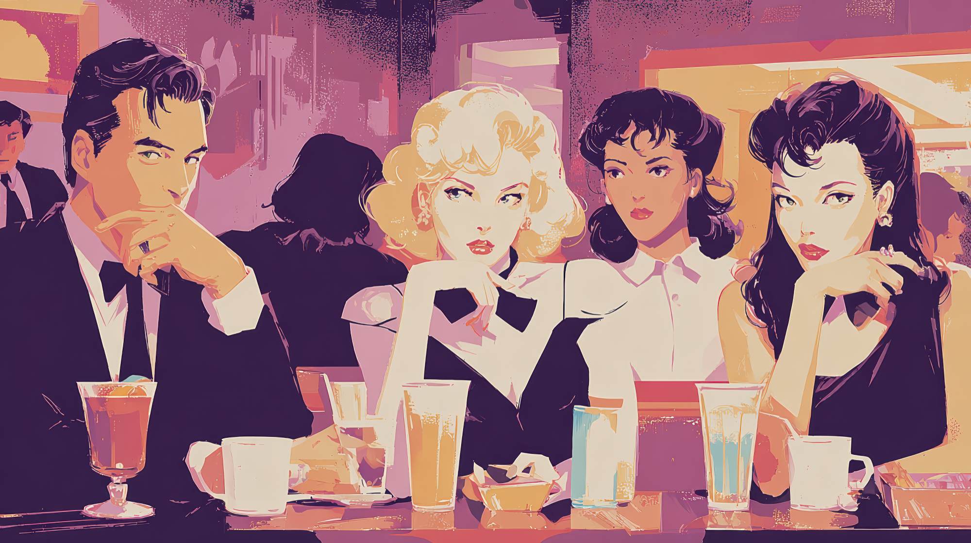
Learn refined techniques that communicate sophistication in short attention windows.
Restaurant advertising lives in a brutally crowded environment. Guests scroll fast, compare faster, and decide on instinct more often than they’d like to admit. In that environment, motion design can either elevate a restaurant’s brand or cheapen it in seconds. I’ve seen both. Too many restaurant marketers treat motion as decoration: a few animated ingredients, a flashy logo reveal, a trendy transition pulled from the same template everyone else is using. That approach gets attention sometimes, but not the right kind. It creates movement without meaning.
The better use of motion design is strategic. It should guide the eye, reinforce the feeling of the brand, and make a restaurant look composed, desirable, and current. Good motion doesn’t scream. It signals confidence. For restaurants trying to project quality, taste, and distinction, that matters a lot more than just being loud.
If you want advertising that feels more premium and less disposable, motion design needs to be treated like service design or plating: every detail has a job.
Why Motion Matters More for Restaurants Than Most Brands
Restaurants are selling a physical experience through a digital surface. That’s a difficult translation. A still image can show the dish, the room, the drink, the crowd. Motion can convey everything else: timing, warmth, atmosphere, anticipation, pace, and polish. It gives shape to the emotional promise behind the food.
That’s especially important in restaurant marketing because people are rarely evaluating on pure logic. They’re deciding where to spend a Friday night, where to meet friends, where to impress a client, where to grab something fast that still feels worth the money. Motion can help answer those questions before a single word of copy gets read.
A refined steakhouse should move differently than a neighborhood pizzeria. A minimalist omakase concept should not animate like a sports bar. This sounds obvious, but the number of brands that mismatch visual motion and real-world experience is still surprisingly high. When the movement feels off, people may not consciously articulate the problem, but they feel it. And when they feel it, they move on.
The point is not to “add animation.” The point is to create alignment between what the restaurant is and how it behaves visually.
Start With Brand Tempo, Not Effects
One of my strongest opinions on restaurant creative is that pace is branding. Before choosing transitions, text animation, or camera movement, define the tempo of the restaurant. Is it slow, intentional, and intimate? Quick, social, and energetic? Bright and playful? Dark and restrained?
This matters because motion communicates class signals immediately. Slow, smooth reveals tend to suggest care, control, and confidence. Fast cuts can create energy, but overused speed often reads as insecurity, like the ad is afraid you’ll leave if everything isn’t moving at once. There’s a place for velocity, especially in QSR and high-volume social campaigns, but sophistication usually comes from restraint.
For upscale or design-conscious restaurant brands, I usually favor:
Longer visual holds on hero shots
Clean directional movement
Subtle scaling rather than aggressive zooms
Type that enters with intention, not gimmick
Transitions that feel almost invisible
That last one is underrated. A seamless transition says the brand knows what it’s doing. A flashy one says the editor wants credit. In restaurant advertising, the food and feeling should be the star, not the effect.
Use Motion to Direct Appetite and Attention
The best restaurant ads understand that appetite is visual, but decision-making is guided. Motion design should control what the viewer notices first, second, and last. If everything moves equally, nothing feels important. Sophisticated advertising has hierarchy.
Maybe the first frame establishes mood: candlelight, room tone, a hand setting down a cocktail. Then motion draws attention to the pour, the steam, the char, the texture. Then copy enters with the reservation prompt or limited menu mention. That sequence matters. It mirrors how a guest actually experiences the restaurant: environment, product, action.
Too many ads lead with text overload or montage chaos. That’s not premium; that’s panic. If the dish is beautiful, let it land. If the interior is a selling point, give it room. If the chef’s process is the story, don’t bury it under five competing animated elements.
A useful discipline is to assign each clip one purpose. One clip establishes credibility. One builds desire. One delivers information. One closes the invitation. Motion should support that structure, not flatten it.
Typography Is Where Sophistication Usually Wins or Loses
If you want a restaurant ad to look expensive, stop treating type as an afterthought. Typography in motion does a huge amount of brand work. It can make a restaurant feel editorial, modern, heritage-driven, playful, or forgettable. And in my experience, weak text animation is one of the fastest ways to make a good restaurant look mediocre.
For a more refined feel, type should move with discipline. That usually means fewer words on screen, stronger spacing, and animation that respects the rhythm of reading. Text should not bounce, spin, or race in unless the brand genuinely calls for that personality. Most restaurants trying to convey quality benefit from understated movement: fades, slight slides, elegant reveals, carefully timed line breaks.
The copy itself also needs control. Don’t clutter the frame with every selling point. Pick one thought per beat. “Now taking holiday reservations.” “Seasonal tasting menu.” “Late-night cocktails.” “Wood-fired every night.” That’s enough. Sophisticated advertising leaves room for inference. It doesn’t explain the joke, and it doesn’t oversell the meal.
A practical tip: if your animated text would feel embarrassing printed on a menu, it probably won’t feel right in your ad either.
Camera Motion and Graphic Motion Should Feel Like One System
There’s a common disconnect in restaurant video: the footage feels luxurious, but the graphics feel generic. Or the footage is lively and handheld, while the text and overlays move like a corporate presentation. That mismatch breaks immersion.
Strong motion design treats camera movement and graphic movement as one visual language. If the footage glides, graphics should echo that glide. If the shots are sharp and rhythmic, the edits and text can be more punctuated. If the restaurant leans tactile and handmade, motion can carry a bit of organic imperfection. Not messiness, but humanity.
This is where experienced marketers have to push beyond trend adoption. Just because a motion style is popular on Instagram doesn’t mean it belongs in your brand system. Restaurants are highly sensory businesses, and the visual identity has to hold together across video, stories, paid ads, in-house screens, and launch campaigns. Consistency is what makes motion feel intentional instead of improvised.
That consistency doesn’t need to be rigid. It just needs principles. Think in terms of speed, easing, spacing, color behavior, type behavior, and framing. Once those are defined, your ads start to look like a brand, not a content calendar.
Short Attention Spans Do Not Mean Shallow Creative
There’s a lazy assumption in marketing that because attention spans are short, creative must be simplistic, aggressive, and hyperactive. I don’t buy that. Especially in hospitality, short-form creative can still be nuanced. It just has to be clear.
Some of the strongest restaurant ads I’ve seen in recent years are incredibly simple: one perfect dish, one elegant movement, one line of copy, one compelling end frame. They work because they know exactly what to say and what to leave out. They trust the audience to connect the dots.
That’s the real challenge. Sophistication under time pressure is not about cramming in more signals. It’s about choosing better ones. A deliberate close-up of butter melting over fresh bread may do more than ten fast cuts of an entire menu. A restrained wordmark reveal after a moody dining-room shot can feel far more premium than a loud promotional banner slamming onto the screen.
When in doubt, edit down. Then edit down again. If a motion choice doesn’t deepen desire, clarify the offer, or reinforce the brand, it probably doesn’t belong.
Where Restaurant Marketers Should Actually Apply Better Motion Design
This isn’t just for launch videos or agency showpieces. Restaurants can use refined motion design in very practical places that affect performance and perception every day.
Paid social is the obvious one. If you’re competing in-feed, motion can make a mid-sized restaurant brand look sharper than bigger players with bigger budgets. Reservation campaigns, menu drops, event promotions, and opening announcements all benefit from better pacing and visual hierarchy.
Organic social matters too, particularly for restaurants trying to maintain a premium position without feeling inaccessible. Motion can turn everyday content into something with more editorial authority. A chef plating special items, a bartender finishing a seasonal serve, a dining room reset before service, all of it becomes more persuasive when edited with a point of view.
Email and web deserve more attention as well. Lightweight motion on landing pages, subtle animation in hero sections, or moving menu previews can make a restaurant feel current without becoming distracting. The trick is keeping it tasteful. The website should feel alive, not busy.
Even in-store screens and digital signage can benefit. Most restaurant screen content is visually noisy and operationally dull. A little motion discipline can make promotions feel more considered and on-brand, which absolutely affects how guests perceive quality while they’re deciding what to order.
The Standard Should Be Memorable, Not Merely Modern
Restaurant marketers can get too fixated on looking current. Current is easy. Memorable is harder. Sophisticated motion design is not just about keeping up with style trends; it’s about building a recognizable brand feeling that lasts longer than the trend cycle.
The restaurants that do this well understand that every moving element contributes to guest expectation. Before the reservation, before the first bite, before the host stand, the ad has already started the experience. If the motion is clumsy, overworked, or generic, the promise weakens. If it’s measured, distinctive, and aligned with the actual restaurant, the marketing starts to carry real brand equity.
That’s the opportunity. Motion design is not a finishing touch. It’s a hospitality signal. And in a category where everyone is fighting for the same sliver of attention, the brands that move with taste tend to look like they’re worth visiting.
Not louder. Better.