Last Updated on April 20, 2026 by DSNRY
Consistency creates familiarity.
If you’re a fitness professional trying to grow a real brand—not just a rotating stream of social posts—visual consistency matters more than most people want to admit. It’s not the flashy part of marketing. It’s not a secret algorithm trick. It’s not a “hack.” It’s the simple discipline of looking, sounding, and showing up in a way people can recognize over time.
And in fitness, where trust is everything, recognition is not a superficial advantage. It’s a business asset.
People do not buy coaching, classes, programs, or memberships from brands they barely remember. They buy from the trainer whose content they recognize in a crowded feed. From the studio whose website feels polished and familiar. From the gym that looks the same on Instagram, in email, on signage, and at the front desk. Familiarity lowers friction. It makes people feel like they know you before they’ve ever spoken to you.
That’s what consistency really does. It builds comfort. And comfort drives action.
Your brand is not your logo. It’s your pattern.
One of the biggest branding mistakes fitness professionals make is thinking visual branding begins and ends with a logo. It doesn’t. A logo is one small identifier. What people actually remember is the pattern around it.
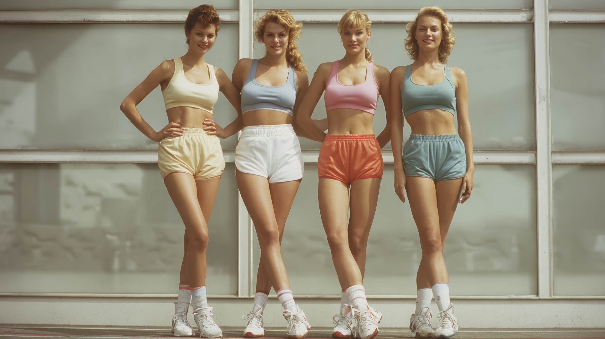
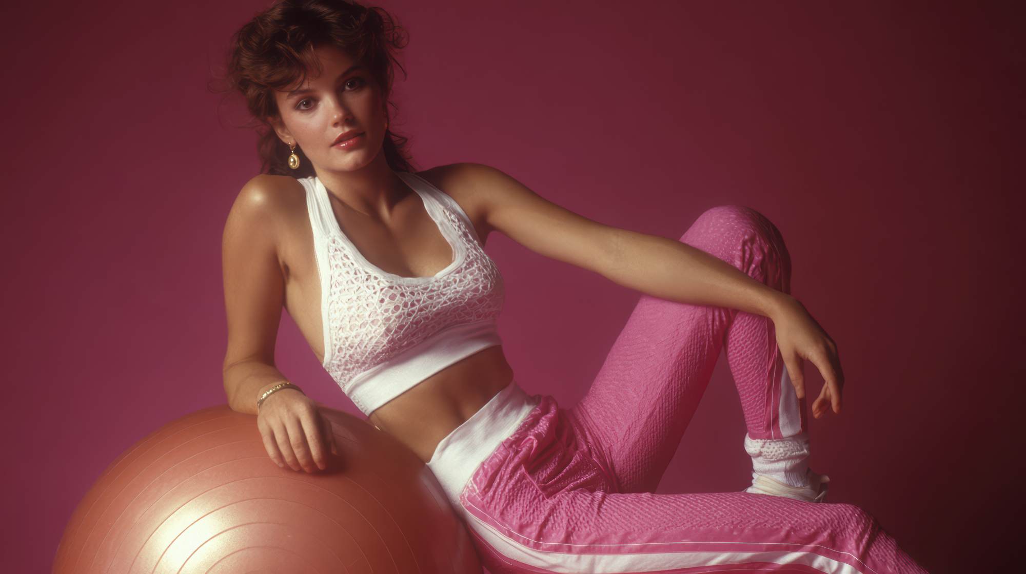
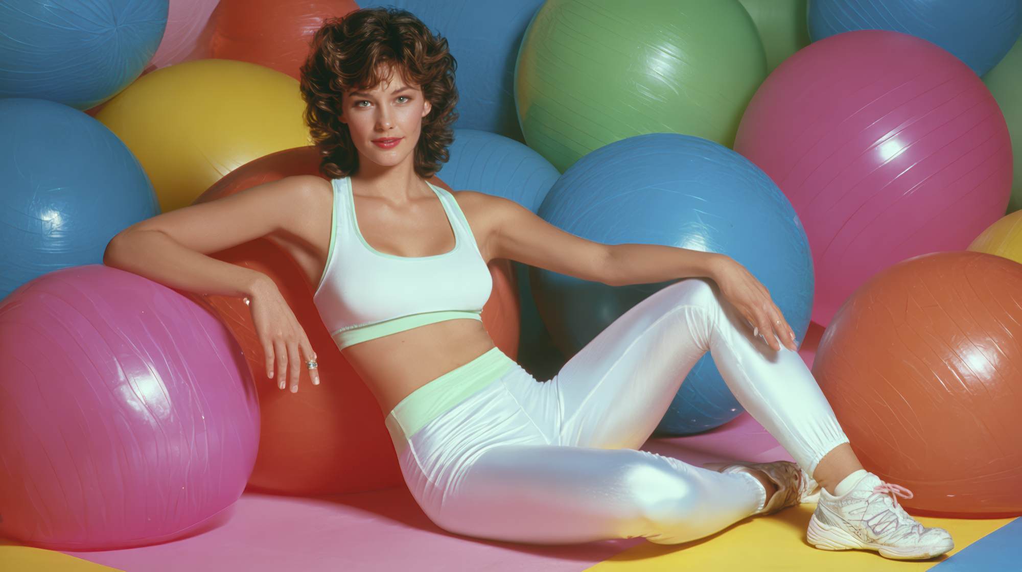
They remember your colors. Your photo style. Your typography. The way your graphics are laid out. The tone of your captions. The editing style of your reels. The atmosphere of your website. Even the kinds of images you choose—high-energy class shots, clean minimalist headshots, gritty training-floor content, bright wellness imagery—these all signal who you are.
When those pieces repeat consistently, people start connecting the dots. They don’t need to stop and ask, “Who posted this?” They know. That kind of recognition is powerful because attention online is short, and in local fitness marketing especially, you often need repeated exposure before someone takes the next step.
If your Instagram looks edgy and performance-driven, but your website looks soft and generic, and your email headers use totally different colors and fonts, you’re creating disconnect. Not because any one element is “bad,” but because the overall brand feels unstable. Inconsistency makes a business feel less established than it may actually be.
That matters in fitness because people are not just buying a workout. They’re buying guidance, accountability, and a place to invest their time, money, and vulnerability. A scattered brand subtly suggests a scattered experience.
Recognition comes before conversion
Fitness professionals often focus hard on lead generation while overlooking brand memory. That’s a mistake. Most people do not convert the first time they see you. They watch. They scroll. They compare. They tell themselves they’ll look into it later. Then later comes when your brand shows up again—and again—in a way they instantly recognize.
This is where visual consistency does real work. It helps your business stay mentally available.
When someone has finally had enough of trying to work out alone, when they decide they need a coach, when they want to join a gym, when they start looking for postnatal training, sports performance, mobility work, or nutrition support, the recognizable brand has an edge. Not always because it’s objectively better, but because it already feels known.
And “known” is a huge advantage in a category full of skepticism.
The fitness industry has no shortage of noise. Every week there’s a new trainer, new challenge, new six-week program, new transformation ad, new viral trend. Consumers have learned to be cautious. They are constantly filtering for credibility. A visually consistent brand doesn’t prove expertise by itself, but it does support the perception that this is a serious business with standards.
That’s not shallow. That’s how people make decisions in crowded markets. They use signals.
What visual consistency actually looks like in a fitness business
Let’s make this practical. Visual consistency is not about making every post identical or turning your brand into a boring template. It means certain elements stay reliably aligned so everything feels connected.
For fitness professionals, that usually includes:
A defined color palette: Pick a small set of core brand colors and actually use them. Not just on your logo, but on story graphics, carousels, website buttons, lead magnets, and printed materials.
Consistent typography: You do not need ten fonts. You need two or three at most. One for headlines, one for body copy, maybe one accent font if it genuinely fits your brand. More than that usually starts looking amateur.
A repeatable photo style: Are your images bright and clean? Dark and intense? Candid and community-driven? High-end and editorial? Choose a lane. Random stock images mixed with iPhone screenshots mixed with dramatically different brand shoots creates visual chaos.
Standard graphic structure: This is one of the easiest wins. Use repeatable layouts for testimonials, tips, announcements, class schedules, and offers. Familiar structure makes your content easier to recognize and easier to consume.
A consistent editing approach for video: The same caption style, pacing, framing, transitions, and overall tone can go a long way. Video is often where brands accidentally become fragmented.
Alignment across channels: Your Instagram should feel related to your website. Your email design should feel related to your landing pages. Your in-gym signage should not look like it belongs to another company entirely.
The point is not perfection. The point is cohesion.
Why fitness brands struggle with this more than they should
Honestly, a lot of fitness businesses sabotage themselves here because they treat marketing like an afterthought until they urgently need more leads. Then they throw content together, outsource one-off graphics, copy what other coaches are doing, and wonder why the brand never quite sticks.
Another issue: fitness professionals are used to operating in action mode. Train clients. Run sessions. Manage schedules. Sell memberships. Follow up. Marketing becomes a reactive task squeezed into gaps. And consistency does not thrive in chaos.
There’s also a deeper mindset problem. Some people hear “brand consistency” and assume it means looking corporate, over-designed, or fake. It doesn’t. Some of the strongest fitness brands are simple and highly personal. What makes them strong is that they repeat the same visual cues consistently enough that the audience forms an association.
You can still be authentic. You can still be casual. You can still post real life, behind-the-scenes content, and personality-driven messaging. In fact, you should. But authenticity lands better when it’s delivered inside a recognizable frame.
Think of it this way: consistency doesn’t remove personality. It makes personality easier to identify.
Strong brands reduce decision fatigue for your audience
People are overwhelmed. That is not a trendy marketing observation; it is the operating condition of nearly every potential client you want to reach. They are juggling work, stress, family, health goals, budgets, and a nonstop stream of content from businesses competing for attention.
When your branding is visually consistent, you make things easier. Easier to recognize. Easier to trust. Easier to remember. Easier to choose.
This matters especially for fitness professionals who offer premium services. If you are selling personal training, semi-private coaching, specialized programs, or recurring memberships, your prospects are not making impulse purchases in the same way they might buy a low-ticket digital product. They need confidence. They need clarity.
A consistent visual identity supports both. It signals that the business is organized, intentional, and likely to deliver a more stable client experience.
I’ll put it bluntly: if your brand presentation feels random, people may assume your onboarding, communication, programming, and service quality are random too. Fair or unfair, branding creates expectation. In service businesses, expectation is a precursor to trust.
How to build consistency without becoming repetitive
This is where many fitness brands overcorrect. They realize they need consistency, so they make everything so rigid that the content loses energy. That is not the goal.
The better approach is to create a small set of brand rules and then give yourself room to move within them.
Start with a lightweight brand system:
Choose 3 to 5 brand colors. Keep them in use everywhere.
Select 2 fonts. One headline font, one clean supporting font is enough.
Define your image style. Decide what kinds of photos and video best represent your business.
Create 4 to 6 core content templates. For tips, testimonials, announcements, promotions, education, and community highlights.
Set visual rules for social posts. This can be as simple as consistent text spacing, logo placement, border use, thumbnail style, or cover design.
Audit your customer journey. Check whether your Instagram, website, booking pages, welcome emails, and printed materials feel like one brand.
Then let the content itself vary. Different stories. Different angles. Different offers. Different client wins. Different opinions. Consistency should create structure, not sameness.
The best fitness marketing has both: a recognizable visual system and content that still feels alive.
Where to focus first if your brand feels all over the place
If your branding is currently inconsistent, do not try to rebuild everything at once. Start where people encounter you most often.
For most fitness professionals, that means:
Social media profiles: Clean up your profile image, highlight covers, post templates, and thumbnail style.
Your website homepage: Match your colors, typography, and image style to what people see on social.
Lead capture points: If you use a free trial, consultation form, class pass, or challenge signup, make sure those pages look on-brand.
Email marketing: Even basic consistency in headers, colors, and layout helps reinforce recognition.
Physical touchpoints: Signage, flyers, intake forms, welcome packets, and in-studio visuals should not be neglected.
You do not need an expensive rebrand to make progress. In many cases, you need less randomness, not more creativity.
That’s an unpopular opinion in some marketing circles, but it’s true. A lot of fitness brands don’t have a design problem. They have a discipline problem. They keep changing the look before the audience has had enough repetition to remember it.
The long game is what makes branding work
Visual consistency is not exciting because its payoff is cumulative. You don’t usually post one well-branded graphic and suddenly see a flood of leads. What happens is subtler and more valuable: over time, your business becomes easier to recall, easier to trust, and easier to recommend.
That is how strong brands are built in the fitness space. Not through constant reinvention, but through steady repetition with purpose.
If you want your business to feel established, stop treating every post, flyer, page, and promotion like a separate creative experiment. Build a recognizable visual identity and commit to it long enough for your audience to actually learn it.
Because in the end, people trust what feels familiar. And familiarity is earned through consistency.