Last Updated on April 20, 2026 by DSNRY
Find clarity in your branding by stripping away the noise.
There’s a reason so many fitness brands look busy, loud, and strangely forgettable. In an industry built on energy, transformation, and motivation, the default instinct is often to add more: more colors, more slogans, more offers, more graphics, more buzzwords, more “content.” But for fitness professionals trying to build a credible, modern brand, more is usually not the answer. Better is.
Minimalist design, when done well, is not bland. It’s disciplined. It’s confident. It tells your audience that you know exactly who you are, what you offer, and why it matters. That kind of clarity is especially powerful in the wellness space, where trust is everything and first impressions often happen in a split second on Instagram, a landing page, or a class booking screen.
If you’re a personal trainer, studio owner, coach, or wellness entrepreneur, minimalist branding can help you look more premium, communicate more clearly, and convert more of the right people. Not because it’s trendy, but because it removes friction. And in marketing, friction is what kills momentum.
Why simplicity works so well in fitness and wellness
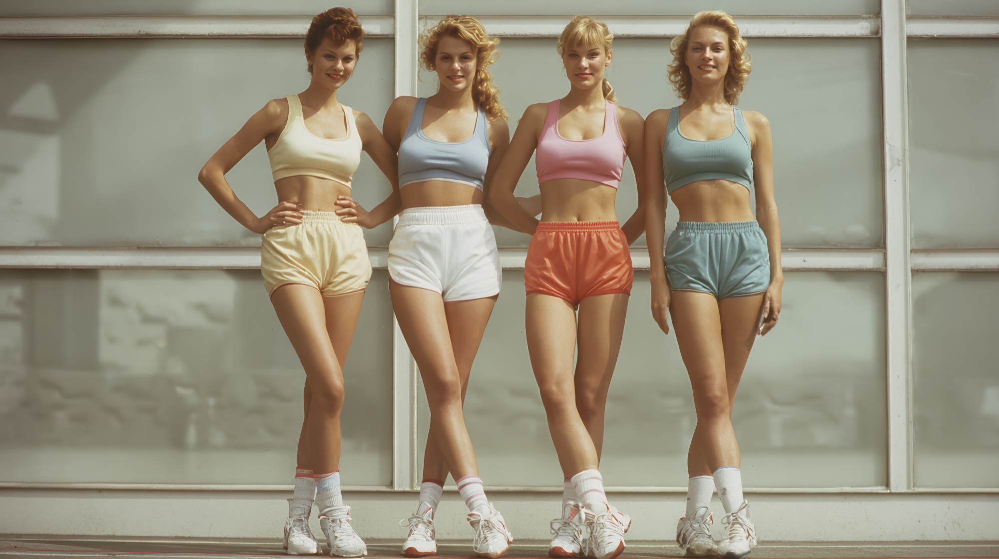
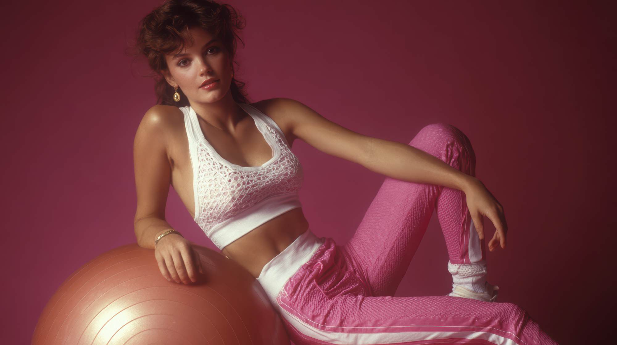
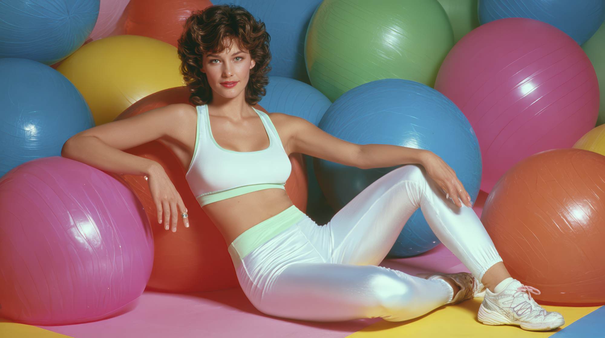
The wellness industry is crowded with sameness. The same stock imagery. The same “stronger every day” copy. The same neon accents, black backgrounds, and over-designed promotional graphics. It’s not that these choices are wrong on principle. It’s that they often feel generic, and generic doesn’t build connection.
Minimalist branding stands out precisely because it doesn’t scream. It creates space. Space for your message. Space for your values. Space for your client to actually understand what you do without having to decode it.
That matters because most fitness buyers are not making decisions the way marketers pretend they do. They are not carefully comparing ten trainers in a spreadsheet. They are reacting emotionally and quickly. They’re asking themselves: Does this feel trustworthy? Does this feel organized? Does this feel like a place or person that understands me?
Clean, intentional design answers those questions fast. It suggests professionalism. It signals maturity. It implies that your business is well run before someone ever books a consultation or signs up for a trial class.
And let’s be honest: in wellness, perception is part of the product. If your brand feels chaotic, your service feels less credible. If your visuals feel calm, focused, and polished, people assume your process probably is too.
Minimalist design is not “plain” branding
This is where a lot of fitness brands get it wrong. They hear “minimalist” and think it means stripping everything down until the brand has no personality left. Beige website. Thin font. One-word logo. No edge. No warmth. No point of view.
That’s not minimalist branding. That’s underdeveloped branding.
Real minimalism is about removing what doesn’t serve the message so the right things come through more clearly. It’s selective, not empty. A strong minimalist brand still has a perspective. It still has energy. It still feels distinct. It just doesn’t rely on clutter to create that effect.
For fitness professionals, that might mean choosing one visual signature instead of five. One sharp brand promise instead of a paragraph of vague claims. A tight color palette instead of trying to communicate “energy” by throwing orange, lime green, red, and electric blue into the same flyer.
The strongest brands in this space know restraint is a form of authority. When you look like you don’t need to overperform for attention, people pay closer attention.
What fitness professionals should simplify first
If your branding currently feels scattered, don’t start with a full rebrand. Start with the obvious friction points. Most fitness businesses have too many messages competing at once, and that confusion usually shows up in the same places.
First, simplify your core positioning. Can someone understand exactly what you do, who it’s for, and why it matters within a few seconds? If your homepage says you help with strength, fat loss, mobility, mindset, confidence, accountability, nutrition, and holistic transformation for “everyone,” that’s not clarity. That’s avoidance. Narrow it down.
Second, simplify your visual hierarchy. On your website, social posts, and printed materials, what do you want people to notice first? Too many brands treat every element as equally important, which means nothing stands out. A strong headline, clean spacing, one clear call to action, and fewer decorative distractions will usually outperform a busy layout.
Third, simplify your typography. Fitness brands love dramatic fonts, but two solid typefaces are almost always enough: one with personality, one highly readable. Anything beyond that usually starts to feel amateur. Good typography is one of the easiest ways to make a wellness brand feel premium.
Fourth, simplify your color system. You do not need a rainbow to communicate emotion. In fact, a restrained palette often creates more impact because it feels deliberate. One primary color, one or two support tones, and a neutral base can take you very far. Consistency beats intensity.
Finally, simplify your content design. Social media graphics packed with six lines of text, icons, borders, and multiple logos are usually trying too hard. If the message matters, let it breathe. White space is not wasted space. It’s what helps the message land.
How minimalist branding increases trust and conversions
There’s a practical reason this matters beyond aesthetics: simpler brands tend to convert better. Not automatically, and not every time, but often enough that it should be taken seriously.
When your branding is clear, people make decisions faster. They know where to click. They understand the offer. They don’t have to work to find the next step. Good minimalist design reduces cognitive load, and lower cognitive load usually means higher action.
This is especially relevant for fitness professionals selling services that already involve emotional resistance. Joining a gym, hiring a coach, or signing up for a program can trigger insecurity, hesitation, and self-doubt. The last thing your marketing should do is make the process feel more complicated.
A clean landing page with a clear transformation promise, a few compelling proof points, and one strong booking button will often outperform a flashy page full of sliders, pop-ups, and competing offers. The same goes for your social profiles. A simple bio, cohesive visuals, and a clear path to work with you are more persuasive than a feed that looks like five brands stitched together.
People tend to trust businesses that seem focused. Focus implies expertise. And expertise is what sells high-value coaching, premium memberships, and specialized wellness services.
The premium effect: why less often lets you charge more
Here’s an opinion more fitness brands need to hear: if your business wants premium clients, your brand cannot look frantic.
Premium buyers are not just paying for a workout or a program. They are paying for confidence in the experience. They want to feel guided, not pitched. They want to feel they’re entering a system that is considered, not improvised.
Minimalist design supports that perception beautifully. It communicates control. It suggests your business has standards. It says you’re not trying to win people over with noise because your value doesn’t depend on noise.
That doesn’t mean every fitness brand should look luxury-soft and whisper-quiet. A boxing gym can still feel bold. A strength coach can still feel gritty. A sports performance brand can still feel intense. But the branding should be intentional and edited. There’s a difference between energy and visual chaos, and too many businesses confuse the two.
If your prices are rising, your branding has to rise with them. Minimalism is often the bridge between “small business trying things” and “established brand people trust.”
Where to use minimalist principles in your marketing right now
You don’t need to rebuild your entire brand this week. You can apply minimalist thinking immediately across key touchpoints.
Start with your website homepage. Remove anything that distracts from your primary offer. Tighten the headline. Cut unnecessary copy. Use stronger spacing. Make your call to action obvious.
Then look at your Instagram profile. Is the bio clear? Are your story highlights organized? Does your visual style feel cohesive? Could a new follower quickly understand what kind of client you help and how to take the next step?
Next, review your promotional materials. Posters, class graphics, lead magnets, email banners, and digital ads all benefit from restraint. One message per asset is a good rule. If you’re promoting a six-week program, don’t also try to push meal plans, merch, your app, and your referral offer in the same design.
Your booking experience matters too. Many fitness brands invest in marketing visuals and then send prospects into clunky, outdated scheduling systems that feel inconsistent with the brand. Minimalism should extend into the user experience. Fewer steps, clearer choices, smoother flow.
And yes, your physical environment counts. If you run a studio or in-person practice, branding is not just a logo on the wall. Signage, printed materials, retail displays, intake forms, and even the way information is presented at the front desk all shape perception. The cleanest brands understand that every detail either reinforces trust or weakens it.
What to keep: personality, warmth, and a point of view
The risk with any design trend is imitation without judgment. Minimalism only works when it reflects a real brand strategy. If you strip away too much, your business can start to feel interchangeable, which defeats the purpose.
So keep the human parts. Keep your tone. Keep your values. Keep the details that make your coaching style, method, or philosophy memorable. If you’re known for directness, let that show in your copy. If your community is warm and welcoming, your visual system should support that feeling. If your brand is performance-driven and no-nonsense, the design should reflect precision, not softness.
Minimalism isn’t about becoming quieter than you are. It’s about becoming clearer than you’ve been.
That’s the real payoff. Not a prettier feed. Not a more fashionable website. Clearer communication. Better alignment. Stronger recognition. More trust from the right audience.
In a market full of noise, that’s not just a design preference. It’s a marketing advantage.
The bottom line for fitness brands
If your current branding feels cluttered, inconsistent, or overly complicated, take that as useful information. Your audience is likely feeling that friction too. The answer is not to pile on more tactics. It’s to edit harder.
The best fitness marketing today is not the loudest. It’s the clearest. It knows what to say, what to show, and what to leave out. Minimalist design helps you get there by forcing focus, and focus is one of the most valuable assets any fitness professional can have.
Because when your brand is clear, your value is easier to understand. When your value is easier to understand, people are more likely to trust it. And when people trust it, marketing gets a whole lot easier.