Last Updated on April 20, 2026 by DSNRY
Influence client perception before they even read your bio.
Fitness professionals spend a lot of time refining their offer: better programming, better coaching, better client experience, better testimonials. All of that matters. But before a prospect understands any of it, they form an impression based on visuals. And color is one of the fastest signals your brand sends.
That may sound a little too “design school” for a trainer, gym owner, or online coach who just wants more inquiries. I get it. But color is not decoration. It is positioning. It tells people whether you feel premium or accessible, intense or calming, elite or beginner-friendly, clinical or community-driven. In a crowded market where many fitness brands use the same before-and-after formula and the same aggressive language, color can quietly do a lot of heavy lifting.
If your brand colors are mismatched, outdated, or simply generic, you may be creating friction before a lead ever reads your services page. If your colors are chosen with intention, your brand starts building trust at a glance. That is not fluff. That is marketing.
Color shapes expectation faster than copy does
Most people do not consciously analyze a fitness brand the first time they see it. They react to it. That reaction is emotional, and color is one of the strongest triggers in the process. It frames how professional you appear, what kind of energy your business carries, and whether someone sees themselves in your world.
A high-performance strength coach using neon pink, pale mint, and soft beige might create confusion unless that contrast is intentional and beautifully executed. A prenatal fitness coach using hard black and red may come across as more aggressive than reassuring. A boutique studio with muddy, inconsistent colors can feel disorganized, even if the service itself is excellent.
This is the part many fitness businesses miss: color does not just communicate your taste. It communicates your promise. It sets a tone before your language confirms it. That means your visual identity should support your business model, not fight against it.
If you coach overwhelmed professionals who want sustainable health habits, your brand should not visually scream “bootcamp punishment.” If you run a serious performance facility for athletes, your palette should not feel vague or hobbyist. Prospects are trying to answer a simple question: “Is this for me?” Color helps them decide quickly.
What different colors tend to signal in fitness marketing
There are no hard laws here, and context matters. A color does not mean the same thing in every brand. Still, some patterns are reliable enough to be useful.
Black often signals sophistication, authority, intensity, and premium positioning. It can work extremely well for personal training, strength brands, luxury fitness concepts, and high-ticket coaching. Used badly, it can feel cold, overly masculine, or trying too hard.
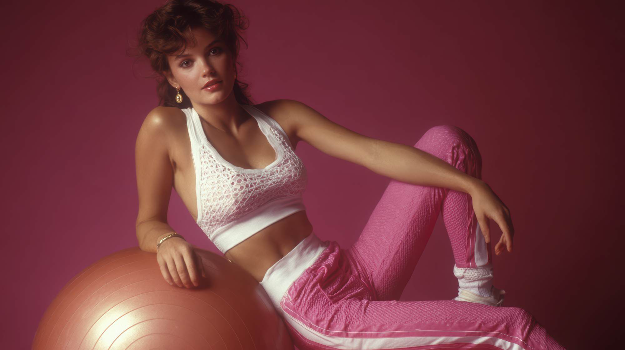
Red communicates urgency, power, energy, and action. It is popular in fitness for obvious reasons. The problem is that it is also overused. If your entire brand leans on red, expect to blend in with every “no excuses” coach on the internet. Red works best as an accent unless bold intensity is central to your offer.
Blue suggests trust, structure, calm confidence, and professionalism. It is useful for coaches who want to feel credible and reassuring, especially in wellness, recovery, longevity, or habit-based coaching. It can also feel a little corporate if there is no warmth elsewhere in the palette.
Green points toward growth, balance, health, and sustainability. It is a smart choice for holistic fitness brands, nutrition coaching, outdoor training, and brands that want to emphasize long-term transformation over quick fixes. Some greens feel earthy and grounded; others feel fresh and modern. That distinction matters.
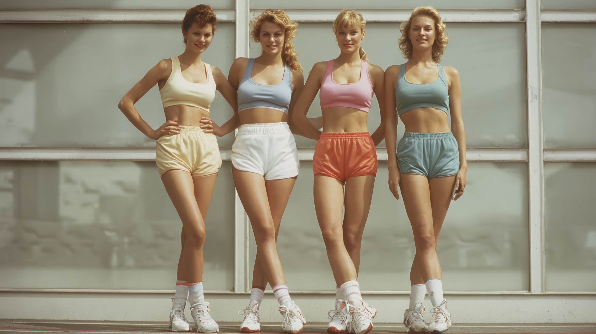
Orange feels friendly, energetic, optimistic, and socially driven. Great for group fitness, community-based brands, and businesses that want to feel approachable. It tends to reduce intimidation. It can also look cheap if paired with weak typography or low-quality visuals.
Purple can imply luxury, creativity, and individuality. In fitness, it is less common, which can be an advantage if you want to stand apart. But it needs careful execution. The wrong purple makes a brand feel amateur fast.
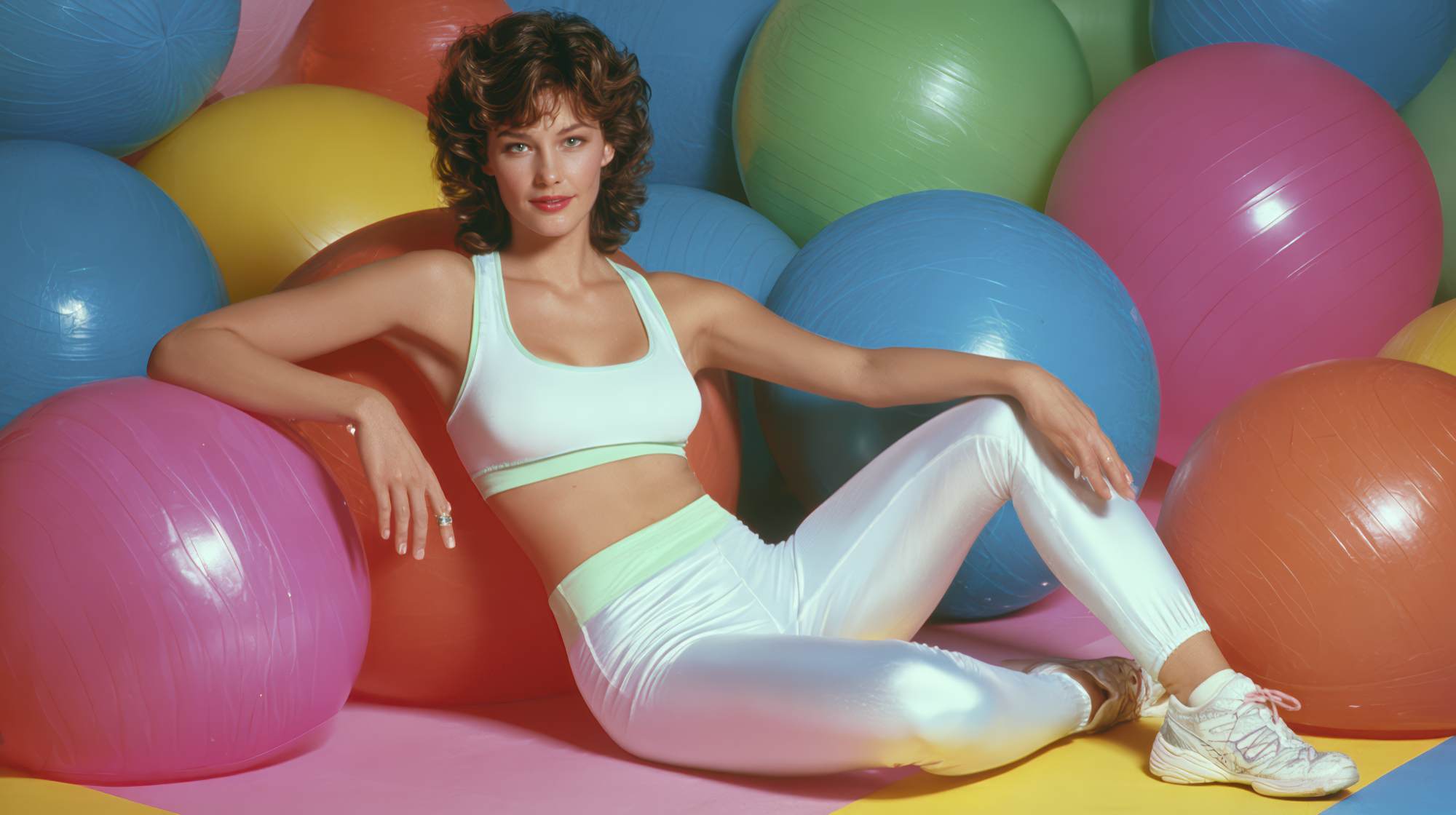
White, beige, and neutrals often support a clean, modern, elevated look. They are especially effective for wellness-forward brands, Pilates, yoga, women’s coaching, and premium online services. The danger is sterility. Minimal does not automatically mean memorable.
The takeaway is simple: pick colors for the feeling they create, not because you personally like them. Your brand is not your living room.
The biggest mistake fitness professionals make with color
The biggest mistake is choosing colors based on personal preference instead of audience psychology. A close second is copying whatever successful competitors are doing without understanding why it works for them.
Just because a high-end studio uses muted neutrals does not mean that palette fits your gritty, results-focused transformation coaching. Just because a loud supplement brand uses electric colors does not mean you should. Their business, audience, and buying motivations may be completely different.
Another common mistake is using too many colors with no hierarchy. Your brand does not need six “main” colors. That usually creates inconsistency across your website, social posts, PDFs, signage, and apparel. Strong brands are recognizable because they repeat the same visual logic. They do not reinvent themselves every week.
And then there is the generic fitness trap: black, red, and white with zero nuance. It is not that those colors are bad. It is that most brands use them lazily. If your market is saturated, defaulting to the most obvious palette makes it harder to stand out unless your execution is exceptional.
Color should make your brand feel distinct and aligned. If it just makes you look like another coach with Canva and a ring light, it is not doing its job.
How to choose a color palette that actually supports your business
Start with positioning, not aesthetics. Ask what kind of transformation you sell and what emotional state your ideal client is in before they hire you.
Are they intimidated by gyms and looking for reassurance? Are they ambitious and seeking a performance edge? Are they burned out and wanting a calmer relationship with fitness? Are they experienced and willing to invest in premium support? Your answers should shape the color direction.
Then define three things:
1. Primary brand emotion.
What should people feel first? Motivated, safe, powerful, calm, supported, disciplined, inspired?
2. Market position.
Are you premium, mass market, boutique, clinical, edgy, welcoming, luxurious, community-focused?
3. Audience identity.
What kind of person should feel at home in your brand? Busy moms, executives, athletes, beginners, post-rehab clients, brides, men over 40, women in perimenopause?
Once you know that, build a simple palette: one primary color, one secondary color, one accent color, and one or two neutrals. That is enough for most fitness brands.
For example, a premium women’s strength coaching brand might use deep charcoal, warm ivory, muted sage, and subtle gold. That says confidence, maturity, and refinement. A youth athletic development facility might use navy, bright orange, white, and steel gray. That says energy, structure, and momentum. A recovery-focused mobility coach might use soft blue, slate, white, and muted green. That feels safe, credible, and restorative.
This is where strategy beats trend-chasing. The best palette is not the most exciting one. It is the one that makes your offer feel immediately coherent.
Color has to work across your entire client journey
Many fitness professionals think about color only in terms of a logo. That is too narrow. Your colors need to hold up across every touchpoint: Instagram posts, reels covers, lead magnets, website buttons, trainer uniforms, signage, check-in areas, email headers, packaging, and even the backgrounds in your photos.
If your Instagram grid feels energetic but your website feels clinical, that disconnect creates doubt. If your studio design says luxury but your PDFs look like a school project, the premium impression collapses. Color consistency builds familiarity, and familiarity builds trust.
This is especially important in fitness because clients are not just buying a workout. They are buying an environment, a relationship, and an identity shift. Your brand colors should help them imagine what it feels like to be coached by you.
That means practical discipline matters. Create rules for how your palette is used. Which color is dominant? Which one is for calls to action? Which backgrounds support readability? Which tones should appear in photography, clothing, or story templates? Consistency is what turns a decent visual brand into a recognizable one.
What color can and cannot fix
Color is powerful, but let’s not pretend it is magic. It will not save weak messaging, poor service, bad offers, or sloppy client experience. If your brand promise is unclear, no palette will solve that. If your website is confusing, changing the button color is not your big breakthrough.
But when the fundamentals are solid, color improves how those fundamentals are perceived. It helps the right people feel resonance faster. It adds professionalism. It increases perceived value. It reduces hesitation. It strengthens memory. Those are meaningful advantages in a market where clients often compare several options at once.
Good branding does not replace good business. It amplifies it.
A practical reset if your current brand feels off
If your visuals feel messy or misaligned, do not overcomplicate the fix. Start by auditing your current brand. Pull up your website, social profile, pricing guide, and any recent marketing assets side by side. Ask yourself: do these colors create one clear impression, or five different ones?
Then ask a few trusted clients or peers what your brand looks like before they read any copy. Not what they think of your coaching. What the visuals alone suggest. You may be surprised by the gap between what you intend and what people perceive.
From there, simplify. Keep what aligns. Remove what distracts. Choose a tighter palette with a defined role for each color. Update your most visible assets first: profile image, website homepage, social templates, email banners, and lead magnet cover. You do not need a full rebrand to improve clarity. Often, you just need better discipline.
The fitness brands that win visually are not always the loudest or the trendiest. They are the ones that know who they are, who they serve, and how to make that obvious quickly. Color is one of the simplest ways to do that well.
If your brand visuals are sending mixed signals, prospects feel that confusion immediately. If your colors are intentional, your marketing starts working before a single word is read. That is the real value here. Not making things prettier. Making your brand easier to trust.