Understand how palette choices influence mood and reinforce overall brand positioning.
Restaurant marketing usually gets discussed in terms of ads, social content, loyalty programs, and menu engineering. Fair enough. Those are visible levers, and they matter. But one of the most persuasive brand tools in the business is quieter than all of them: color. Not flashy color for the sake of making a room “Instagrammable,” but a deliberate, repeated palette that shows up across the dining room, signage, packaging, uniforms, menus, and digital touchpoints.
I’ve seen operators spend heavily on campaigns to define their brand while the physical space tells a completely different story. The result is confusion. Customers may not be able to explain why the experience feels off, but they feel it immediately. A restaurant says it is premium, calm, and ingredient-driven, yet the room is blasted with harsh contrasts and random accent colors. Or a concept wants to feel energetic and social, but the palette is flat, muted, and lifeless. That disconnect weakens trust before the first bite arrives.
Color strategy is not decoration. It is positioning. It shapes expectation, appetite, comfort, tempo, and memory. In a crowded market where guests have endless choices, consistency in color can become one of the clearest signals a brand sends.
Color works before service does
Most guests begin forming an opinion about a restaurant well before they judge the food or service. They notice the exterior, the host stand, the wall tones, the lighting warmth, the menu design, the packaging on takeout shelves. All of that combines into a fast emotional reading: Is this place lively or intimate? Affordable or elevated? Trendy or timeless? Clean and modern or cozy and familiar?
That first impression matters because it frames everything that follows. If the colors suggest comfort and ease, guests may settle in faster. If they suggest speed and efficiency, people may order more quickly and turn the table sooner. If they suggest sophistication, guests are often more open to higher check averages because the environment has already justified a premium.
This is where a lot of restaurant brands make a basic mistake. They treat palette choices as isolated design decisions instead of customer communication. The paint color gets selected one way, the menu another, the website another, the to-go packaging another. Nothing is intentionally connected. The customer doesn’t experience “creative variety.” They experience inconsistency.
Strong restaurant brands know that repetition builds confidence. When the same visual language appears across the full guest journey, it tells people the concept is thought through. That kind of coherence is a form of hospitality. It reduces friction. Guests understand the place faster, and what they understand, they tend to trust.
Mood is not accidental, and neither is appetite
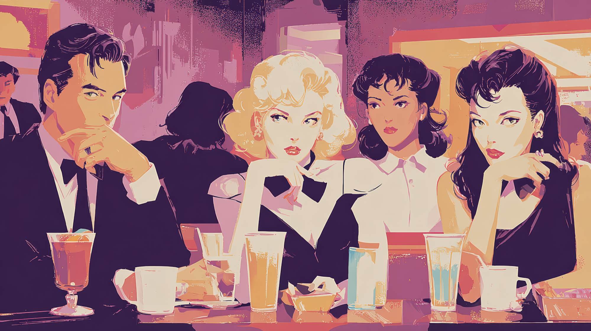
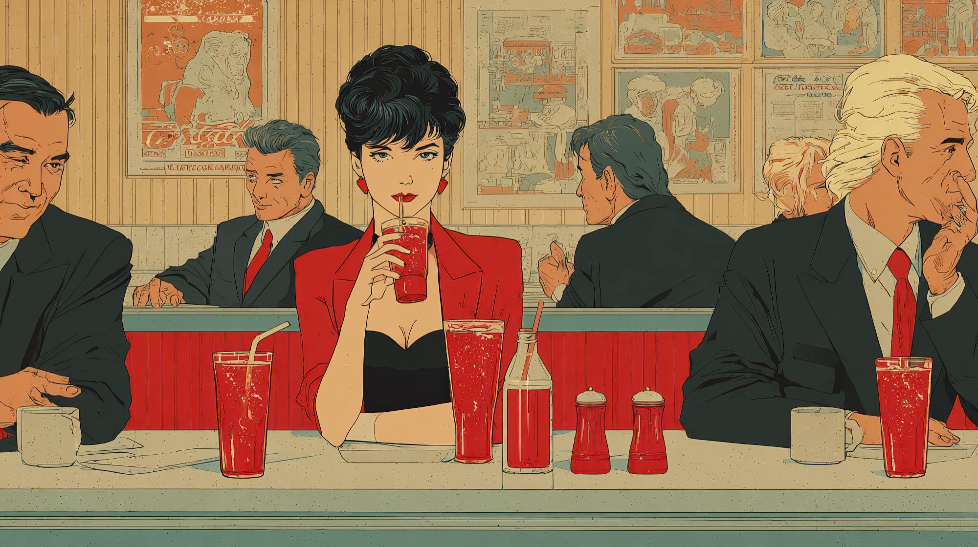
There is a reason certain palettes appear over and over in hospitality. Warm neutrals, earthy greens, soft charcoals, muted terracottas, creamy whites, deep navies, natural wood tones. These choices are not arbitrary trends. They help create a mood that supports dining.
Warm tones can make a room feel inviting and human. Earthy palettes often signal freshness, craft, and connection to ingredients. Darker, richer colors can imply intimacy and indulgence. Brighter accents can bring energy and sociability. None of these effects are mechanical or universal, but they are real enough that marketers and designers ignore them at their own risk.
In restaurant marketing, mood matters because mood influences behavior. People linger in some spaces and rush through others. They order dessert in some settings and skip it in others. They perceive one place as worth celebrating in and another as purely functional. Color is not solely responsible for those outcomes, of course, but it is part of the emotional architecture that guides them.
The smartest operators think beyond “What looks good?” and ask “What should people feel here?” A neighborhood café may want to feel grounded, welcoming, and unrushed. A high-volume lunch concept may want freshness, speed, and clarity. A cocktail-forward dining room may want richness, depth, and a sense of escape. Once the emotional goal is clear, palette decisions become far easier and far more effective.
I’m opinionated on this point: if a restaurant cannot describe the emotional job of its space, it is not ready to choose colors. A palette without a brand feeling behind it is just paint.
Consistent color is one of the easiest ways to strengthen brand positioning
Positioning is really about owning a clear idea in the customer’s mind. Maybe your restaurant is the polished neighborhood staple. Maybe it is the high-energy social spot. Maybe it is the health-forward fast casual option that still feels craveable. Whatever the positioning is, your visual choices should support it relentlessly.
Consistency in color helps because it turns abstract brand language into something guests can see instantly. If your brand is calm and ingredient-led, your palette should feel restrained and natural. If your brand is playful and youth-oriented, the color story can be more expressive, but it still needs discipline. Playful does not mean chaotic.
This is especially important for restaurant groups, multi-unit concepts, and franchises. As brands grow, inconsistency multiplies. One location goes warmer, another cooler. One manager orders off-brand signage. Seasonal promotions suddenly introduce colors that have nothing to do with the core identity. Over time, the brand starts to feel diluted.
A defined color strategy prevents that drift. It gives internal teams, agency partners, architects, and local operators a shared system. Not a rigid prison, but a framework. Core colors, supporting tones, acceptable materials, digital equivalents, packaging applications, photography guidance. The more practical and specific the standards are, the easier it becomes to protect the brand across every guest-facing moment.
And yes, this has marketing value beyond aesthetics. Consistency improves recognition. Recognition improves recall. Recall helps a restaurant stay in the consideration set when guests decide where to dine next. In a market full of interchangeable messaging, a restaurant that looks unmistakably like itself has a real advantage.
Where restaurants go wrong with palette choices
The most common mistake is overdesigning. Operators chase novelty and end up creating spaces that feel more like mood boards than restaurants. Too many statement colors, too many competing surfaces, too many “moments.” The room may generate short-term attention, but it often ages badly and photographs inconsistently.
Another mistake is choosing colors based on personal taste rather than brand logic. Owners are human; they bring preferences. But “I like blue” is not a strategy. The better question is whether blue belongs in this concept, in this market, for this audience, at this price point, with this menu and service model.
There’s also a widespread tendency to underestimate lighting. A perfectly smart palette can fail under the wrong lighting temperature. Warm neutrals can turn muddy. Greens can go gray. Whites can feel clinical. If a restaurant is serious about its atmosphere, color and lighting need to be planned together. They are inseparable in practice.
Finally, many brands forget that color strategy extends far beyond walls. Menus, website buttons, reservation interfaces, gift cards, staff aprons, social templates, food packaging, window decals, and outdoor signage all contribute to the same brand story. If those touchpoints don’t align, the physical space loses some of its power.
Practical ways to build a palette that actually works
Start with positioning, not inspiration. Write down three to five adjectives that define the guest experience you want to create. Not generic words like “good” or “memorable,” but real ones: intimate, bright, energetic, grounded, polished, rustic, celebratory, calm. Then ask what colors naturally support those feelings.
Next, look at the menu and service model. A seafood concept, a steakhouse, a vegan café, and a late-night ramen bar should not all communicate the same way. Ingredient story, daypart, pace of service, and average ticket all affect what palette will feel credible.
Then build from a core set, not a rainbow. Most strong restaurant brands do best with a restrained primary palette and a few secondary accents. That creates consistency without making the brand feel flat. If everything is shouting, nothing is distinctive.
Test colors in real conditions. Print menu samples. View materials during lunch and dinner. Check how dishes look against tabletop surfaces. See how staff uniforms appear in photos. Good color strategy must survive operational reality, not just look good in presentations.
It’s also wise to think in terms of longevity. Trend-heavy palettes can create immediate buzz, but restaurants are not seasonal campaigns. They are expensive environments. Refreshability matters. A durable palette gives you room to evolve through small updates in graphics, textiles, florals, or promotional materials without forcing a full identity reset every few years.
The best color strategies don’t call attention to themselves
When color strategy is working, guests usually don’t praise the palette directly. They say the place feels warm. Or stylish. Or lively. Or expensive in a good way. They remember the room. They recognize the packaging. They notice that the website, menu, and dining space all seem to belong to the same brand. That’s the point.
In restaurant marketing, some of the most effective decisions are the least theatrical. A consistent color system does not guarantee better food or service, but it absolutely helps frame both in the right light. It tells customers who you are before anyone says a word. It supports mood, sharpens positioning, and creates the kind of coherence people associate with quality.
And in a category where brand confusion is common, coherence is not a small thing. It is a competitive advantage.
If restaurant leaders want a more disciplined, memorable brand presence, they should stop treating color as a finishing touch. It belongs much earlier in the conversation, right alongside concept development, menu strategy, and guest experience design. The restaurants that understand that tend to feel more confident in the market, because they are. Their spaces are not just attractive. They are aligned. And alignment is what makes a brand believable.