Last Updated on April 20, 2026 by DSNRY
Ensure your brand’s voice is heard clearly through sophisticated design.
Fitness professionals spend a lot of time refining their coaching style, their client experience, and their offer stack. Then they throw it all onto a website or Instagram graphic in a font that says something completely different. That disconnect matters more than people think.
Font choice is not decoration. It is positioning.
Before a client reads your credentials, pricing, or transformation philosophy, they are already making assumptions about your business based on how your words look. Sharp, modern sans-serifs can feel disciplined and premium. Soft scripts can feel personal, feminine, or boutique. Traditional serifs can signal expertise, legacy, and authority. Messy combinations can quietly communicate that the business itself is messy.
In fitness marketing, where trust and clarity directly affect conversions, typography is not a minor design decision. It is part of your brand voice. And if your visuals and your message are out of sync, prospective clients feel that friction immediately, even if they cannot explain why.
Your font is part of your first impression
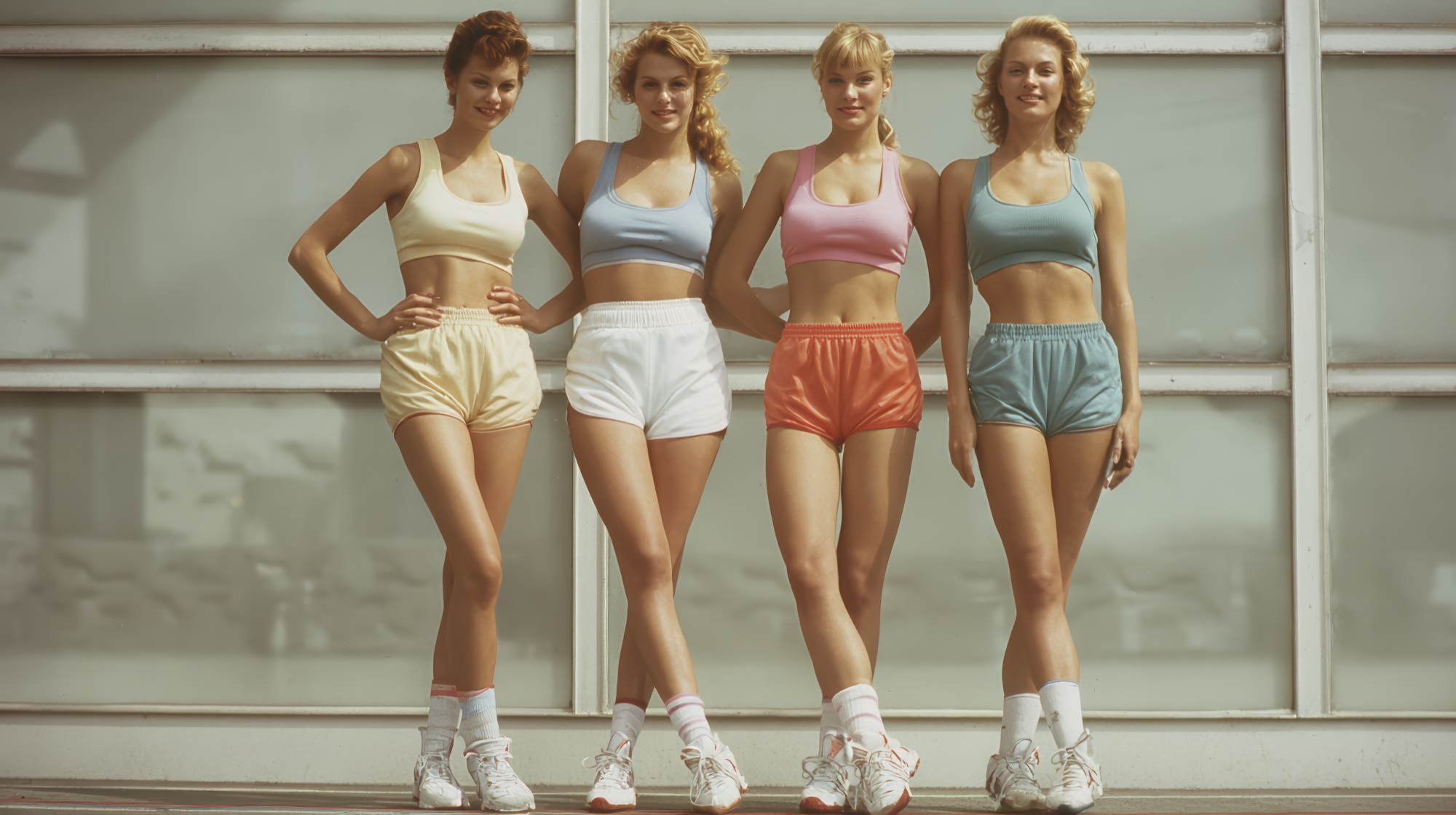
Fitness is a high-trust industry. People are not just buying workouts. They are buying confidence, accountability, safety, and a sense that you understand their goals. That means every brand touchpoint has to reinforce credibility. Typography is one of the fastest ways to do that, or to undermine it.
If you are a strength coach working with executives and your website uses playful handwritten fonts, the message gets mixed. If you are a prenatal or postnatal trainer with a nurturing, supportive brand and your content looks like a hardcore performance facility, that is also a mismatch. Neither choice is inherently wrong. The issue is whether the visual language matches the emotional promise of the business.
This is where many fitness brands go off track. They choose fonts based on what looks trendy on Canva, not what aligns with their market position. A font may be stylish and still be wrong for your client base.
A serious online coach serving ambitious professionals needs typography that feels structured, clean, and efficient. A yoga studio rooted in ritual and calm may want something more graceful and spacious. A boutique HIIT brand can lean bold and energetic. Different markets need different signals. Smart marketing respects that.
What different font styles tend to communicate
There are no absolute rules, but there are patterns. Clients respond to visual cues quickly, and typography carries associations whether you intend it to or not.
Sans-serif fonts usually feel modern, clean, direct, and efficient. They are widely used by brands that want to project confidence without unnecessary flourish. For many fitness professionals, this is the safest foundation because it tends to read well across websites, mobile screens, social posts, and email.
Serif fonts often communicate heritage, authority, polish, and editorial sophistication. When used well, they can elevate a brand and make it feel more established. This can work especially well for premium coaching businesses, wellness brands, and founders who want a more refined feel rather than a loud, aggressive one.
Script or handwritten fonts can feel intimate, expressive, luxurious, or feminine, depending on how they are used. They are best used with restraint. In fitness marketing, they can be effective as accents for a warm personal brand, but they often lose impact when overused or paired with weak layout choices.
Display fonts are more stylized and attention-grabbing. They can create energy and personality, but they are risky if readability suffers. A strong display font can work for headlines in a bold group fitness brand. It usually should not carry the full burden of your communication.
My opinion here is simple: most fitness brands do not need more personality in their fonts. They need more discipline. You can build a distinctive brand without making your graphics harder to read.
Readability is a marketing issue, not just a design issue
There is a persistent mistake in fitness marketing: prioritizing aesthetics over clarity. It shows up everywhere. Light gray text on white backgrounds. Tiny captions on promotional graphics. Decorative fonts in headlines that make the offer feel vague. All of this reduces the effectiveness of your message.
Good typography helps clients understand what you do, who you help, and what action to take next. That is marketing. If your design gets in the way of comprehension, it is not sophisticated. It is inefficient.
Your ideal client is often scrolling quickly, half-distracted, comparing options. If they have to work to read your content, you are asking too much. The businesses that convert well tend to be the ones that communicate clearly and consistently. Their type hierarchy is obvious. Their headlines are readable. Their calls to action are easy to spot. Their visual identity supports the offer instead of competing with it.
This matters even more for fitness professionals because so much of the business is built on repeated exposure. A prospect may see your content ten times before booking a consultation. Every one of those impressions should feel coherent. Familiarity builds trust, and consistent typography plays a bigger role in that than most people realize.
How to match typography to your fitness niche
If your brand feels visually confused, start with your niche and your client promise. Ask what emotional state your clients want to move toward, and then make sure your typography supports that transition.
For example, a performance coach working with athletes may want fonts that feel precise, strong, and contemporary. Clean sans-serifs with confident spacing usually do that job well. A wellness-focused coach serving women navigating stress, hormonal shifts, or burnout may benefit from a softer system that still feels professional, perhaps pairing an elegant serif headline with a highly readable sans-serif body font.
If you serve high-ticket clients, your typography should not feel chaotic or cheap. Premium brands usually use restraint. They do not rely on five font styles, loud outlines, or overly compressed text blocks. They use white space. They use hierarchy. They let the message breathe. Premium is often less about ornament and more about control.
And for local studios, typography can help shape the in-person experience before someone ever walks through the door. If your studio culture is warm, inclusive, and community-driven, your visual identity should reflect that. If your facility is elite, intense, and results-focused, that should also be obvious. The key is honesty. The right typography attracts the right people and filters out the wrong ones. That is good marketing.
A practical font system for fitness brands
You do not need a complicated brand package to improve your typography. Most fitness professionals can get strong results with a simple two-font system.
Use one primary font for headlines and one for body text. That is enough.
Your headline font should reflect your brand personality. Your body font should be highly readable across devices. In most cases, the body font matters more because it carries your actual communication. A beautiful headline font cannot rescue a weak reading experience.
Here are a few practical standards worth following:
Keep your font count limited. Two fonts is usually ideal, three at the absolute most.
Use consistent hierarchy. Your headings, subheadings, and body copy should always follow the same visual structure.
Do not rely on all caps for everything. It can work for labels or short headlines, but too much of it feels aggressive and becomes harder to read.
Watch your spacing. Tight line spacing and cramped layouts make even good fonts look amateur.
Test on mobile. Many fitness brands design for desktop or templates, but most clients experience the brand on their phones.
If you are using Canva, resist the urge to experiment endlessly. Choose a system and repeat it. Repetition is what builds recognition.
Where typography shows up in your client journey
Font choice is not limited to your logo. It affects every stage of your marketing funnel.
On your website, typography influences bounce rate, trust, and whether people feel your service is worth the price. On social media, it affects whether your educational content gets saved and shared. In email marketing, it shapes readability and tone. In lead magnets and PDFs, it can be the difference between looking like a real brand and looking like a rushed freebie.
Even small details matter. The type on your intake forms, your consultation deck, your pricing guide, and your in-studio signage all contribute to brand perception. That is why typography should be treated as a system, not a one-off design choice.
Clients notice consistency, even subconsciously. When every touchpoint feels aligned, your brand appears more established and more trustworthy. When your website says one thing and your Instagram says another, confidence drops. Fitness buyers may not use design vocabulary, but they absolutely respond to polish.
The biggest typography mistakes fitness professionals make
The first is choosing fonts based on personal taste alone. You are not designing for yourself. You are designing for the client you want to attract.
The second is over-stylizing. Too many fitness brands try to force personality through dramatic fonts when better messaging would do more work. If your offer is strong and your positioning is clear, your typography can be confident without being loud.
The third is inconsistency. One week the brand looks luxury wellness, the next week it looks bootcamp flyer, and then suddenly it is using playful scripts on a fat-loss promotion. That kind of drift weakens recognition.
The fourth is ignoring legibility. If your audience has to squint, zoom in, or decode what they are reading, your design is costing you attention.
And finally, many professionals underestimate how much typography contributes to perceived value. If you want clients to invest at a higher level, your brand presentation has to feel intentional. People do judge the package. In fitness, where the market is crowded and many services can sound similar, those judgments matter.
Strong brands sound right because they look right
Good marketing is not just about what you say. It is about making the message believable. Typography helps do that quietly, efficiently, and constantly. It tells clients whether you are polished, current, trustworthy, premium, approachable, intense, nurturing, or all over the place.
That is why font choice deserves more respect than it usually gets in fitness branding. It is not fluff. It is one of the clearest nonverbal signals your business sends.
If your visual identity feels disconnected from your coaching style or your target market, start there. Refine the type system. Simplify the design. Make readability non-negotiable. Build consistency across every touchpoint. When the typography matches the brand voice, the whole business feels more credible.
And in a competitive market, credibility is not a bonus. It is the thing that gets the inquiry, earns the consultation, and helps the right client say yes.