Last Updated on April 20, 2026 by DSNRY
Using market research to inform your visual direction.
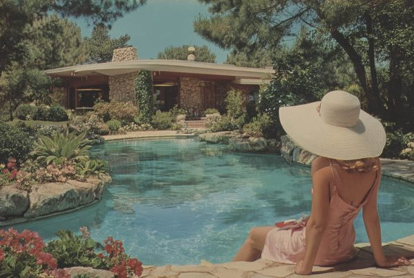
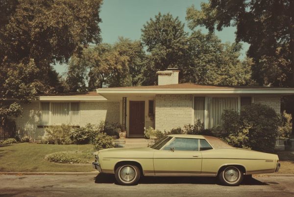
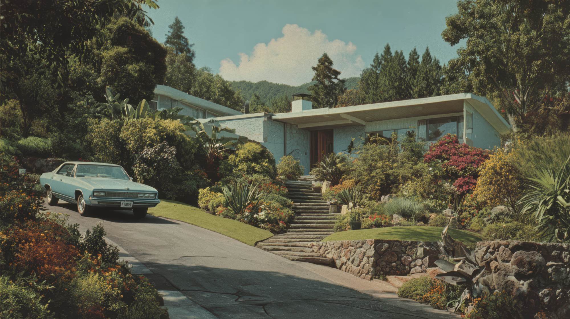
Real estate marketing has a sameness problem. Scroll through almost any listing portal, brokerage website, or social feed in a crowded market and the pattern becomes painfully obvious: the same brightened exterior shot, the same wide-angle kitchen image, the same beige-and-white branding, the same “luxury lifestyle” language, the same templated property brochure pretending to be premium because it uses a serif font.
When every listing is presented the same way, the market doesn’t become easier for buyers to navigate. It becomes easier for them to tune out. And when buyers tune out, agents and brokerages start making the wrong assumption—that they need to spend more on ads, not think harder about presentation.
The better move is usually not louder marketing. It’s sharper visual differentiation.
That doesn’t mean turning every listing into an art project or forcing a trendy aesthetic onto homes that don’t support it. It means understanding what the market is already showing buyers, identifying where visual fatigue has set in, and building a presentation strategy that helps the right properties stand apart for the right reasons.
If you’re serious about attracting attention in a market where everything starts to blur together, market research should be driving your visual direction—not personal taste, not imitation, and definitely not whatever another brokerage posted last week.
Why so many listings feel interchangeable
A lot of real estate marketing teams think they have a design problem when they actually have a positioning problem. The visuals all look alike because the strategy behind them is alike. Everyone is using the same references, chasing the same audience assumptions, and borrowing from the same set of “best practices” until those practices stop being best.
There’s a reason this happens. Real estate is operationally fast. Agents need assets quickly. Marketing teams need repeatable systems. Photographers and designers create formulas because formulas scale. None of that is inherently bad. The issue is that efficiency can quietly flatten distinction.
In many markets, visual conventions become so dominant that they stop communicating quality and start communicating category. In other words, your listing doesn’t look polished—it just looks familiar. Familiar can be useful, but it rarely earns a second look.
This is especially true in high-volume suburban markets, condo-heavy urban markets, and luxury segments where “elevated” has become a style cliché. Once every property is using the same cinematic video opener, the same drone sweep, and the same monochrome brand palette, the visuals are no longer differentiators. They’re wallpaper.
That’s the real challenge: not creating something flashy, but creating something recognizable and relevant enough that buyers, sellers, and even other agents feel the difference immediately.
Research first, design second
One of the biggest mistakes in real estate marketing is deciding what looks “good” before deciding what the market actually responds to. Visual direction should be informed by evidence, not internal opinion. Too many teams build branding around what the broker likes, what the top producer saw at a conference, or what a designer wants in their portfolio.
That’s backwards.
Good market research for visual strategy doesn’t have to be overly academic, but it does need to be disciplined. Start by reviewing the dominant visual language in your target area. Look at active listings, recently sold listings, top-performing agents, local developers, and adjacent brands competing for the same affluent or aspirational audience. Pay attention to patterns in photography style, staging, color grading, typography, video pacing, social content structure, and property brochure design.
Then ask the more useful question: what is overused, and what is underrepresented?
If every listing in a neighborhood is photographed to look airy, sterile, and generic, there may be an opportunity to lean into warmth, texture, and lived-in sophistication—if it fits the property. If every luxury listing is shot like a boutique hotel, maybe the stronger angle is architectural seriousness. If every downtown condo campaign is polished and minimal, maybe your differentiation comes from emphasizing neighborhood rhythm, convenience, and personality instead of trying to force aspirational distance.
Research should also include audience behavior. What are buyers in this segment actually noticing? What are sellers proud of? What kind of homes are getting shared, saved, or remembered? What features matter emotionally in this market—and which ones are just industry filler?
That last part matters. A visual strategy only works if it connects to what people value. Distinctive visuals without market relevance are just decoration.
Find the gap between market expectations and market fatigue
The sweet spot in real estate visuals is rarely total disruption. Buyers still need clarity. Sellers still want professionalism. There are certain expectations that exist for a reason. Clean photography, accurate presentation, intuitive layouts, and polished branding should not be abandoned in the name of standing out.
The opportunity is in spotting where expectations end and fatigue begins.
This is where experienced marketers can make a real difference. You don’t need to reinvent listing presentation from scratch. You need to identify where the market has become visually numb and adjust the emphasis.
For example, if every listing leads with the same front elevation shot, maybe your lead image strategy should be more selective and emotionally intelligent. If the real selling point is the backyard experience, the natural light in the living area, or the architectural detail buyers won’t expect, lead there. This sounds obvious, but it’s amazing how often listing media is produced by habit instead of hierarchy.
The same goes for editorial tone. If everyone else is writing generic descriptions packed with empty adjectives, your visual direction should be supported by copy that feels observant and specific. Strong real estate marketing works best when the written and visual systems reinforce each other. A home marketed as refined should not be paired with visuals that feel cold and stock-like. A family-oriented property should not be presented with branding that feels inaccessible or overly formal.
Differentiation is often less about dramatic design moves and more about disciplined alignment: right property, right audience, right tone, right visual decisions.
Build visual systems for segments, not just for brand consistency
A lot of brokerages overcorrect on consistency. They become so focused on making every listing look “on brand” that they erase the unique character of the inventory. Consistency matters, but in real estate, rigid consistency can become its own kind of mediocrity.
A smarter approach is to create a flexible visual system that holds the brand together while allowing different market segments to express themselves differently.
A starter condo, a historic home, a new construction property, and a luxury waterfront listing should not all be dressed in the exact same visual logic. They can share brand standards—logo use, type systems, tone, layout principles—but the photography treatment, edit style, asset mix, and campaign emphasis should shift based on audience and property type.
This is where market research becomes practical. If you know how different buyer groups in your area respond, you can create repeatable segment strategies instead of one-size-fits-all templates. Maybe downsizer-focused properties need cleaner floor plan storytelling and more emphasis on ease and simplicity. Maybe luxury suburban homes need less “grand” posturing and more nuanced presentation of craftsmanship, privacy, and outdoor use. Maybe younger urban buyers respond better to visual pacing and neighborhood integration than to square footage callouts.
The point is not to create chaos. The point is to stop pretending every listing deserves the same visual treatment just because your internal workflow prefers it.
Practical ways to make your listings feel different
Visual differentiation doesn’t have to mean a full rebrand or a bigger production budget. In many cases, it comes from making better choices with the assets you’re already producing.
Start with the image hierarchy. Most listings have at least a few usable angles, but not every angle deserves equal importance. Decide what emotional story the property should lead with and build the sequence around that. The first five images matter more than the next twenty-five.
Revisit your editing style. Overbright, flattened images may technically look clean, but they often strip out depth and atmosphere. In the attempt to look polished, many listing photos lose the feeling of the home entirely. Buyers may not know why one listing feels more compelling than another, but they can absolutely feel the difference.
Audit your staging choices. Too much staging now looks like staging. If every room is filled with the same neutral accessories and generic décor, the home becomes less memorable, not more. Better styling is selective. It should support the architecture and the likely buyer identity, not perform “tastefulness” in a vacuum.
Think harder about color. So much real estate marketing defaults to visual neutrality, which is understandable—but neutrality isn’t the same as sophistication. If your brand palette, social graphics, signage, and brochures all disappear into the same sea of safe grayscale minimalism, you’re not signaling premium taste. You’re signaling caution.
Video deserves special attention here. The industry has become obsessed with motion, but a lot of listing video is beautifully produced and strategically empty. If your video doesn’t reveal something meaningful about the home, the neighborhood, or the lifestyle fit, it’s just expensive filler. Better to create a shorter, sharper piece with a clear point of view than another glossy montage with no memory value.
And yes, floor plans, maps, and neighborhood visuals count as part of visual differentiation too. Not everything has to be cinematic. Sometimes the clearest signal of professionalism is giving buyers useful context in a visually coherent way.
Your visual direction should attract the right seller too
Here’s something agents sometimes overlook: differentiated listing presentation doesn’t only help with buyers. It helps win listings.
Sellers are watching how homes are marketed in their area, and many of them have the same reaction buyers do: everything looks the same. When a brokerage or agent presents a clearer, more thoughtful visual strategy, it communicates competence. It suggests that the property won’t be dropped into a generic production line.
That matters, especially for sellers who believe their home has special value and want a marketing approach that reflects it. And frankly, that’s a more useful promise than claiming you’ll “go above and beyond.” Everyone says that. Very few actually show a distinctive understanding of how their marketing will feel different in market.
If your listing presentation can demonstrate that your team studies local visual trends, understands buyer psychology, and adapts creative direction based on the property’s position in the market, you stop sounding like another service provider and start sounding like a strategist.
That’s a better sales conversation. And in a crowded field, better sales conversations matter.
Stop copying the market you’re trying to outperform
The most honest advice here is also the simplest: if your visual references come entirely from your direct competitors, you will eventually become one more version of them.
Real estate marketers need a wider field of vision. Study hospitality, editorial, architecture, retail, and lifestyle brands. Not to imitate them blindly, but to sharpen your sense of pacing, composition, storytelling, and emotional positioning. The best listing campaigns often borrow their confidence from outside the category.
But even then, the work has to come back to market truth. Good visual differentiation isn’t about being more stylish than everyone else. It’s about being more intentional. It’s about using research to decide what should be emphasized, what should be restrained, and what buyers are tired of seeing.
In a market where every listing starts to look the same, the answer is not random creativity. It’s informed creative direction. The teams that understand that are the ones that build marketing people actually remember.
And remembered is still one of the most valuable things a listing can be.