Maintain brand integrity while creating excitement around temporary experiences.
Restaurant collaborations and pop-ups are having a long moment, and for good reason. They create urgency, generate social conversation, and give regulars something new to talk about. But from a branding perspective, they can also get messy fast. I’ve seen strong restaurant brands dilute themselves with one-off visuals that feel disconnected, gimmicky, or worse, totally forgettable. The problem usually isn’t the idea of the collaboration. It’s the lack of a visual identity system that can hold the experience together.
Temporary doesn’t mean random. In fact, the shorter the campaign window, the more disciplined the branding needs to be. A collaboration has to feel fresh enough to earn attention, but familiar enough that guests still recognize who’s behind it. That balance is where good restaurant marketing lives. If your pop-up looks like it belongs to somebody else entirely, you’re borrowing hype at the expense of long-term equity.
The smartest restaurant brands don’t reinvent themselves for every activation. They build flexible visual systems that can stretch, adapt, and collaborate without losing their center. That’s the difference between a pop-up that gets Instagram likes and one that actually strengthens the brand.
Why temporary experiences need permanent brand discipline
There’s a common temptation when restaurants launch a collaboration: go louder, trendier, and more “special” than the core brand normally allows. Sometimes that works in the short term. More often, it creates a disconnected experience where the campaign visuals, menu design, signage, packaging, and social assets all feel like they came from different universes.
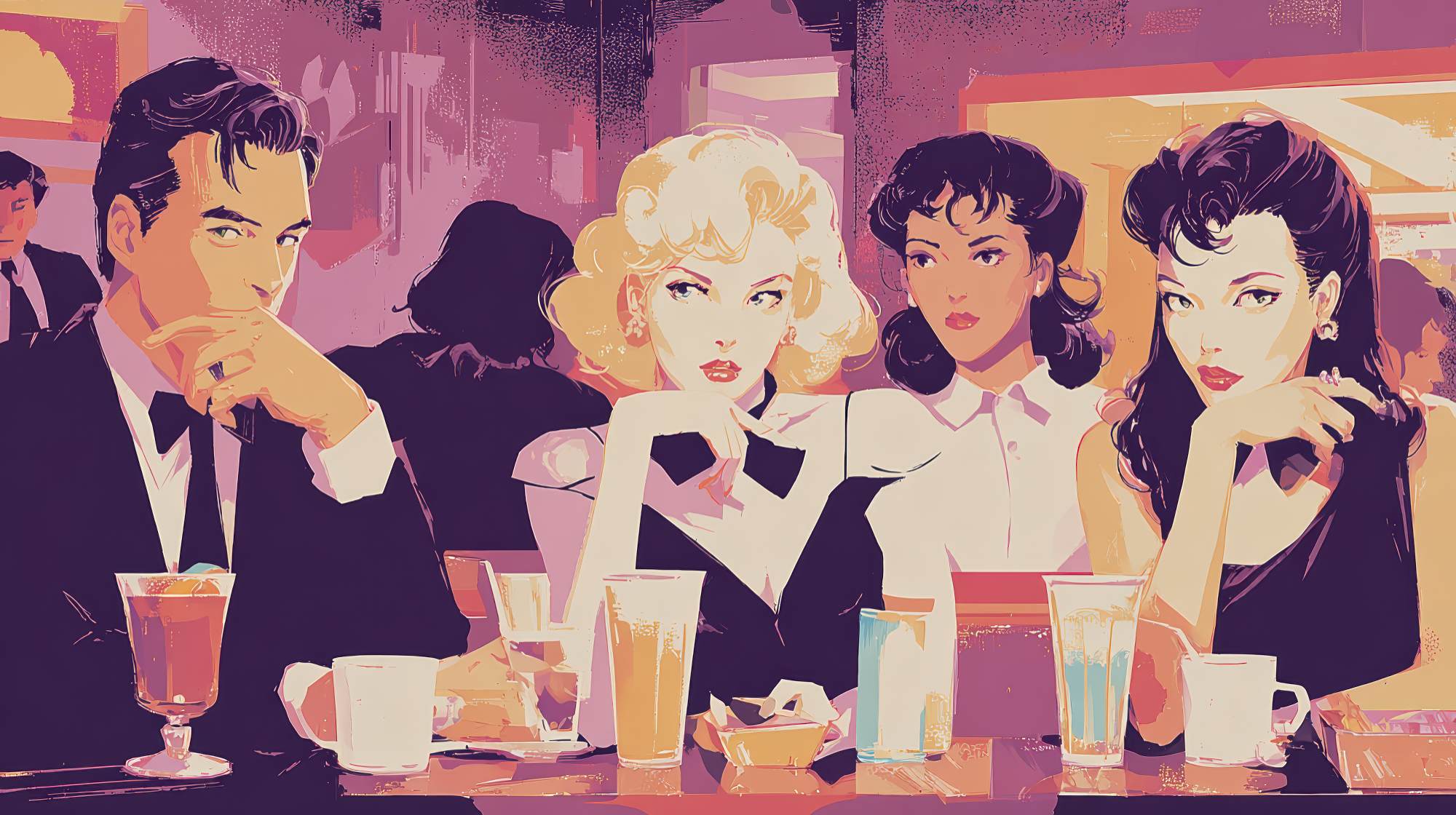
That kind of inconsistency is especially risky in hospitality because restaurants don’t just market ideas. They market trust, atmosphere, taste expectations, and memory. Guests need to feel continuity between what they saw online, what they walked into, what they ordered, and what they posted afterward. If the visual language shifts too aggressively, the experience can feel manufactured instead of exciting.
A temporary activation should still feel like your brand hosted it, endorsed it, and shaped it. Even in a true partnership, your audience should be able to recognize your point of view. That doesn’t mean every pop-up must look identical to your everyday identity. It means there should be a clear visual logic connecting the two.
I’m a big believer that restaurants should treat collaborations less like costume changes and more like capsule collections. Same brand DNA, different expression. That mindset is far more sustainable, and frankly, it usually produces stronger creative.
Build a visual identity system, not just a campaign look
A campaign look is a one-time aesthetic. A visual identity system is a set of rules and assets that can adapt across formats and partners. If you want your collaborations to feel polished rather than improvised, you need the second one.
At minimum, a restaurant collaboration system should define a few non-negotiables:
First, typography. Decide which fonts remain tied to the parent brand and where flexibility is allowed. Maybe your headline font can shift for the collaboration while your body copy and menu typography stay consistent. That’s a simple way to create novelty without losing recognition.
Second, color strategy. Not every pop-up should inherit the full master palette, but there should be a clear relationship to it. You can introduce a limited campaign accent color or merge palettes with a partner brand, but don’t let the result feel visually unrelated to your base identity.
Third, logo usage. Collaboration lockups matter. Too many brands either shrink their own identity into irrelevance or force both logos into awkward equal billing. A cleaner approach is to pre-design a system for co-branding: primary lockup, stacked lockup, social avatar version, packaging version, and signage version. Do that work up front and every activation will move faster.
Fourth, image treatment. Photography and illustration styles are often overlooked, but they carry a huge amount of brand perception. Decide how food is styled, how people are shown, what tone the lighting conveys, and whether graphic overlays or textures are part of the visual language. Consistency here goes a long way.
And fifth, environmental application. The identity cannot live only on Instagram. It has to translate to menus, window signage, table tents, takeaway packaging, uniforms, and wayfinding. A real system performs in physical space, not just on mockups.
When restaurants skip this structure, every collaboration starts from zero. That wastes time, creates inconsistent guest experiences, and usually leads to design-by-committee. A system gives your team boundaries, and boundaries are good for creativity.
What should stay consistent and what should change
This is where most teams either become too rigid or too chaotic. The goal is not to preserve every single element of the main brand untouched. The goal is to know which parts of the identity carry your core equity and which parts can flex for context.
In my view, restaurants should usually keep these elements relatively stable: core brand mark, foundational typography, tone of voice, and a recognizable connection to the primary color architecture. These are the cues that help guests understand who is behind the experience.
The elements that can change more freely are campaign naming, secondary graphic motifs, illustration style, merchandise design, event-specific photography, and a limited set of accent colors or textures. These are the tools that create energy and distinction.
If the collaboration is with another restaurant, chef, beverage brand, artist, or retailer, the smartest route is usually a “host plus guest” model. One brand acts as the structural base and the other enters through selected moments of expression. That approach keeps the result from becoming visually crowded. It also mirrors how guests usually experience the event: one brand is the venue and operational anchor, the other is adding a new layer of interest.
Trying to represent both brands equally in every single asset often creates bland compromise. Better to decide where each brand leads. Maybe the host dominates environmental branding while the guest shows up more strongly in menu storytelling and social content. Visual hierarchy is not a threat to partnership. It’s what makes co-branding legible.
The guest journey is where branding either works or falls apart
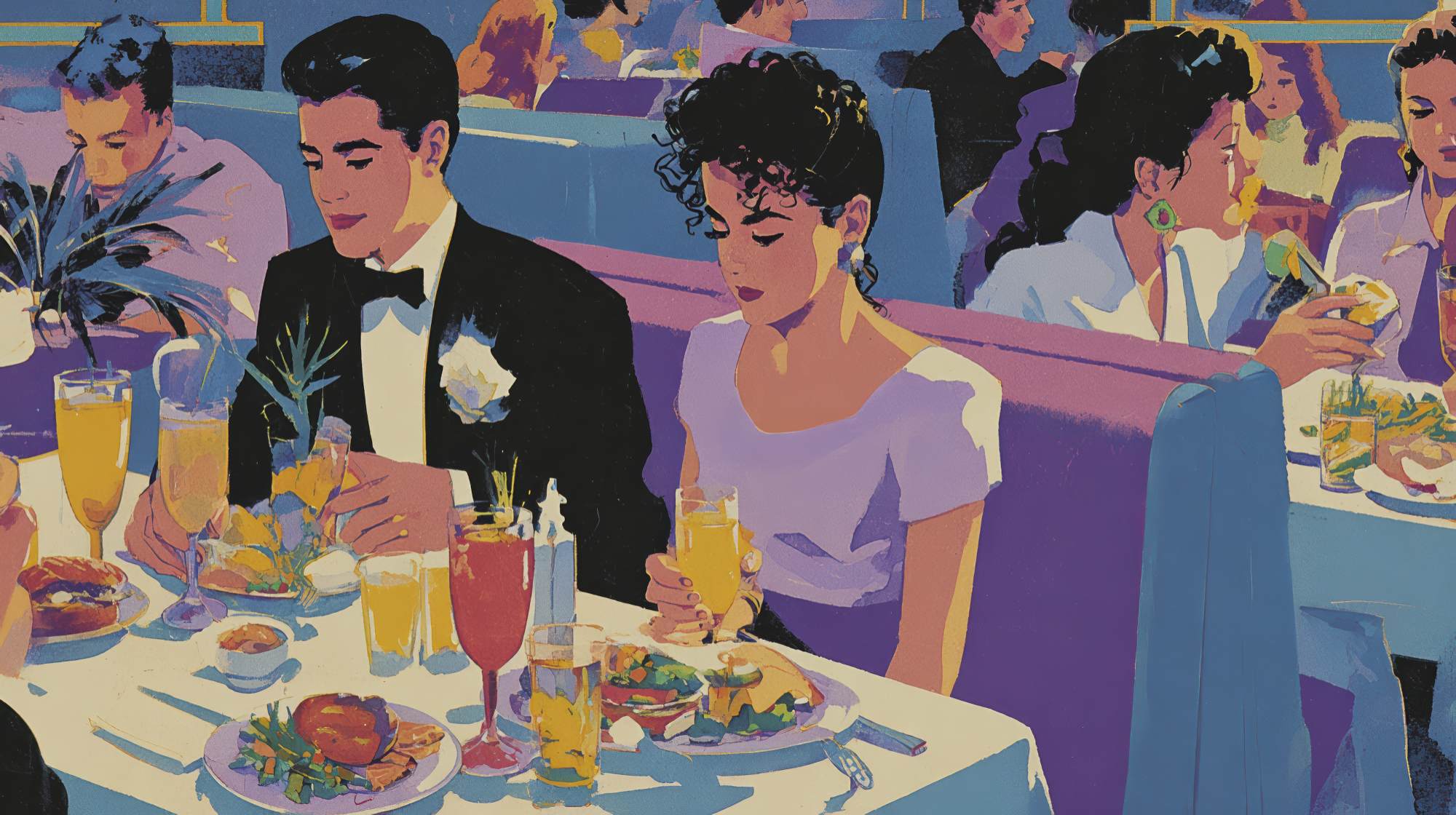
Too many restaurant marketers judge collaboration branding based on the announcement post alone. But guests don’t experience a pop-up as a single square on a feed. They experience it as a sequence.
They see a teaser. They click to learn more. They book or plan to attend. They arrive and look for cues that they’re in the right place. They read the menu. They take photos. They order. They share. Then ideally, they remember who created the experience.
A solid visual identity system has to support every stage of that journey.
The teaser phase needs intrigue, yes, but it also needs immediate brand recognition. If people can’t tell who the activation belongs to, awareness gets wasted. The booking phase needs clarity over style. Beautiful graphics mean nothing if reservation details are hard to read or buried. The arrival phase needs environmental cohesion. Signage, staff presentation, and printed materials should all confirm the promise made online.
This is especially important for pop-ups operating inside an existing restaurant footprint. If your digital promotion suggests a whole new world but the in-store expression is just one poster by the host stand, the experience feels undercooked. Guests notice when the branding effort stops at the marketing layer.
On the other hand, you do not need a massive budget to create continuity. A thoughtful menu insert, a branded stamp or sticker on packaging, one strong photo moment, and a clear collaboration lockup across touchpoints can do a lot. The issue is rarely scale. It’s intention.
Design for shareability without turning the experience into a prop
Let’s be honest: collaborations and pop-ups are social media fuel. Restaurants know this, and they should. Shareability matters. But there’s a difference between designing an experience that photographs well and designing one that exists only to be photographed.
The best restaurant branding supports natural sharing. It creates a scene, a color story, a few memorable branded moments, and packaging or plating that people genuinely want to post. It doesn’t scream for validation at every turn.
I think a lot of brands overestimate how much visual noise equals excitement. They add too many signs, too many slogans, too many graphic moments competing for attention. The result is less premium and less believable. Guests don’t need ten backdrops. They need one or two strong visual anchors and an environment that feels fully considered.
If you want the collaboration to travel online, focus on the assets people actually capture: storefront or entrance moment, menu, signature dish presentation, packaging, cocktails, tabletops, and whatever is in guests’ hands while they’re standing around talking. That’s your real media plan in physical form.
And please, make sure the branding in those moments is recognizable but not intrusive. The most effective shareable design usually looks effortless, even when it’s carefully engineered.
Operational teams need brand systems too
This is the part marketing teams sometimes miss. A collaboration identity is not just for designers and social managers. It has to be usable by operators, managers, printers, event staff, and front-of-house teams under time pressure.
If the rules are too vague, the execution gets sloppy. If the rules are too complicated, the team ignores them. What works best is a lightweight brand kit for temporary activations: approved logo files, menu templates, signage specs, color values, typography hierarchy, social story templates, and a few visual examples of correct and incorrect use.
That kind of tool kit is not glamorous, but it is what keeps the brand from fragmenting across vendors and locations. It also makes future collaborations easier to launch. One of the most practical marketing advantages of a visual identity system is speed. When the framework already exists, your team can spend more energy on concept and storytelling instead of repeatedly solving the same production problems.
In a category where timing matters and opportunities can appear quickly, that agility is a real competitive edge.
Use collaborations to strengthen the master brand, not distract from it
The restaurants that benefit most from collaborations are the ones that understand the long game. The pop-up itself is temporary, but the impression it leaves on the brand is not. Every activation teaches your audience something about your taste level, your standards, your creative range, and the company you keep.
That’s why visual identity decisions matter so much. They’re not surface-level decoration. They signal whether your restaurant is culturally aware or culturally opportunistic. Whether it knows itself or chases novelty. Whether it can collaborate without becoming generic.
My advice is simple: build a system before you need one. Define your visual constants. Decide where flexibility lives. Create co-branding rules. Think through the guest journey. Make the assets usable in the real world. And whenever a new partnership comes along, ask one question before approving the creative: does this feel like our brand becoming more interesting, or just less clear?
That distinction is everything. The best restaurant collaborations create genuine buzz while making the brand more memorable, not more confusing. If you can do that, you’re not just producing a successful pop-up. You’re compounding brand value every time you open the door to something new.