Last Updated on April 20, 2026 by DSNRY
Selecting a palette that resonates with established business owners.
Real estate websites have a bad habit of confusing activity with progress. They celebrate traffic, admire long session times, and obsess over how many people clicked a property gallery, while missing the only metric that really matters: are qualified buyers taking the next step?
That gap usually comes down to structure. Not flashy animations. Not clever slogans. Not some expensive redesign that looks impressive in a pitch deck and underperforms in the real world. Structure. The way a website guides attention, builds trust, filters intent, and helps the right visitor move forward without friction.
In real estate marketing, especially when the audience includes established business owners, investors, and high-intent buyers, the website has a very specific job. It should not try to charm everybody. It should make serious prospects feel like they are in the right place immediately. That means every decision, from navigation to page hierarchy to visual palette, has to support credibility and clarity.
I’ve always believed that many real estate brands over-design for aspiration and under-design for decision-making. They aim for “luxury” and accidentally create distance. They aim for “modern” and accidentally strip away trust signals. They aim for “sleek” and accidentally make the site feel generic. Serious buyers are not browsing for entertainment. They are evaluating risk, timing, fit, and professionalism. Your site should respect that mindset.
Serious buyers don’t need more options. They need better direction.
One of the biggest mistakes in real estate website planning is assuming that more content equals more persuasion. It usually does not. Most property websites and brokerage sites are built like storage units: everything is technically there, but nothing is arranged to help someone make a confident decision.
High-intent visitors want a clean path. They want to understand what you offer, who you serve, what kinds of listings or opportunities are relevant to them, and how to engage without hitting dead ends. If your homepage is trying to speak to first-time homebuyers, luxury sellers, multifamily investors, retail tenants, and commercial developers all at once, you are not broadening appeal. You are weakening your message.
This is especially true when marketing to established business owners. They do not want to decode your website. They do not want to guess where to click next. They do not want to scroll through decorative filler before finding the numbers, the property categories, the market expertise, or the contact path. They appreciate sophistication, but sophistication in this context means organization, not ornament.
A good site architecture guides users into relevant lanes quickly. Residential and commercial should not be buried under the same vague umbrella. Investment properties should have their own logic. Market reports should support trust, not sit hidden in a blog archive. Contact opportunities should feel available on every key page without becoming obnoxious.
If a qualified prospect lands on your site and thinks, “This firm understands how I think,” you are already ahead of most competitors.
Navigation is not a design detail. It is a sales tool.
I’m opinionated about navigation because it gets treated like housekeeping when it should be treated like strategy. The menu is often the first real proof that your business is organized. In real estate, organization equals confidence.
Too many sites rely on vague labels like “Services,” “Properties,” or “Resources” without giving visitors enough context. That might feel clean from a branding perspective, but it often creates hesitation. And hesitation kills conversion. Buyers with real intent do not need mystery. They need momentum.
A better navigation system uses clear, useful categories. For example, separate property types by audience and need. Distinguish between available listings, sold properties, lease opportunities, and investment-focused inventory. If you serve commercial clients, say so directly. If you specialize in owner-user acquisitions, make that easy to find. If you advise business owners on relocation, expansion, or portfolio strategy, bring that expertise out of the shadows.
The same goes for calls to action. “Contact Us” is fine, but it is rarely enough on its own. Stronger pathways might include “Schedule a Property Consultation,” “Request Market Insights,” “Discuss Acquisition Goals,” or “Get a Listing Valuation.” These are not just buttons. They are signals that you understand buyer intent at different stages.
The websites that convert best are usually the ones that remove ambiguity. They do not ask users to do interpretive work. They say, in effect, here’s what we do, here’s who it’s for, and here’s how to move forward.
Color palette matters more than many marketers want to admit
Let’s talk about visual tone, because this is where many real estate brands either overplay luxury clichés or wander into startup aesthetics that feel completely wrong for the audience.
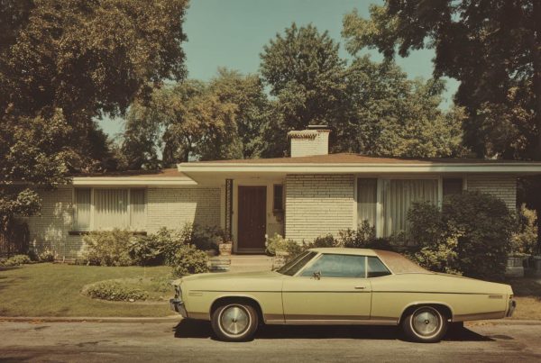
When your audience includes established business owners, your color palette should communicate maturity, restraint, and competence. That does not mean boring. It means intentional. A palette that resonates with this audience often leans on grounded neutrals, deep charcoals, warm whites, softened navies, muted greens, and thoughtful accent tones that feel premium without screaming for attention.
I would argue that the best palettes in real estate marketing are the ones that create calm authority. They make information easier to absorb. They support photography rather than fighting it. They give the site a sense of permanence. That matters. Business owners and serious buyers are making decisions with financial weight behind them. If your website looks overly trendy, hyper-saturated, or too eager to impress, it can quietly undermine trust.
There is also a practical side to this. Strong palette choices improve readability, hierarchy, and usability. A serious buyer should be able to scan market data, listing details, and service descriptions without visual fatigue. If every section is battling for attention through aggressive contrast or decorative color use, the site starts to feel noisy. Noise is the enemy of confidence.
A restrained palette also gives your brand room to feel human. One of my favorite approaches is pairing a stable, executive-level base palette with a warmer accent color that adds accessibility. That creates a tone that says: we are experienced, we are credible, and we are still approachable enough to work with directly.
In other words, color should support positioning. If you want to attract serious buyers, your visual system should look like it was built for serious conversations.
Property pages should answer real questions, not just display photos
Listing pages are where a lot of real estate websites fall apart. Beautiful galleries, weak substance. Large images, tiny context. Plenty of visual drama, not enough decision support.
Photos matter, obviously. But qualified buyers are not converting because they saw one more wide-angle shot of a conference room or kitchen island. They convert when the page helps them assess fit quickly and confidently.
That means property pages should be built with information hierarchy in mind. Core facts should be easy to identify immediately. Pricing or lease terms, square footage, location context, zoning or use notes where relevant, standout features, and next-step options should all be visible without forcing a scavenger hunt.
For commercial real estate and business-owner audiences, I think context is especially important. Don’t just tell me what the property is. Tell me why it matters. What kind of owner-user would benefit? What market conditions make this attractive right now? What operational advantages does the location offer? Where are the demand signals? This is where real marketing starts to separate itself from digital brochure work.
Good property pages also anticipate friction. Include downloadable materials where appropriate. Offer map views, nearby business context, floor plans, investment highlights, and simple inquiry paths. If the lead form is too generic, the page loses energy. Give users a reason to engage now by tying the CTA to the asset itself: request financials, schedule a walkthrough, discuss fit, receive similar opportunities.
The more serious the buyer, the less patience they have for pages that look polished but say very little.
Trust is built through sequencing, not just testimonials
Everyone wants trust on a website, but most brands chase it in superficial ways. They add a testimonial slider, place a few logos in the footer, and call it credibility. That helps, but it is not enough.
Trust online is often about sequencing. What the visitor sees first, second, and third determines whether your expertise feels real. If your homepage leads with abstract brand language and delays concrete proof, you are making the user do unnecessary emotional labor. If your service pages describe outcomes without process, you create doubt. If your About page feels self-congratulatory instead of clarifying how you work, you miss an opportunity.
The strongest real estate websites sequence trust in layers. First, they establish relevance: we serve this market, these clients, these property needs. Next, they establish competence: here’s our track record, our insight, our process, our understanding of the landscape. Then they create low-friction action: here’s how to start the conversation.
That sequence works particularly well for established business owners because it mirrors how they evaluate vendors and advisors in general. They are not just buying a property or brokerage relationship. They are evaluating whether your team is capable, responsive, and commercially aware.
Case studies are often more persuasive than generic testimonials here. So are concise market insight pages, transaction examples, and well-written service explanations. Anything that shows you can think beyond the listing itself adds weight to your brand.
Content should filter for quality, not chase vanity traffic
I’ll say something that some marketers still resist: not all website traffic is useful. In fact, a lot of it is a distraction. Real estate brands can get trapped producing broad content that brings in readers with no commercial intent. That may look good in a report, but it does very little for pipeline.
If you want a website that supports serious buyer conversion, your content strategy should be aligned with actual decision points. Write about timing, valuation, market shifts, acquisition strategy, location tradeoffs, tenant demand, ownership considerations, and what buyers need to know before they act. Create resources that help the right prospect think more clearly, not just content that casts the widest possible net.
This is where tone matters too. Established business owners respond well to content that sounds informed, specific, and grounded in real experience. They do not need endless hype. They need useful perspective. They want someone who can reduce noise, not add to it.
A smart content ecosystem can also support site architecture beautifully. Articles should connect naturally to service pages, listing categories, market insight sections, and conversion paths. The blog should not feel like a separate island. It should function as a support system for trust and lead quality.
The goal is not a prettier website. It is a more decisive one.
When real estate marketers talk about improving websites, they often default to visual upgrades. Better photography. Cleaner layouts. More modern fonts. Those things can help, but they are not the point.
The real goal is a website that helps the right people make decisions faster. That means architecture that guides instead of distracts. Navigation that clarifies instead of hiding. property pages that inform instead of merely posing. A color palette that signals professionalism and stability. Content that qualifies intent instead of chasing volume. And calls to action that feel like the natural next step, not a desperate sales grab.
If your audience includes serious buyers and established business owners, the standard should be higher. Your website should feel like an extension of how you actually work: organized, credible, thoughtful, and commercially aware. Not louder than the competition. Smarter.
That is what converts. Not buzzwords. Not trend-chasing. Not digital window dressing. Just a website that understands what serious prospects are trying to accomplish and helps them get there with confidence.