Last Updated on April 20, 2026 by DSNRY
Structure creates freedom.
In real estate, people love to talk about inventory, rates, lead flow, and timing. All of that matters. But in competitive markets, design quietly does a huge amount of the selling before anyone fills out a form, books a showing, or picks up the phone. I don’t mean “design” in the shallow sense of making something look expensive. I mean the full experience of how a brand presents itself, how information is organized, how listings are framed, how pages guide attention, and how trust gets built visually before a single conversation happens.
The hard truth is that many real estate brands still treat design like decoration. They’ll invest heavily in ad spend, CRM systems, automation, SEO, videography, and sales training, then hand the final customer-facing experience over to inconsistent templates, dated branding, cluttered listing presentations, or websites that feel like they were built for a completely different market cycle. That disconnect costs more than most teams realize.
When the market gets crowded, design stops being a nice extra and becomes part of the strategy. It’s what helps people understand your value quickly. It’s what makes your marketing feel credible. And it’s often the difference between a brand that feels premium, focused, and in-demand versus one that feels interchangeable.
Design is how your positioning becomes visible
Every real estate business says some version of the same thing: local expertise, white-glove service, strategic marketing, strong negotiation, trusted advisors. None of those claims mean much if the brand experience doesn’t support them. If your visuals are inconsistent, your materials feel generic, or your website is difficult to navigate, you’re forcing people to reconcile a premium message with a mediocre experience. Most won’t bother. They’ll simply move on.
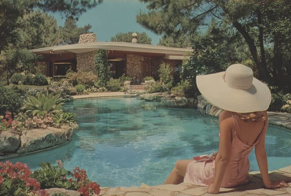
This is where strong design earns its keep. Good design translates positioning into something clients can feel instantly. It tells them whether you understand your market, whether you pay attention to detail, and whether you operate with intention. In luxury real estate especially, but honestly across every price point now, presentation influences perceived competence.
Sellers don’t just hire an agent. They hire a marketer. Buyers don’t just look at homes. They evaluate whether the people behind the listing seem organized, current, and trustworthy. If your brand looks pieced together, your marketing probably feels pieced together too.
I’ve seen teams with average messaging outperform more experienced competitors simply because they looked sharper, clearer, and more professional at every touchpoint. That isn’t superficial. It’s market psychology. People make assumptions fast. Design shapes those assumptions whether you’re paying attention to it or not.
Clarity beats volume every time
One of the biggest mistakes in real estate marketing is overloading everything. Too much copy. Too many fonts. Too many calls to action. Too many badges, headshots, awards, neighborhood names, testimonials, buttons, maps, links, and blocks of text competing all at once. The intention is usually to communicate value. The result is usually friction.
Competitive markets reward clarity. Buyers and sellers are already overwhelmed. They’re scanning fast, comparing options, and making snap judgments. Design should reduce cognitive load, not add to it. The best-performing real estate marketing assets are often the ones that make decisions easier: where to click, what to read first, what matters most, what happens next.
That applies everywhere:
On your website, visitors should immediately understand who you serve, what kind of properties or clients you specialize in, and how to take the next step.
On listing pages, photography, layout, and copy should work together rather than compete.
On social media, consistency should create recognition instead of chasing trends that dilute the brand.
In listing presentations, information should feel structured, persuasive, and easy to absorb—not like a data dump disguised as strategy.
This is why design and conversion are connected. Clear hierarchy, strong spacing, intentional typography, and disciplined messaging help people move. Not because they’re dazzled, but because they’re not confused.
A lot of teams think they need more content when what they really need is better organization. More isn’t better if no one knows where to look.
The market notices when your standards are high
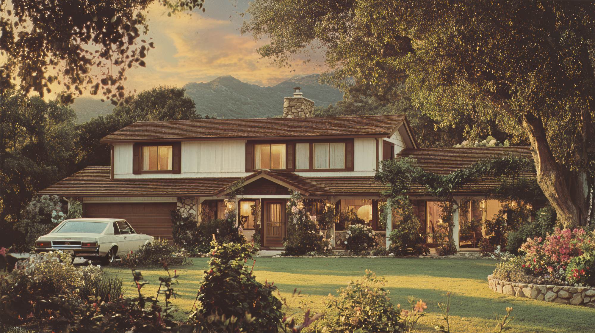
Real estate is a referral business, but referrals don’t happen in a vacuum. Your reputation gets reinforced by what people see. When your brand identity is polished, your signs are clean, your print materials are thoughtful, your listing campaigns feel cohesive, and your digital presence actually matches the quality you promise, people notice. Clients notice. Other agents notice. Developers notice. Past clients notice. Prospects who haven’t contacted you yet definitely notice.
There’s a reason some firms seem to carry momentum even when conditions tighten. Their marketing creates the impression of discipline. That impression matters. Strong design signals standards. It suggests that if this is how you handle your own brand, you’ll probably handle a property launch, a negotiation, or a client relationship with the same care.
And no, this doesn’t mean every brand has to look ultra-luxury or minimalist or trend-forward. Good design is not about copying what’s fashionable on Instagram this quarter. It’s about coherence. The style should fit the audience, the geography, the property type, and the actual business. A boutique neighborhood specialist should not look like a national developer unless that’s truly the strategy. A high-volume team targeting first-time buyers should not market like a private office brokerage. Design works when it aligns with the offer.
That’s the part too many people skip. They jump straight to colors, logos, and templates before deciding what the brand should feel like in the market. Design decisions should support business decisions, not replace them.
Bad design creates hidden drag across your whole funnel
What makes weak design so expensive is that the damage is rarely obvious in one place. It shows up as underperformance everywhere. Ads get impressions but fewer clicks. Website traffic comes in but doesn’t convert. Social content gets seen but doesn’t build recognition. Listing presentations don’t create confidence. Email campaigns feel forgettable. Signage attracts attention but doesn’t reinforce the right message. Individually, each issue seems minor. Collectively, they create drag.
This is why throwing more budget at marketing often disappoints. If the creative foundation is weak, additional spend just amplifies inconsistency. You don’t fix a trust problem by increasing traffic. You fix it by making the brand experience stronger.
In practical terms, here’s where I’d start if a real estate company wants to tighten design without wasting time:
First, audit the full customer journey, not just the homepage. Look at ads, landing pages, bio pages, listing pages, brochures, PDFs, social templates, email signatures, presentation decks, signage, and follow-up materials. Most branding breaks happen in the handoffs.
Second, simplify. Cut visual clutter. Reduce unnecessary elements. Create clearer hierarchy. Make it easier for someone to know what matters.
Third, standardize core assets. That means brand fonts, color use, photography style, logo placement, templates, icon systems, and layout rules. Consistency is what turns design into a business asset instead of a one-off project.
Fourth, prioritize mobile. A shocking amount of real estate marketing still looks like it was designed for a desktop world that no longer exists. If it doesn’t read clearly on a phone, it doesn’t work.
Fifth, use real art direction. Stock imagery, random graphics, and inconsistent listing visuals weaken perceived quality fast. Even modest brands can look significantly better with stronger image selection and tighter visual standards.
Great design gives your team room to operate better
This is the part I wish more brokers, team leaders, and marketers understood: design is not restrictive when it’s done well. It actually creates flexibility. When you have a strong visual system, approved templates, clear brand rules, and a consistent framework for campaigns, your team moves faster. Content becomes easier to produce. New listings can launch without reinventing the wheel. Social posts stay on-brand without endless debate. Presentations look polished without requiring custom work every time.
That’s what the best marketing systems do. They reduce friction internally so the external experience feels seamless. The structure is what creates the freedom. Without it, every asset becomes a one-off decision, which is where quality starts slipping and execution slows down.
For real estate teams especially, this matters because marketing volume can get intense. New listings, open houses, market updates, agent recruiting, community content, email campaigns, seasonal promotion, and client nurturing all need to coexist. If there’s no design system underneath it, output becomes chaotic. And chaotic brands rarely feel premium, even if the people behind them are excellent at what they do.
The teams that look the most effortless are usually the most structured behind the scenes. They’re not guessing every time. They’ve made the key decisions already.
If you want to compete seriously, design has to be treated like infrastructure
Design should sit closer to brand strategy and revenue strategy than most real estate businesses currently allow. It is not a finishing touch applied after the “real” marketing is done. It is part of how the marketing works. It shapes perception, improves usability, supports conversion, and reinforces positioning. In competitive markets, those are not minor benefits. They’re core advantages.
If your brand feels dated, fragmented, generic, or overly complicated, the answer is not to keep layering more tactics on top of it. Step back and fix the foundation. Get clear on who you are, how you want to be perceived, and what your client experience should feel like from first impression to closed deal. Then make sure your design system actually supports that vision.
Because at a certain level, clients are not just choosing based on data or promises. They are choosing based on confidence. Design helps create that confidence before a single sales conversation begins.
And in a market where attention is expensive and trust is everything, that’s not optional. That’s the job.