
Last Updated on April 20, 2026 by DSNRY
Friction costs you customers.
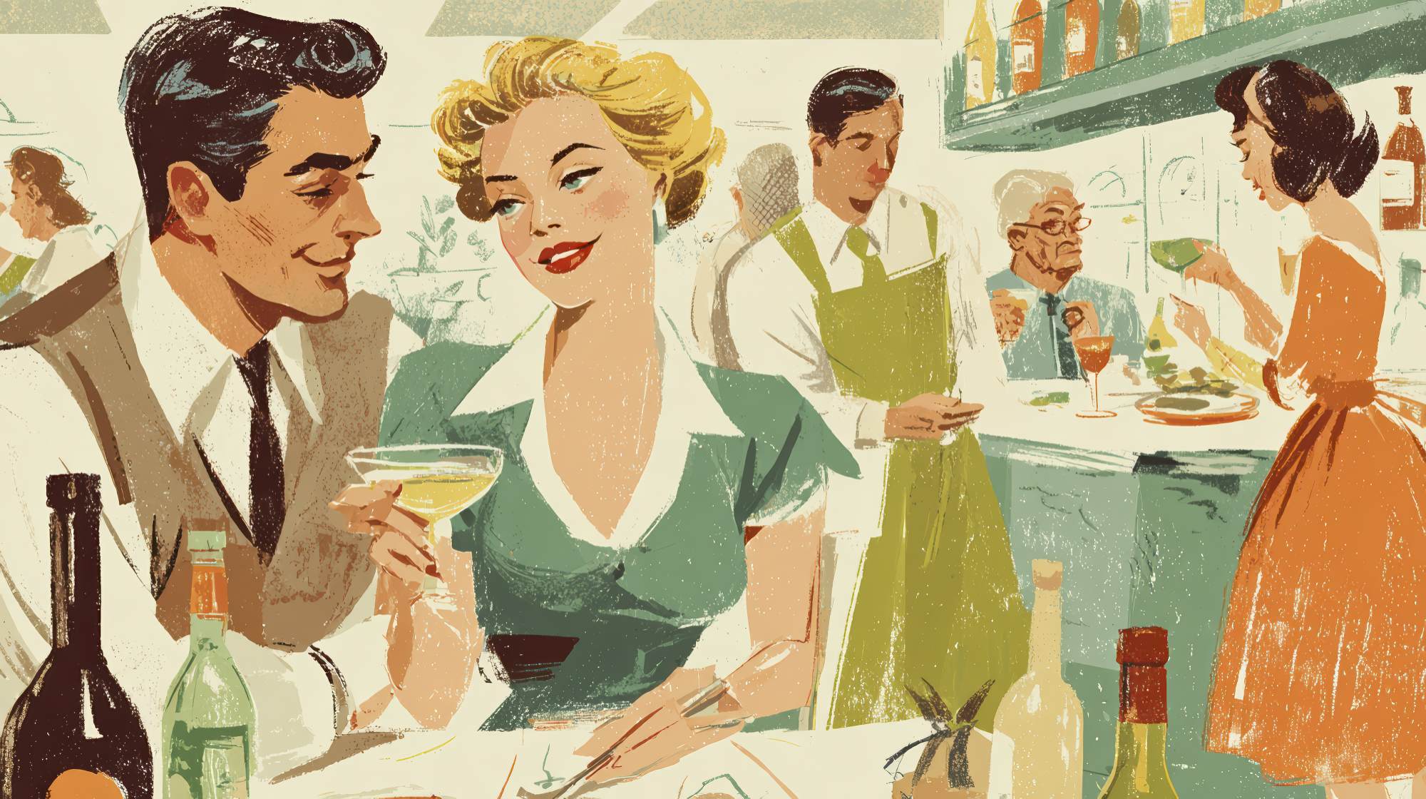
Restaurant operators spend a lot of time thinking about the food, and they should. The menu is still the core product. But in practice, guests do not experience your restaurant as a list of dishes. They experience it as a sequence of moments: finding you online, deciding whether you look trustworthy, booking a table or placing an order, parking, waiting, scanning a QR code, asking for help, paying, leaving, and deciding whether to come back.
That full journey is your user experience. And if it is clunky, slow, confusing, or inconsistent, your menu will not save you.
I think a lot of restaurant marketing still gets this wrong. Operators obsess over promotions, social posts, and seasonal launches while ignoring the everyday points of friction that quietly kill conversions. The hard truth is that most lost customers are not making dramatic decisions. They are simply giving up. They bounce from your website because they cannot find hours. They abandon an online order because the checkout feels sketchy. They choose the place across the street because your reservation system asks for too much. They decide not to return because the pickup process felt chaotic, even though the food was good.
Marketing is not just about getting attention. It is about making it easy for someone to say yes. In restaurants, user experience is often the difference between interest and revenue.
Your restaurant is judged long before the first bite
By the time a guest tastes your food, they have already formed a strong opinion about your brand. That opinion is shaped by convenience, clarity, and confidence. Can they find your menu fast? Does your Google listing match your actual hours? Is your online ordering system mobile-friendly? Are your photos current? Does your reservation button work without forcing them through three unnecessary steps?
These sound like small details. They are not. They are signals.
Customers read operational smoothness as a proxy for quality. If your digital experience is messy, many people assume the in-person experience will be too. That may not be fair, but it is absolutely real. A polished guest journey suggests competence. A confusing one creates doubt.
This matters even more in restaurant marketing because people often make decisions quickly. They are hungry, distracted, on their phone, and comparing options in real time. They are not looking to “discover your story” if they cannot even figure out whether you take reservations. They are not patiently decoding your navigation. They are moving on.
There is a marketing lesson here that I wish more restaurants would take seriously: reducing friction is often more profitable than increasing awareness. If 1,000 people visit your site and your experience turns away a meaningful percentage of them, spending more money to drive 1,000 more visitors is not the smartest first move. Fix the leaks before buying more water.
Friction hides in the places owners stop noticing
One of the biggest challenges with user experience is that the people closest to the restaurant are usually the least likely to see the problems clearly. Owners know the menu by heart. Managers know how the ordering flow works. Staff know where guests are supposed to stand for pickup. But customers are seeing it fresh, often for the first time, and they do not have the patience to “figure it out.”
That is why friction tends to hide in plain sight.
Maybe your homepage leads with a giant brand video but buries the menu link. Maybe your online ordering platform opens in a new tab and looks nothing like your actual brand. Maybe your dining room signage is elegant but unclear. Maybe your confirmation emails do not explain where to park, how long tables are held, or what happens if someone is running late. Maybe your phone number is technically listed, but impossible to tap on mobile.
None of these issues sound catastrophic. Collectively, they absolutely are.
The most expensive friction points are not always dramatic failures. They are the low-grade annoyances that chip away at momentum. In marketing, momentum matters. Every extra click, every unanswered question, every awkward pause gives customers another chance to rethink the decision.
Restaurants feel this especially hard because the category is so substitutable. Your competitor does not need to be better than you. They only need to be easier.
The best restaurant marketing removes uncertainty
If I had to sum up great restaurant user experience in one phrase, it would be this: remove uncertainty. Good marketing gets someone interested. Great experience gets them comfortable enough to act.
People want answers to basic questions fast:
What kind of place is this?
What does it cost?
Is it good for the occasion I have in mind?
Can I get in easily?
How do I order?
How long will it take?
Where do I go?
What should I expect?
Restaurants that answer these questions clearly tend to outperform restaurants that rely on vibe alone. Vibe matters, of course. Hospitality is emotional. Branding is emotional. But emotion works better when logistics are handled.
This is where practical UX becomes a marketing advantage. Strong photos are not just aesthetic; they reduce uncertainty. A simple menu structure is not just cleaner; it helps people decide faster. Accurate wait times are not just operational; they build trust. Clear instructions for pickup are not just helpful; they reduce post-purchase regret.
I would go as far as saying this: convenience is part of the brand now. Not a side issue. Not a tech issue. A brand issue.
If your positioning says “effortless neighborhood spot” but booking a table feels like filing taxes, the experience is telling a different story than your marketing. And customers believe the experience.
Where restaurants should audit the guest journey first
If you want to improve user experience without turning it into a giant consulting project, start with the highest-impact touchpoints. In most restaurants, those are the moments closest to conversion.
First, audit your Google Business Profile. This is one of the most important marketing assets you have, and many restaurants still treat it like a set-it-and-forget-it listing. Your hours, phone number, menu links, photos, service options, and review responses should all be current. For a lot of customers, this profile is the homepage.
Second, test your website on a phone. Not a desktop. Not from the office Wi-Fi. On an actual phone, like a customer. How fast does it load? Can you find the menu, location, reservations, and ordering in seconds? Are the buttons obvious? Is the text readable? If your mobile site makes people work, it is underperforming.
Third, go through your reservation or ordering flow from start to finish. Count the steps. Notice where the friction appears. Are there surprise fees? Forced account creation? Confusing modifiers? Dead ends? Any step that creates hesitation should be questioned.
Fourth, audit the in-store transition points. This is where many restaurants lose the thread. The digital experience might be decent, but then pickup is disorganized, hosts are unclear on policies, or payment feels awkward. User experience is not limited to screens. It includes the handoff between channels.
Finally, review your communications. Confirmation texts, reservation reminders, order-ready emails, and post-visit follow-ups all shape perception. Good communication reduces anxiety. Bad communication creates support volume and frustration.
A useful rule: if your staff has to answer the same customer question repeatedly, that is probably a UX problem before it is a staffing problem.
Small improvements often beat flashy redesigns
There is a tendency in marketing to chase big visible changes because they feel strategic. New branding. New photo shoots. New campaigns. Those things can matter, but in restaurants, modest UX fixes often produce faster gains.
Simple wins include:
Putting your top actions above the fold: view menu, order online, reserve, call, find location.
Using plain language instead of clever labels.
Making pricing visible where appropriate.
Showing dietary information clearly.
Reducing unnecessary form fields.
Adding realistic photos of the space and the food.
Clarifying parking, pickup, and waitlist instructions.
Ensuring consistency across your website, social profiles, and third-party platforms.
Training staff to handle handoffs smoothly between online and in-person interactions.
These are not glamorous changes. They are effective changes.
I have seen restaurants invest heavily in brand storytelling while still making customers dig for basic information. That is backwards. Story matters more after trust is established. First, make the experience legible. Then layer on personality.
And yes, there is a deeper brand point here. Thoughtful UX communicates respect. It tells guests that you value their time, attention, and comfort. That is good hospitality, and good hospitality is good marketing.
User experience affects loyalty more than most restaurants realize
When restaurant teams talk about repeat business, the conversation usually turns to food quality, service, pricing, or loyalty programs. Those are all important. But user experience plays a bigger role in retention than many people admit.
People return to places that feel easy. Easy to choose. Easy to book. Easy to reorder. Easy to recommend.
This is one reason chains often outperform independents on frequency even when the food is less exciting. They remove uncertainty. Customers know what to expect, how to transact, and how to navigate the experience. Independent restaurants have an opportunity to do the same without becoming generic. They can keep the personality and still tighten the systems.
That is the sweet spot: memorable food, distinct point of view, low friction.
The restaurant brands that win long term are usually not the ones shouting the loudest. They are the ones making every step feel obvious and considered. They understand that convenience and hospitality are not in conflict. In many cases, convenience is hospitality.
If your restaurant is trying to grow, this is one of the smartest lenses you can adopt. Stop asking only, “How do we get more people to notice us?” Also ask, “Where are we making it harder than necessary for people to choose us?”
That question tends to lead to better marketing decisions, better operational decisions, and better guest experiences.
The practical takeaway
Your menu gets people interested. Your user experience gets them to act.
If you want better marketing performance, do not just promote harder. Walk through the customer journey with fresh eyes and fix the points where momentum dies. Tighten the mobile experience. Simplify the path to order or reserve. Make information obvious. Reduce ambiguity. Smooth out the handoffs.
In restaurant marketing, the best growth strategy is often less about persuasion and more about clarity. People already want to eat. Your job is to make choosing you feel easy.
Because friction does not just annoy customers. It sends them elsewhere.


