
Last Updated on April 20, 2026 by DSNRY
Examine audience-first approaches that ensure visuals speak directly to intended patrons.
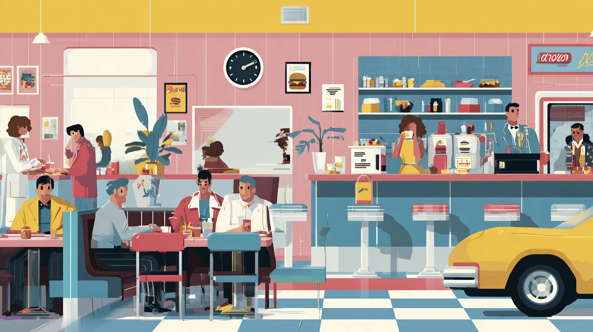
Restaurant marketing gets overcomplicated fast. Teams spend weeks debating colors, fonts, photography styles, packaging details, and social templates, then act surprised when the final creative looks polished but doesn’t actually move people. The problem usually isn’t effort. It’s alignment. Too many restaurants build creative around what ownership likes, what a designer thinks looks current, or what competitors are doing. Very few start with a simpler question: who exactly is this supposed to attract?
If the answer is “everyone,” the creative is already in trouble.
The best restaurant marketing creative feels natural to the right guest. It doesn’t just look good in a vacuum. It signals something specific about price point, atmosphere, taste, pace, social value, and lifestyle fit. Good creative pre-qualifies. It tells the right customer, “this place is for you,” while quietly letting the wrong fit move on. That’s not exclusionary. That’s effective positioning.
When restaurant visuals connect, it’s usually because the brand understands its demographics beyond broad labels like “families,” “young professionals,” or “foodies.” It knows what those people expect, what they notice, what makes them trust a place, and what makes them feel out of place. That level of clarity should shape every visual choice you make.
Demographics are not just data points—they’re signals of expectation
Restaurant marketers often talk about demographics like they’re line items on a slide: age, income, household size, zip code. Useful, sure. But those details matter because they influence expectations. A 24-year-old urban lunch customer and a 46-year-old suburban parent may both love tacos, but they are often looking for entirely different cues from the same category.
One might respond to fast, energetic visuals, handheld food shots, bold typography, and social proof built around trend relevance. The other may care more about cleanliness, menu clarity, kid-friendliness, ease of ordering, and photography that signals reliability over novelty. Same product category. Different visual triggers.
That’s the mistake I see a lot of restaurants make: they assume the menu defines the audience. It doesn’t. Experience defines the audience. A steakhouse isn’t just selling steak. It may be selling business dinner confidence, anniversary credibility, or a sense of earned indulgence. A café isn’t just selling coffee. It may be selling productivity, neighborhood identity, or aesthetic comfort. Once you understand what role the restaurant plays in a guest’s life, creative decisions start getting easier.
Demographic alignment is really about pattern recognition. What does your target audience associate with quality? What looks expensive to them? What looks approachable? What feels current without feeling forced? What kind of photography feels believable? What kind of design feels premium versus try-hard? Those answers are rarely universal.
Start with the guest’s world, not your brand mood board
Here’s a practical opinion: mood boards are overrated when they’re disconnected from audience reality. They often become a collage of trends pulled from brands with totally different customer bases. A neighborhood brunch spot starts referencing luxury hospitality campaigns. A family pizza concept starts mimicking minimalist wellness branding. A fast-casual chain borrows visual language from independent chef-driven restaurants. The result is creative that may be attractive, but not persuasive.
Instead, begin with the guest’s world. What do they already respond to in adjacent categories? What other brands do they trust? What retail environments are they comfortable in? What social platforms do they actually use, and how do they behave there?
If your core demographic is busy parents, your creative probably needs less abstract branding and more direct reassurance. Show the food clearly. Make portions legible. Signal convenience. Make value easy to understand. Let the environment look welcoming, not precious. Parents are not looking for a visual puzzle.
If your target is younger social diners choosing where to meet friends, creative should probably emphasize atmosphere as much as product. They are often buying into shareability, vibe, lighting, cocktails, and the feeling that this is where something is happening. In that case, pristine menu board graphics won’t work as hard as energetic photography, real in-room moments, and design that looks native to their feed habits.
If your audience skews affluent and occasion-driven, cheap-looking promotions can quietly damage trust. That demographic often reads visual clutter as lack of confidence. They respond better to restraint, material quality, strong composition, elegant typography, and photography that suggests craft without overselling it.
The point is not to stereotype people. It’s to understand the visual context they bring with them before they ever walk through the door.
Photography is where most restaurants either earn trust or lose it
Restaurant photography does more demographic work than almost any other creative asset. And yet a lot of brands still treat it like decoration. It isn’t. It’s evidence.
Different audiences want different kinds of proof. Some want to see abundance. Some want to see sophistication. Some want to see warmth, speed, texture, freshness, or social energy. The wrong photography style can make a restaurant feel too expensive, too cheap, too formal, too bland, or simply not meant for the person seeing it.
For value-conscious diners, overly stylized food photography can be a miss. If the food looks tiny, precious, or art-directed within an inch of its life, it may create distance instead of desire. These audiences often respond to generous framing, visible ingredients, realistic portions, and context that signals accessibility.
For trend-aware urban diners, stock-looking food photos can be fatal. If your images feel generic, flat, or obviously staged, they don’t just underperform—they make the brand look behind. This audience usually wants texture, movement, imperfect realism, and environmental cues that make the restaurant feel like a lived-in experience rather than a brochure.
For upscale audiences, poor lighting and inconsistent editing are credibility killers. If you are asking people to pay premium prices, your photography has to carry composure. That doesn’t mean sterile. It means intentional. Premium guests want to feel that details are managed.
One of the smartest things a restaurant can do is segment photography by use case. Hero images for awareness campaigns should not necessarily look like app-ordering images. Social content doesn’t need to match private dining collateral. In-store visuals may need clarity over mood. The audience and the moment should guide the style.
Design choices quietly communicate who belongs there
Typography, layout, color, spacing, iconography—these seem like technical design choices, but they send social signals immediately. Guests make judgments in seconds, and design tells them whether the brand feels familiar, aspirational, practical, premium, playful, or inaccessible.
I think restaurants often underestimate how much design can alienate an otherwise interested customer. If your menu typography is hard to read, your older audience notices. If your social graphics look dated, your younger audience notices. If your color palette feels loud and discount-oriented, your premium audience notices. If your branding looks too polished and expensive, your budget-conscious lunch crowd notices.
Visual alignment does not mean pandering. It means removing friction.
A restaurant serving professionals on quick lunch breaks should probably not make its marketing feel slow or ornate. A date-night concept should not present itself like a cafeteria. A family-friendly brand should not look so design-forward that parents wonder whether kids are actually welcome. And a chef-driven destination should not flatten its identity with templated promo graphics that make it look interchangeable.
Design should support the emotional promise of the experience. If that promise is comfort, make it feel comfortable. If it’s excitement, create movement. If it’s trust, be clear. If it’s status, exercise restraint. The strongest restaurant brands don’t just have good taste. They know what kind of taste their audience finds convincing.
Audience-first creative requires tradeoffs, and that’s healthy
One of the hardest truths in restaurant marketing is that not every visual choice should appeal to every potential guest. Strong creative usually involves saying no. No to trends that don’t fit the customer. No to owner preferences that conflict with market reality. No to trying to look premium when the business wins on convenience. No to trying to look mass-market when the restaurant really sells exclusivity and taste.
That’s where demographics become useful as a decision filter. If your audience is clear, tradeoffs become less emotional. You can ask better questions. Will this visual style resonate with our actual dinner crowd? Does this campaign reflect the neighborhood we draw from? Does this menu design help the age group we serve most? Are we creating for high-intent repeat customers or broad awareness from first-timers?
Restaurants that lack this discipline often end up with visual inconsistency across channels. Their website looks upscale, their social looks chaotic, their in-store signage looks promotional, and their ads look like they belong to another brand entirely. Customers feel that disconnect even if they can’t articulate it. Inconsistency creates doubt.
And doubt is expensive in restaurant marketing. There are too many options. If your creative makes people pause for the wrong reason, they move on.
How to make better creative decisions from here
If you want your restaurant creative to align more closely with your demographics, start by getting uncomfortably specific. Not “millennials.” Not “families.” Not “locals.” Build a sharper picture. Who comes most often? Who spends the most? Who brings others? Who are you trying to grow with? What does that person care about before they ever care about your food?
Then audit your visuals honestly. Look at your website, menu boards, social posts, paid ads, photography, email design, print collateral, and in-store signage. Do they all point toward the same customer? Or are they trying to satisfy different internal opinions?
Next, study response patterns. Which images drive clicks? Which promotions bring in the guests you actually want more of? Which posts get engagement from your target local audience versus random attention? Which visuals are shared? Which are ignored? Your audience has probably already told you what feels relevant to them.
Finally, test with intent. Don’t just A/B test headlines. Test visual framing, color systems, photography styles, and layout hierarchy against audience segments. Compare performance by location, time of day, and customer type. Creative improvement is rarely about one dramatic rebrand. It’s usually about repeated small corrections toward better audience fit.
The restaurants that win here are not necessarily the ones with the biggest budgets. They’re the ones with the clearest point of view about who they serve and the discipline to let that reality shape the work.
That’s the real standard. Not whether the creative looks impressive in a presentation. Whether the right customer sees it and feels understood.


