
Last Updated on April 20, 2026 by DSNRY
Understand how to structure identity for both physical venues and delivery platforms.
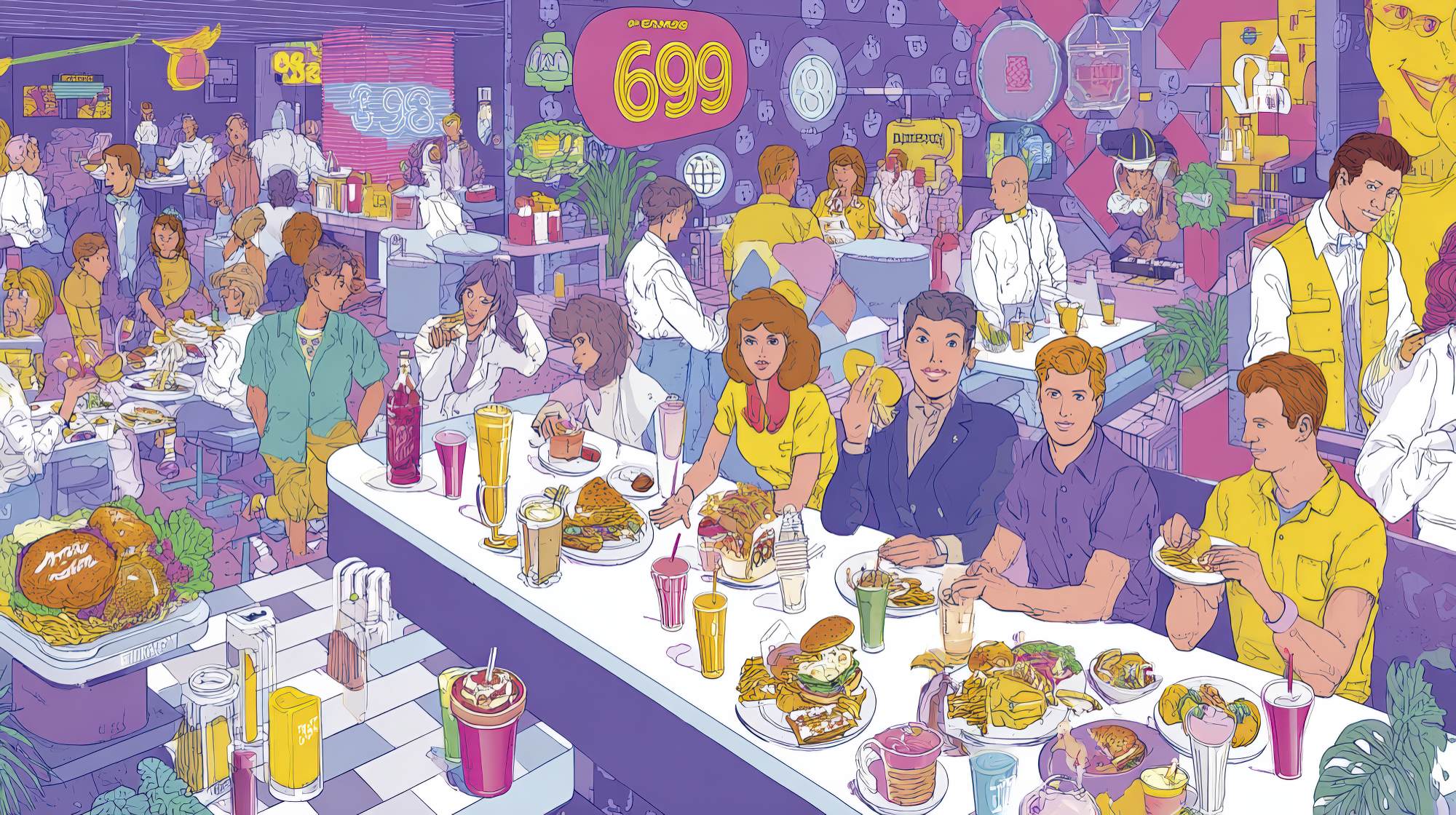
Restaurant brands used to live in obvious places: a sign over the door, a menu in someone’s hand, a dining room people could smell before they could describe. Now a lot of restaurant discovery happens in a grid of delivery app tiles, search results, map listings, and social posts that all flatten context. That shift has made brand architecture far more important than many operators realize. If you’re expanding into online ordering, launching virtual concepts, or trying to make your in-store identity work across delivery channels, you can’t treat naming, visuals, and customer experience as disconnected decisions.
I’ll say it plainly: too many restaurant groups are improvising online expansion in a way that creates short-term sales and long-term confusion. One concept gets copied into three delivery-only brands. A neighborhood restaurant suddenly appears under a different name on apps. Packaging doesn’t match the in-store promise. Customers like the food but can’t remember who actually made it. That is not smart growth. That is borrowed attention.
Good brand architecture solves this. It helps customers understand what belongs together, what is distinct, and why they should trust each offer. More importantly, it helps your team make cleaner marketing decisions as you grow. Whether you operate one flagship location or a portfolio of concepts, the goal is the same: build a structure that makes expansion feel intentional, not opportunistic.
Why restaurant brand architecture matters more online than it does on the street
In the physical world, location does a lot of branding work for you. The neighborhood, storefront, interiors, and service style all tell a story before the first bite. Online, most of that context disappears. Customers are judging you from a thumbnail, a star rating, a delivery estimate, and a few menu items. That creates a branding challenge and an opportunity.
The challenge is that digital platforms compress identity. Distinctions that feel obvious to an operator can be invisible to a customer. If your upscale sit-down concept, your fast-casual lunch spin-off, and your late-night delivery-only wing brand all look vaguely similar or share overlapping menus, people won’t understand the difference. Worse, they may assume the least flattering version: that one of the brands is fake, redundant, or low effort.
The opportunity is that online channels reward clarity. Clear brands get remembered. Clear brands earn repeat orders. Clear brands are easier to recommend. When your concept architecture is disciplined, customers know exactly what they’re choosing and what to expect. That reduces friction, and friction is the enemy of conversion.
I think a lot of restaurants still underestimate how much trust is tied to coherence. If your app listing, Instagram page, packaging, website, and physical venue all feel like separate businesses, customers don’t read that as creative flexibility. They read it as inconsistency. In food, inconsistency is expensive.
Choose the right structure: branded house, house of brands, or something in between
Most restaurant operators expanding online end up choosing between three practical models, whether they use the terminology or not.
The first is a branded house. This is when the parent restaurant brand leads, and extensions live clearly under it. Think of a known restaurant adding online ordering, catering, meal kits, or a delivery-focused sub-line that still carries the master brand. This works well when the main concept already has recognition and credibility. It’s efficient, easier to market, and usually stronger for long-term equity because every order reinforces the same brand.
The second is a house of brands. This is when separate concepts are presented as distinct brands, even if they share ownership or kitchen infrastructure. This can make sense if the audiences, cuisines, price points, or occasions are genuinely different. A premium wood-fired pizza restaurant and a playful late-night chicken tender concept probably should not be sold under the same identity. Different need states deserve different brand systems.
The third is the hybrid model, which is where many smart restaurant groups land. In this structure, the customer-facing brands are distinct enough to serve different purposes, but there is still an underlying connective logic. Maybe the visual systems share a design sensibility. Maybe the About pages reference the same hospitality group. Maybe the packaging family is coordinated without becoming identical. This can be the sweet spot because it preserves flexibility without throwing away trust.
My opinion: operators should resist creating separate online brands unless they can defend the distinction in customer terms, not just kitchen terms. “We already have the ingredients” is not a branding strategy. “This serves a different occasion, audience, and expectation” is. If the only reason the online brand exists is to game app real estate, you are building on shaky ground.
Define what should stay consistent across every touchpoint
Once you decide on the structure, the next step is identifying the brand elements that must remain consistent. This is where a lot of restaurants either overdo standardization or avoid it entirely.
Not everything needs to match. But some things absolutely need to align.
Start with brand promise. What are customers consistently buying from you besides food? Convenience, indulgence, speed, craftsmanship, comfort, celebration, health, value, local character, late-night reliability—whatever it is, name it. If your physical venue promises elevated hospitality but your delivery packaging feels generic and sloppy, the brand promise breaks. If your online-only concept promises bold flavor but the menu copy sounds sterile and corporate, the promise breaks there too.
Then look at verbal identity. Restaurants often obsess over logos and ignore language, which is a mistake. Voice matters online because words do a lot of the work visuals can’t. Menu descriptions, promotional copy, app bios, email campaigns, SMS messages, and customer service responses should all sound like they come from the same business universe. Not identical, but related. A polished neighborhood bistro should not sound like a meme-heavy snack brand unless that contrast is truly intentional.
Visual identity is next, but not in the shallow way people usually mean it. Consistency is not about stamping the same logo on everything. It’s about building a recognizable system: typography, color logic, photography style, iconography, packaging hierarchy, and layout discipline. If your in-store menu feels premium and restrained, your delivery inserts should not look like bargain-flyer clutter.
Finally, define operational consistency. This is the part marketers sometimes leave to operations, but they shouldn’t. Brand architecture is not just a naming exercise. It lives in pickup flows, bag labeling, order accuracy, food travel quality, and response time. If a concept is positioned as streamlined and fast, but every order arrives missing sauces and utensils, the architecture collapses under reality.
Make your physical venue and delivery presence feel related, not identical
This is where nuance matters. Restaurants expanding online often make one of two bad moves. They either duplicate the physical brand too rigidly, ignoring the different context of delivery, or they swing too far and create an online identity that feels detached from the original business.
The better approach is translation, not duplication.
Your physical venue has one kind of sensory power. Online ordering has another. In-store, atmosphere and service shape perception. Online, utility and clarity matter more. That means your delivery expression should preserve the core identity while adapting to the realities of small screens, quick decisions, and post-purchase moments.
For example, if your restaurant is known for warm, handwritten hospitality, maybe that shows up online through more conversational copy, thoughtful packaging notes, and a clean reorder experience. If your venue is sleek and modern, maybe the digital menu architecture is highly edited, visual clutter is reduced, and product naming is sharp and confident. The point is not to mimic the dining room. The point is to carry its essence into a different environment.
I’m generally skeptical of restaurants that hide the relationship between physical and delivery brands unless there’s a compelling reason. Customers are getting smarter about ghost kitchens and virtual concepts. They are not offended by operational efficiency. What they dislike is feeling misled. If your online brand comes from an established restaurant, that can be an asset. Credibility is useful. Use it honestly.
Naming, menus, and packaging are where confusion usually starts
If you want a practical place to audit your architecture, start with the three areas that most often expose weak strategy: naming, menu design, and packaging.
Naming should make your structure obvious enough that customers can orient themselves quickly. If a delivery-only concept is related to a flagship restaurant, decide whether that relationship should be explicit or subtle. Either can work. What doesn’t work is accidental ambiguity. Customers should not need detective skills to understand who is behind the food.
Menus need sharper boundaries than many operators give them. If every concept under your umbrella sells the same fries, same bowls, same wraps, and same dessert, your brand distinctions are probably theatrical rather than meaningful. Shared ingredients are fine. Shared identity by default is not. Each concept should have a point of view on assortment, not just a different logo on the same SKU list.
Packaging is often the first physical brand experience for delivery customers, and too many restaurants treat it as an afterthought. Cheap, inconsistent, or overbranded packaging sends the wrong signal. Good packaging doesn’t need to be expensive, but it should be disciplined. Use it to reinforce hierarchy: master brand, concept name, product cues, and maybe one memorable brand message. Don’t turn the bag into a billboard. Turn it into evidence that the brand knows itself.
Build an internal system, not just an external look
Strong brand architecture is as much an internal management tool as it is a customer-facing strategy. If your team can’t explain the difference between concepts, no amount of design polish will fix it.
Create clear rules. Which audiences belong to which concept? Which channels does each brand use? What menu overlap is acceptable? When does the parent brand appear? How should customer service be handled if one kitchen supports multiple identities? What visual assets are shared, and which are concept-specific? These are not theoretical questions. They affect ad spend, content calendars, listings, reviews, and staffing.
This matters especially as restaurant groups grow. Without a system, every new launch becomes a one-off decision. That’s how portfolios get messy. You wind up with too many names, uneven visuals, fragmented social followings, and marketing teams that spend more time explaining the structure than leveraging it.
A good architecture should make future growth easier. It should help you say yes with discipline and no with confidence.
The best restaurant brands expand online by being more intentional, not more complicated
There’s a temptation in digital expansion to keep adding concepts, offers, channels, and identities because the barriers to launch seem low. But low launch friction often produces high brand friction later. More brands do not automatically mean more market share. Sometimes they just mean more confusion.
The restaurant groups that do this well tend to share one trait: they know what each brand is for. They understand the role of the flagship. They know when to extend and when to separate. They don’t confuse operational convenience with market positioning. And they respect the fact that customers experience brands as patterns, not isolated assets.
If you’re expanding online, take the extra time to build structure before you build volume. Decide what should unify the portfolio and what should distinguish each concept. Make sure the delivery experience feels like a credible extension of the brand, not a side hustle wearing borrowed design. And above all, remember that every digital interaction either sharpens your identity or blurs it.
In restaurant marketing, clarity is underrated. But clarity is what scales.


