Last Updated on April 20, 2026 by DSNRY
A transparent look at a strategic creative workflow.
There’s a difference between a real estate portfolio that feels assembled and one that feels authored. Most agents and brokerages understand the importance of good marketing, but far fewer understand the value of a recognizable visual point of view. That gap matters. In a crowded market, buyers forget the interchangeable. Sellers don’t hire the interchangeable. And luxury clients, especially, can sense when a brand is borrowing polish instead of building identity.
A signature aesthetic is not about making every listing look identical. It’s about creating enough visual and tonal consistency that your work feels connected, intentional, and unmistakably yours. That consistency builds trust. It also makes marketing easier, because decisions stop being random and start being strategic.
I’m opinionated about this: too many real estate brands chase “elevated” without defining what elevated means for them. They copy trends from hospitality, fashion, and architecture, but never translate those references into a usable system. The result is a portfolio filled with nice images and no real story. If your marketing looks good but doesn’t feel distinct, you’re still blending in.
Building a signature aesthetic takes more than a mood board and a Canva template. It requires discipline, restraint, and a creative workflow that turns taste into repeatable standards. Done well, it shapes not only how your listings appear, but how your brand is perceived long before a client picks up the phone.
Why aesthetic consistency matters more than most real estate brands admit
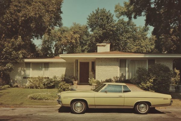
Real estate marketing has a sameness problem. Brightened interiors, drone shots at golden hour, clean sans-serif typography, vague luxury language. None of those things are wrong on their own. The issue is that they’ve become defaults instead of choices. When every listing package follows the same visual formula, your audience stops noticing the details that should set you apart.
A signature aesthetic helps solve that by creating continuity across your portfolio. When your photography, design, copy, social presence, and listing presentations all share a coherent sensibility, the cumulative effect is stronger than any individual asset. People may not consciously identify every design decision, but they absolutely register the feeling of cohesion.
That feeling influences credibility. Sellers want to know you can position a property with discernment. Buyers want to trust that what they’re seeing has been thoughtfully represented. A strong aesthetic signals that you pay attention, and in real estate, attention is currency.
It also protects your brand from becoming purely market-reactive. Without a clear aesthetic framework, every new listing becomes a fresh identity crisis. One modern home gets marketed like a boutique hotel, the next colonial gets treated like a lifestyle magazine spread, and your brand starts shape-shifting based on whatever seems trendy that month. Flexibility is useful. Inconsistency is expensive.
Start with taste, but don’t stop there
The first mistake people make is assuming a signature aesthetic starts with design software. It doesn’t. It starts with taste. More specifically, it starts with understanding your own visual instincts well enough to articulate them.
If you can’t clearly describe what you’re drawn to, your team won’t be able to execute it consistently. “Clean,” “modern,” and “luxury” are not useful directives. They’re filler words. You need sharper language: restrained, sculptural, warm minimalism, editorial contrast, sun-washed, architectural, heritage-driven, tactile, cinematic. The point is not to sound fancy. The point is to get specific.
I always recommend looking outside real estate first. Hospitality branding, independent magazines, fashion campaigns, gallery websites, restaurant interiors, book jackets, boutique packaging. Those references are often more revealing than other agents’ marketing because they show what kind of atmosphere and emotional tone you’re actually drawn to.
Then comes the more difficult part: editing. Most people don’t struggle to collect inspiration. They struggle to eliminate what doesn’t belong. A signature aesthetic is usually defined less by what you include than by what you consistently reject. Maybe you avoid overexposed photography. Maybe you never use scripted fonts. Maybe you prefer negative space over crowded layouts. Maybe your copy avoids cliché lifestyle phrases. These exclusions are what make the system recognizable.
Think of this as developing aesthetic standards, not just preferences. Preferences are casual. Standards are operational.
Build a visual system that can survive different property types
A strong real estate brand cannot depend on one kind of listing. If your visual identity only works for ultramodern homes with floor-to-ceiling glass, it’s not a system. It’s a niche styling exercise. Your aesthetic has to be flexible enough to support different architecture, neighborhoods, and price points without losing coherence.
That means choosing a few foundational elements that remain stable across everything you market. Photography direction is one. Are your images airy and soft, or shadow-forward and editorial? Do you prefer wide environmental context, or tighter detail-driven storytelling? Typography is another. Color palette, layout rhythm, copy voice, and pacing all matter too.
The goal is not to force every property into the same mold. Good marketing should respond to the property’s personality. But your brand should still function as the curator. A historic townhouse and a contemporary penthouse may require different storytelling angles, yet both can still feel like they were presented by the same discerning team.
This is where many portfolios fall apart. The marketing materials are treated as isolated projects rather than parts of a larger body of work. A signature aesthetic fixes that by introducing continuity at the brand level while allowing variation at the listing level.
Practically, that might mean creating a defined image-selection framework, a photo retouching style, a limited font pairing, a set of layout templates with room for customization, and copy guidelines that shape tone without making every description sound repetitive. You are not trying to industrialize creativity. You are trying to remove the randomness that weakens it.
Your photography is doing more brand work than your logo
Let’s be honest: in real estate, your photography carries more emotional weight than your logo ever will. People experience your brand through images first. That’s why your photo direction needs to be treated like strategy, not logistics.
Too often, photography is approached as a checklist: front exterior, kitchen, primary suite, backyard, drone, twilight if budget allows. That approach gets the job done, but it rarely produces a memorable portfolio. A signature aesthetic requires a stronger point of view behind the lens.
That starts with choosing photographers whose instincts align with your brand, not just those who produce technically competent work. Technical quality is table stakes. What matters is whether they understand mood, framing, restraint, and visual narrative. Can they photograph texture without overprocessing it? Can they make a room feel calm instead of merely bright? Can they capture architecture as architecture, not just square footage?
You also need to direct more than most agents do. Not micromanage, direct. Give references. Define priority shots. Talk about time of day, light quality, styling thresholds, and what details should be emphasized. If you want your portfolio to feel editorial, you cannot rely on generic capture and hope post-production fixes it later.
And yes, styling matters. Not in an overdone, artificially staged way, but in the disciplined sense. Remove distractions. Simplify surfaces. Let strong materials read clearly. Don’t cram every room with props to simulate “lifestyle.” The more confidence a brand has, the less it needs to oversell atmosphere.
Copy should sound like someone with taste wrote it
Most real estate copy is painfully interchangeable. “Nestled in the heart of.” “Boasting an open-concept floor plan.” “Seamlessly blends luxury and comfort.” None of it says anything, and buyers have seen it all before.
If you want a signature aesthetic, your words need to carry the same level of intention as your visuals. That does not mean every listing needs to read like a design journal. It means the tone should feel considered, specific, and free of tired language.
Good real estate copy observes. It names what is actually distinctive about a property: proportion, light, materials, setting, privacy, flow, craftsmanship, views, history, atmosphere. It understands when to be precise and when to leave room for imagination. It doesn’t inflate ordinary features into dramatic claims. Confidence reads better than hype.
Your voice also needs consistency across platforms. A listing description, Instagram caption, email campaign, and brochure shouldn’t sound like they came from four different brands. The wording can adapt, but the sensibility should remain intact.
This is one of the clearest signs of a mature marketing operation: the brand voice is recognizable even when the format changes. That kind of consistency creates familiarity, and familiarity creates trust.
The workflow is what makes the aesthetic sustainable
This is the unglamorous part, but it’s the reason some brands maintain high standards while others drift. Aesthetic consistency is not sustained by inspiration alone. It is sustained by workflow.
You need an actual process for how a listing moves from intake to launch. What gets reviewed first? Who defines the creative angle? How are photography references shared? What standards determine image selects? Who checks that social graphics, brochures, and web pages align? When does copy get refined for tone, not just accuracy?
Without a workflow, even strong taste gets diluted under time pressure. Teams default to convenience. Shortcuts become habits. Before long, your portfolio starts looking like it was built by a committee with conflicting opinions and no final edit.
A transparent creative workflow usually includes five stages: positioning, planning, production, refinement, and release. Positioning defines the story of the property and how it fits within your brand. Planning aligns photography, video, design, and copy before anything gets made. Production captures the assets. Refinement is where real quality control happens. Release ensures the final package is deployed consistently across channels.
This may sound structured, but structure is what gives creative work room to be good. The less chaos in the process, the more attention you can give to nuance.
What clients actually notice
Clients may not use the phrase “signature aesthetic,” but they notice its effects immediately. They notice when your materials feel cohesive. They notice when your listings look more expensive, more thoughtful, and more composed than the competition’s. They notice when your social presence feels curated instead of improvised.
Sellers especially respond to this because they’re not just hiring marketing output. They’re hiring judgment. They want to feel that their property will be understood and presented with care. A clear aesthetic communicates that you know how to make choices, and that matters in a business where confidence is often the deciding factor.
The irony is that a signature aesthetic can make your brand feel more personal, not less. In a market full of generic “professionalism,” distinct taste reads as human. It gives people something to remember and something to associate with you beyond transactions and production metrics.
Final take: don’t aim for polished, aim for recognizable
Polished is easy to imitate. Recognizable is harder, and far more valuable. A signature aesthetic is not about perfection or preciousness. It’s about consistency of judgment. It’s about making enough intentional choices, over a long enough period of time, that your portfolio begins to carry its own identity.
If you’re serious about elevating your real estate marketing, stop asking whether your materials look professional. That’s the minimum. Ask whether they look like you. Ask whether someone could remove your logo and still sense your brand. Ask whether your process is strong enough to produce coherence under pressure, not just when there’s extra time and budget.
That’s the real standard. Not trend-driven. Not performative. Just clear, disciplined, and creatively honest. And in this market, that alone can set you apart.