Last Updated on April 20, 2026 by DSNRY
Ensure your visual identity grows alongside your business.
Growth is exciting until your brand starts feeling like it belongs to the business you used to run, not the one you run now.
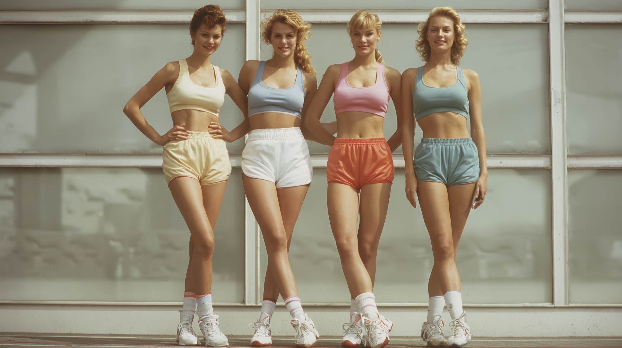
This happens all the time with fitness professionals. A trainer starts with one-to-one coaching, builds a loyal client base, then adds small-group training, online programs, nutrition support, recovery services, maybe even a second location. The business gets stronger, but the brand often lags behind. Suddenly the logo feels too narrow, the website feels stitched together, the Instagram grid looks like three different businesses sharing one account, and new prospects can’t immediately tell what you actually offer.
That disconnect matters more than a lot of people in fitness want to admit. Brand equity is not some soft, corporate idea reserved for big companies with giant budgets. For a gym owner, coach, studio founder, or personal brand in fitness, brand equity is trust. It’s recognition. It’s the feeling clients get when everything looks and sounds aligned enough that they believe your next offer will be as solid as your current one.
If you’re expanding your services, the goal is not to reinvent yourself every time you grow. The goal is to build a visual identity flexible enough to stretch without snapping. That takes intention. It also takes restraint. Not every new service needs its own mini-brand, color palette, or personality crisis.
Your Brand Should Expand, Not Fracture
One of the most common mistakes fitness businesses make during expansion is treating each new revenue stream like a separate universe. You launch strength coaching with one look, mobility with another, your online program gets a third vibe, and your corporate wellness offer somehow ends up looking like it belongs to a SaaS startup. From the inside, all of this can feel logical. From the outside, it feels messy.
Clients do not experience your business in neat organizational charts. They experience it as one brand. They see your Instagram post, click to your website, receive an email, walk into your space, and decide whether all of it feels coherent. If each service looks unrelated, your business starts to feel less established, not more dynamic.
The stronger move is to create a brand system, not just a brand look. A system gives you room to add services while staying recognizable. That means your typography, colors, photography style, messaging tone, and layout principles should be consistent enough to unify the business, but adaptable enough to let individual offers have their own emphasis.
I’m opinionated about this: fitness brands often overvalue novelty and undervalue consistency. Consistency is what makes growth feel credible. A recognizable business earns more trust than a constantly reinventing one, especially in an industry where clients are already skeptical of hype.
Audit What Your Current Visual Identity Is Actually Saying
Before you update anything, look at your current brand like a customer would. Not like the founder who knows the backstory, the pivots, and the half-finished plans. What does your visual identity communicate right now?
If your branding was built when you were only offering personal training, it may still be signaling something very specific: intimate, high-touch, trainer-led, maybe local and boutique. That can be a strength. But if you now also offer digital coaching, classes, workshops, or products, your identity may no longer reflect the scope of your business.
Ask a few blunt questions:
Does your logo still fit the business, or does it lock you into one service category?
Do your brand colors and fonts feel premium, approachable, athletic, clinical, community-driven, or something else entirely?
Does your website visually prioritize the services you most want to grow?
Do your sales pages, social graphics, signage, and email templates feel like they came from the same company?
Would a new prospect understand your offer expansion without being confused about your core focus?
This kind of audit is useful because many fitness businesses are not suffering from weak branding. They’re suffering from outdated branding. That’s a different problem. You may not need a total rebrand. You may need a thoughtful evolution.
And to be clear, evolution usually performs better than revolution. If clients already know and trust you, don’t throw away the equity you’ve built just because you’re adding services. Protect what’s recognizable. Upgrade what’s limiting.
Keep the Core, Differentiate the Offers
Here’s the balance to aim for: one master brand, clearly organized offers.
Your overall visual identity should do the heavy lifting when it comes to recognition. Then each service can have its own expression inside that system. This is where fitness professionals get a chance to be strategic instead of scattered.
Let’s say you run a fitness brand with personal training, semi-private coaching, online programming, and recovery sessions. You do not need four logos. You probably do not need four separate websites. What you do need is a clear way to distinguish each service while maintaining visual unity.
You can do that through:
Color hierarchy: one core brand palette, with accent colors assigned to specific service lines
Photography cues: distinct imagery styles for training versus recovery versus education
Page structure: similar layouts across service pages so the user experience feels familiar
Iconography or labels: subtle visual markers that help people navigate your offers quickly
Messaging architecture: a shared brand voice with different emphasis depending on the service
This matters because people don’t just buy fitness. They buy clarity. If your expanded offer suite feels organized, your business appears more mature and easier to trust. If it feels cluttered, prospects assume the client experience might feel cluttered too.
Visual identity is often treated as decoration when it should really be treated as infrastructure. It helps people understand what you do, who it’s for, and how your services connect. That is a marketing advantage, not an aesthetic bonus.
Make Sure Your Best Opportunities Look Like Your Best Opportunities
When fitness businesses expand, they often leave their visual priorities behind. The service making the most money might still be buried on the website. The new premium offer might still be promoted with Canva graphics that look like a side hustle. The studio redesign might be stunning in person while the online brand still feels years out of date.
Your visual identity should reflect your business strategy, not your business history.
If you want to grow a higher-ticket service, it should look premium. If you want to be known for transformation coaching instead of generic training sessions, your visuals should support that shift. If your expansion is aimed at attracting a broader demographic, your imagery, typography, and layout choices should make that audience feel included.
This is where a lot of fitness marketing gets too passive. Owners wait for the brand to “catch up” naturally. It rarely does. You have to make choices. You have to decide what the next version of the business is and then design for it on purpose.
Sometimes that means simplifying a visual identity that has become too noisy. Sometimes it means elevating production quality. Sometimes it means removing visual habits that were fine when you were scrappy but now actively undermine your positioning.
There is nothing wrong with looking established. In fact, more fitness brands should aim for it. The obsession with always looking edgy, intense, or trendy can backfire fast. Mature branding tends to age better, scale better, and support better pricing.
Expansion Is the Right Time to Tighten Brand Standards
If you’re adding services, staff, locations, or channels, you need clearer brand standards than you needed in year one. Otherwise every new touchpoint introduces more inconsistency.
This does not have to mean some bloated 80-page brand manual. But you should absolutely have a practical set of rules that keeps your identity intact as more people start creating materials for the business.
At minimum, document:
Your primary and secondary logo use
Your font pairings and where each should be used
Your core color palette and accent colors
Your photography style and image treatment
Your social media graphic style
Your voice and tone guidelines
Your preferred page layouts or design templates
This is especially important if you have a team. The minute multiple coaches, admins, marketers, or contractors start producing content without standards, the brand starts drifting. Not because anyone is careless, but because everyone is improvising.
Improvisation can work in coaching. It does not work well in branding.
A clear standard is what allows your business to look bigger, sharper, and more intentional as it grows. It also makes marketing faster. People spend less time guessing and more time executing.
Don’t Let Social Media Become the Default Brand Identity
Fitness professionals often build their brands on Instagram first, which makes sense. It’s visual, immediate, and community-driven. But as you expand your services, you cannot let social media aesthetics become the only thing defining your brand.
Social content changes quickly. Trends shift. Design styles come and go. What performs in a reel thumbnail is not always what supports long-term brand equity. If your identity is too dependent on platform trends, your brand starts feeling disposable.
Your website, email design, sales materials, printed collateral, studio environment, and onboarding experience should all reinforce the same visual world. That’s how a business starts to feel real and established, not just visible.
I’d go further: many fitness brands are over-marketed on social and under-branded everywhere else. They have content volume but not brand structure. Great reach, weak cohesion. That works for attention, but not always for conversion or retention.
A strong visual identity should survive outside the feed. If it only works as a social style, it’s not robust enough for expansion.
Growth Should Feel Familiar to Your Existing Clients
The final test of brand expansion is this: can your current clients recognize themselves in the next version of your business?
You want growth to attract new people without alienating the ones who helped build the brand in the first place. That’s why maintaining brand equity matters. Your best clients already trust the business. Your visual identity should reassure them that expansion means improvement, not dilution.
That doesn’t mean nothing changes. It means the changes feel connected to the same core values, same quality standard, same point of view. Familiar, but elevated.
In fitness, people are not just buying access to workouts. They are buying confidence in your method, your standards, and your consistency. Your brand identity should reflect that every time you evolve.
If your business is growing, your visual identity should grow with it deliberately. Not reactively. Not randomly. Not one rushed launch at a time.
The best fitness brands do not look like they are constantly starting over. They look like they know exactly who they are, even as they expand what they offer. That is the sweet spot. And it’s worth protecting.