
Last Updated on April 20, 2026 by DSNRY
Learn to calibrate visual tone so imagery matches the experience guests expect.
Restaurant marketing gets judged in seconds, and photography does a lot of that judging before a guest ever reads a menu, checks your hours, or decides whether your reservation policy feels annoying or worth it. People look at your photos and make a snap call: expensive or casual, polished or chaotic, special occasion or Tuesday lunch, chef-driven or just trying too hard. That judgment isn’t shallow. It’s efficient. Guests use imagery to predict what kind of experience they’re walking into and whether the price will feel fair.
That’s why photography direction matters so much. Not “pretty pictures,” not “content,” not “something for Instagram.” Direction. The deliberate visual choices that tell people what kind of restaurant you are and what kind of bill they should expect at the end. When those cues are aligned, your marketing builds trust. When they’re off, you create friction before service even begins.
I’ve seen restaurants undersell themselves with flat, bargain-looking imagery even though the food and service were excellent. I’ve also seen mid-priced places shoot themselves like luxury brands, only to disappoint guests who arrive expecting a more elevated room, more polished service, and more theatrical plating than the operation can consistently deliver. In both cases, the problem isn’t photography quality alone. It’s tonal mismatch.
Price point isn’t just a number. It’s a visual promise.
Most operators think about price point in terms of menu engineering, food cost, labor, and competitive set. Fair enough. But guests experience price point emotionally before they experience it mathematically. They don’t just ask, “How much does the entree cost?” They ask, “Does this place look like it’s worth what they’re going to charge me?”
Your photography helps answer that question.
A neighborhood pasta spot with approachable pricing should not look like a hushed tasting-menu temple unless that’s truly how it feels in the room. Likewise, a premium steakhouse shouldn’t rely on dim, messy phone shots that make a $68 ribeye feel like a gamble. The visual language has to support the check average. That means the lighting, styling, composition, camera distance, surfaces, props, cropping, retouching, and even the pace implied in the image all need to reinforce the same message.
Here’s the blunt take: guests are usually forgiving of price when the brand signals feel honest. They get annoyed when the visuals overpromise or underframe the experience. If your images say “exclusive” and your service says “busy and informal,” trust takes a hit. If your images say “cheap eats” and your product is actually thoughtful, premium, and carefully sourced, you’re likely attracting the wrong customer and training them to compare you to lower-priced alternatives.
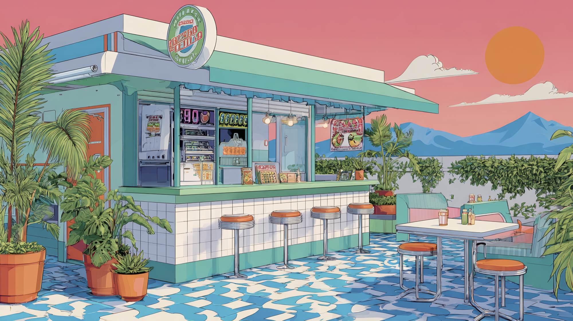
Cheap-looking and approachable are not the same thing
This is where a lot of restaurant marketing goes sideways. Operators often want photography that feels “real,” “fun,” or “accessible,” which is smart. But in practice, that sometimes becomes careless lighting, cluttered tables, overstuffed compositions, inconsistent edits, and close-up food shots with no atmosphere. The result feels less approachable than underconsidered.
Approachable visual tone still needs intention. A casual restaurant can use bright natural light, energetic framing, hands in the shot, shareable tablescapes, and a little motion to create warmth and immediacy. But the image still needs restraint and point of view. The textures should feel appetizing, not greasy. The backgrounds should feel lively, not chaotic. The styling should feel abundant, not random.
On the higher end, the opposite mistake happens. Teams assume expensive has to mean dark, moody, and minimal to the point of lifelessness. They strip out too much humanity. The room looks sterile. The plates look precious. The whole thing starts reading as concept art instead of hospitality. Premium doesn’t mean cold. It means confidence, discipline, and detail.
The best photography direction doesn’t mimic a category cliché. It captures the emotional truth of the experience and makes the price feel coherent.
Use these visual levers to match imagery to the guest check
If you want your photography to align with your price point, stop thinking in vague adjectives and start working with specific visual levers.
Lighting: Bright, even lighting tends to support casual, daytime, energetic concepts. Controlled shadows, directional lighting, and richer contrast often signal intimacy, craft, and higher perceived value. Neither is automatically better. They just tell different stories.
Composition: Tighter crops can highlight texture and craveability, but if every image is a hyper-close food shot, guests lose context. Wider compositions that show spacing, materials, glassware, and service details often help justify premium pricing because they communicate environment, not just product.
Styling: Budget-friendly and mid-market brands usually benefit from visual abundance. More dishes on the table, visible pours, shared plates, moments of interaction. Fine dining and upscale concepts typically need more editing discipline. One plate with room to breathe can feel more expensive than six plates jammed into frame.
Props and surfaces: Tabletops, linens, utensils, glassware, and even menu corners matter. If your restaurant charges premium prices but your photos feature scratched laminate, mismatched props, or generic stock-style surfaces, the image weakens the value story. On the flip side, a humble concept styled with too much polished stone, overdesigned florals, and luxury cues can feel fake.
Color treatment: Over-saturated edits often pull a brand downmarket. Desaturated doesn’t automatically equal upscale, but controlled color usually reads more intentional. Skin tone, food tone, and ambient warmth all need attention. Guests should feel the restaurant, not the filter.
Human presence: Ask yourself how much of the hospitality should be visible. Lower and mid-priced restaurants usually gain from more social energy in the frame. Premium concepts often benefit from selective human presence: a server’s hand, a wine pour, a guest leaning in. Enough life to feel inhabited, not so much that the image becomes noisy.
Photograph the whole value equation, not just the plate
One of my strongest opinions on restaurant content is this: too many brands obsess over food photography and ignore the rest of the value equation. Guests are not paying only for the dish. They are paying for mood, service, comfort, pace, design, ritual, and confidence. If your imagery focuses only on plated food, you’re marketing like a takeout menu even when the actual business is an on-premise experience.
This is especially important as prices rise. The higher the check average, the more your photography has to communicate the total environment. Show the banquette. Show the bar glow. Show the spacing between tables if privacy is part of the value. Show the hand-polished stemware if beverage matters. Show the open kitchen if craftsmanship matters. Show the city view if the room is part of the justification.
Even for more affordable restaurants, atmosphere matters. A guest choosing between three similar lunch spots may decide based on who looks cleaner, friendlier, more vibrant, or more dependable. Photography direction should make those cues obvious.
If your current library is 90 percent entrees and 10 percent everything else, you’re probably not telling the full pricing story.
Audit your imagery for expectation gaps
A simple exercise: pull up your website, Instagram grid, Google Business profile, third-party delivery listings, and any press photos side by side. Then ask three brutally honest questions.
What check average would a first-time guest assume based only on these images?
What level of service would they expect?
What occasion would they think this restaurant is for?
If the answers don’t line up with reality, you’ve found your problem.
Maybe your affordable brunch concept looks too polished and “occasion” heavy, which can scare off frequent local traffic. Maybe your higher-end restaurant has too many casual party shots, making it look more like a social bar than a serious dinner destination. Maybe your image quality is inconsistent, which quietly signals inconsistent execution. These are not cosmetic issues. They affect who walks in, what they order, how they evaluate the bill, and whether they come back.
Expectation management is one of the most underappreciated jobs in restaurant marketing. Good photography doesn’t just attract attention. It pre-qualifies the right guest.
Give photographers a strategy, not just a shot list
A lot of disappointing restaurant shoots happen because the brief is thin. Teams ask for “food, interiors, lifestyle, and some verticals for social,” which is a production checklist, not a brand point of view. If you want imagery that supports your pricing, the photographer and creative team need sharper direction.
Start with these questions before the shoot:
What should a guest feel when they see these images?
What price range should the photos imply?
Should the restaurant feel everyday, celebratory, exclusive, relaxed, bustling, or quietly refined?
Which details make the experience worth paying for?
What visual elements would accidentally push us too cheap or too luxury?
That last question is important. Great direction is often about what to avoid. Maybe you don’t want overhead-only food shots because they flatten the room’s sophistication. Maybe you want to avoid overly staged cheersing shots because they cheapen a more serious dining experience. Maybe you don’t want heavy flash because it fights the warmth of your actual environment. Creative boundaries save brands from generic outcomes.
And please, involve operations. If the service experience is intentionally swift and casual, the imagery shouldn’t imply lingering white-tablecloth formality. If the kitchen sends out highly detailed plates that require precision, the shoot styling should respect that. Marketing should not invent a restaurant that service can’t deliver.
Consistency beats spectacle
One amazing hero image won’t fix a scattered visual identity. What matters more is whether the full set of images tells a coherent story over time. Guests encounter your brand across channels, not in a single campaign layout. If your website looks upscale, your Instagram looks playful, your Google listing looks accidental, and your press kit looks like a different restaurant entirely, the brand starts to feel unstable.
Consistency doesn’t mean every image looks identical. It means they all seem to belong to the same establishment, the same price band, and the same guest promise. A reliable visual system builds confidence. And confidence is incredibly valuable in hospitality, especially when consumers are more selective about where they spend.
The restaurants that do this well usually aren’t the ones chasing every trend. They know who they are. They know what their prices ask guests to believe. And they make sure the photography reinforces that belief at every touchpoint.
The goal is alignment, not aspiration for its own sake
It’s tempting to use photography to make a restaurant look more expensive than it is. Sometimes that works for a moment. More often, it creates disappointment. The better move is to look exactly as good as the experience feels on its best, most reliable night. That’s the sweet spot. Not inflated. Not undersold. Accurate in a flattering, strategic way.
When visual tone aligns with your restaurant’s price point, marketing gets easier. The right guests show up with the right expectations. They understand the proposition faster. They are more likely to see the bill as fair. And your brand feels more trustworthy before anyone takes the first bite.
That’s what great restaurant photography direction really does. It doesn’t just make people hungry. It makes the experience make sense.


