
Last Updated on April 20, 2026 by DSNRY
Learn how typography, layout, and imagery influence ordering behavior and perception.
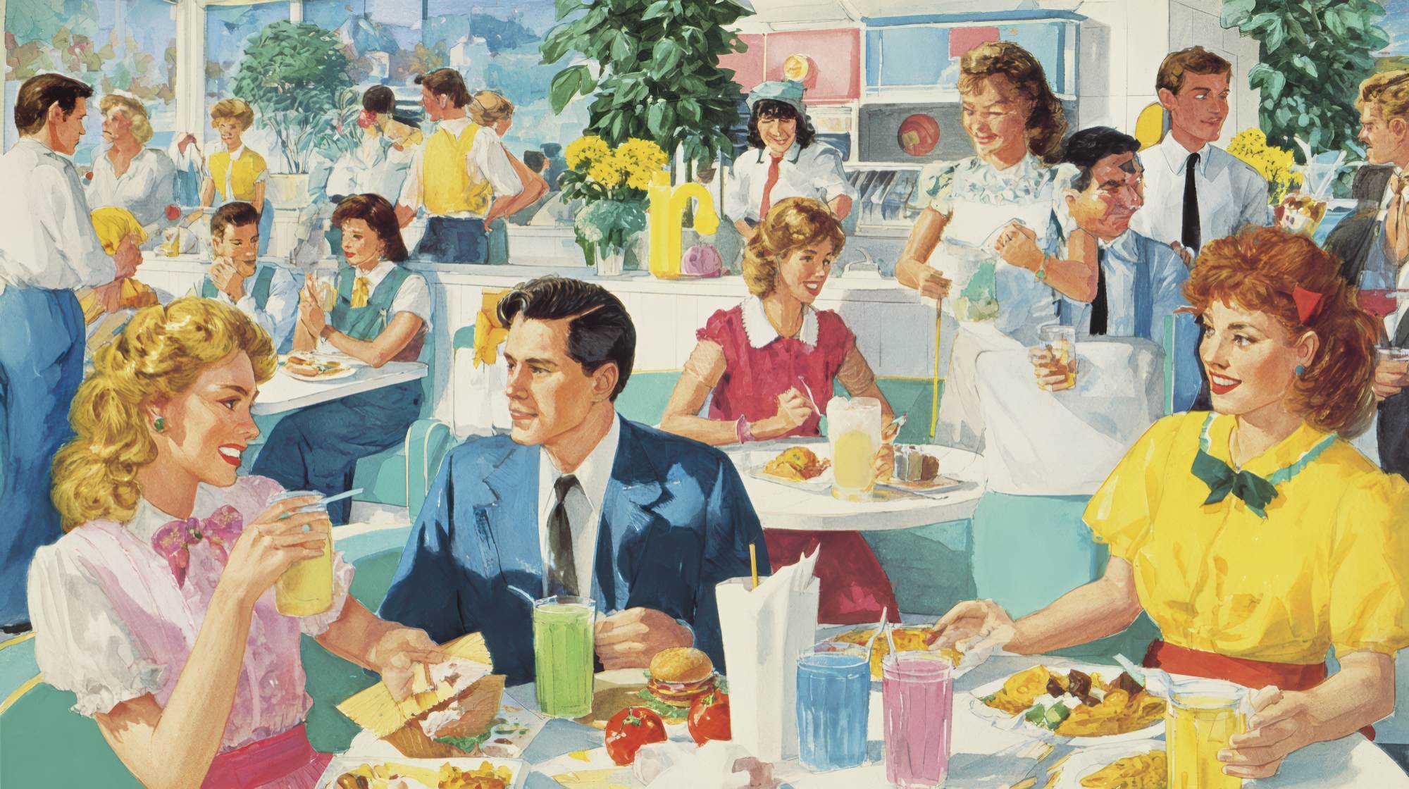
Restaurant operators spend a lot of time thinking about food cost, labor, and service standards. They should. But one of the most overlooked marketing tools in the building is sitting in guests’ hands for ten or fifteen minutes every visit: the menu.
I’ve always thought it was strange how often menu design gets treated like a last-minute formatting task. A few font choices, some dish descriptions, maybe a logo at the top, and done. That mindset misses the point entirely. A menu is not just a list of items. It is one of the most persuasive brand documents a restaurant will ever produce. It shapes what people notice, what they crave, what they think is worth the price, and ultimately what they order.
Good menu design does not feel pushy. It feels natural. That is exactly why it works. The strongest restaurant marketing is often subtle. It guides instead of shouts. It reinforces the experience instead of distracting from it. A smart menu does all of that while helping guests make decisions faster and with more confidence.
The Menu Is a Salesperson, Not a Catalog
Too many menus are built like inventories. They try to be exhaustive, neutral, and “fair” to every item. That sounds reasonable, but it is not effective. Guests do not walk into a restaurant hoping to study a spreadsheet. They want to be led.
A menu should function more like a well-trained server: confident, clear, and slightly strategic. It should know what the restaurant wants to be known for. It should understand margin. It should help direct attention toward signature items, profitable dishes, and combinations that improve the guest experience while supporting the business.
This is where menu design becomes marketing. Every design decision communicates something. A cramped layout suggests confusion or cost-cutting. A clean, thoughtfully spaced menu suggests quality and control. Long, cluttered descriptions can make a restaurant feel like it is trying too hard. Short, sharp language can feel more premium when used well.
If a restaurant says it is modern and elevated, but its menu looks like it was assembled in five different fonts on a deadline, the brand promise breaks immediately. That disconnect matters. Customers may not articulate it that way, but they feel it.
The menu is often the first moment when brand identity becomes practical. It moves from logo and decor into actual buying behavior. That is why I tend to see menu design less as graphic design and more as conversion design.
Typography Does More Than Make Things Look Nice
Typography has a real effect on how guests interpret quality, personality, and price. That may sound dramatic, but it is true. Fonts are not neutral.
A refined serif can signal tradition, craft, or upscale dining. A clean sans serif can suggest modernity, simplicity, or freshness. A handwritten accent might add warmth in the right setting, but overdo it and the whole menu starts feeling unserious. The wrong font choice can create tension between the restaurant’s concept and the customer’s expectations.
Readability matters just as much as style. If people have to work to read the menu, they get tired faster, ask fewer questions, and often default to safe choices. That is not ideal if you are trying to introduce signature items or promote higher-margin dishes. Good typography lowers friction.
There is also pacing to consider. Larger type and stronger hierarchy tell guests where to start. Subheads, spacing, and contrast help them scan. This is especially important because most diners do not read menus from top to bottom. They skim, bounce, compare, and narrow down options based on visual cues before they ever get to the full description.
One opinion I hold pretty firmly: restaurants often underestimate how much trust is built through legibility. A clean, easy-to-read menu feels more professional. It makes pricing feel more justified. It creates calm. In a dining environment, calm is valuable. Calm diners tend to order with more confidence.
Layout Shapes Attention and Influences What Sells
Layout is where the business strategy becomes visible. What is placed first, what gets breathing room, what gets boxed, and what gets buried all affect sales.
This is not about manipulation. It is about prioritization. Every restaurant has items it wants to sell more often. Those may be signature dishes, high-margin appetizers, cocktails, seasonal features, or desserts that round out the check average. A strong layout supports those goals without making the menu feel gimmicky.
Visual hierarchy matters here. Guests naturally gravitate toward areas with white space, contrast, and structure. If every section is dense and every item is formatted the same way, nothing stands out. If one dish gets a subtle callout, a slightly stronger description, or placement in a high-attention area, it has a better chance of being noticed and chosen.
But restraint matters. I see too many menus trying to feature everything. Boxes, stars, icons, photos, labels, chef recommendations, bestsellers, spicy markers, gluten-free indicators, and promotional banners all fighting for attention. When everything is emphasized, nothing is emphasized.
The best layouts make choices. They understand that editing is a marketing skill. A menu does not need to show off every possibility. It needs to create a clear path through the meal and gently point guests toward the dishes that define the restaurant best.
There is also a pricing component. How prices are displayed influences perception. Lining up prices in a neat column can encourage comparison shopping, which is not always what you want. Integrating prices more naturally into the item listing can keep the focus on the dish itself rather than reducing the decision to a numbers game. For many restaurants, that small shift alone can change ordering behavior.
Imagery Should Support Appetite, Not Replace Imagination
Food photography in menu design is one of those areas where restaurants tend to swing too far in either direction. Some avoid imagery completely out of fear of looking cheap. Others overload the menu with photos and unintentionally make the brand feel less premium.
The truth is, imagery can be incredibly effective when used selectively and well. A strong hero image can set the tone, communicate freshness, and create appetite before a guest reads a single line. It can also clarify unfamiliar dishes or spotlight specialties in a way that increases trial.
But quality is everything. Weak photography hurts trust faster than no photography at all. If the lighting is poor, the styling is dated, or the images do not match the food that arrives at the table, the menu starts undermining the entire experience.
There is also the issue of volume. In most cases, a few intentional images will outperform a menu crowded with visuals. People still want room for imagination. A good description paired with one or two strategic images often creates more desire than a full-page collage of every entrée in the house.
Imagery extends beyond food photos, too. Color palette, iconography, illustration, texture, and even paper stock all play a role in perception. These details tell diners whether a restaurant feels polished, playful, classic, rustic, or contemporary. They do not just decorate the brand. They help define it.
My take is simple: use imagery to reinforce appetite and identity, not to compensate for weak positioning. If the concept is sharp, the menu should amplify it, not explain it to death.
Description, Naming, and Design Work Together
One of the biggest mistakes in menu marketing is separating copy from design. They work best as a unit. A beautifully designed menu with flat item names and generic descriptions will still underperform. Likewise, strong copy buried in poor formatting loses power.
Dish names should do more than identify ingredients. They should signal experience. “Roasted Chicken” may be accurate, but “Herb-Roasted Half Chicken” gives shape and mood. Descriptions should create interest without becoming novels. The goal is to spark appetite and reduce uncertainty, not to write a short essay under every entrée.
Where restaurants really win is in the alignment between wording and presentation. Signature items should feel like signature items. Seasonal dishes should look timely. Premium offerings should be framed with enough space and confidence that the guest understands their value before glancing at the price.
That kind of consistency is not accidental. It comes from approaching the menu like a marketing asset with a point of view. What are we known for? What do we want first-time guests to try? What ordering patterns are we trying to encourage? Which items deserve more visual support?
Those are marketing questions. The menu should answer them clearly.
Practical Moves Restaurants Can Make Right Now
If a full menu redesign is not in the cards this quarter, there are still useful improvements most restaurants can make quickly.
First, audit your top-margin and top-performing items. Are they visually easy to find? If not, fix that. Better placement and hierarchy can produce meaningful gains without changing the menu entirely.
Second, simplify. Cut unnecessary visual clutter, reduce font inconsistency, and create more breathing room. A cleaner menu almost always feels more premium.
Third, review your descriptions. Remove filler language and make sure your strongest dishes have the strongest copy. Be specific, appetizing, and concise.
Fourth, look at pricing presentation. If your menu unintentionally encourages guests to scan for the cheapest option, rethink how prices are integrated.
Fifth, if you use imagery, upgrade it. One excellent image beats six mediocre ones every time.
And finally, test with fresh eyes. Ask someone unfamiliar with the menu to tell you what they notice first, what they would order, and what feels confusing. Operators are often too close to their own materials to see the friction points clearly.
A Better Menu Creates a Better Brand Experience
The strongest restaurant brands understand that marketing is not confined to ads, social posts, or promotions. Marketing lives inside the guest experience. The menu is one of the clearest examples of that.
When typography is intentional, layout is strategic, and imagery is used with discipline, the menu becomes more than a tool for taking orders. It becomes a quiet but persuasive extension of the brand. It can raise perceived value, guide decisions, improve check averages, and make the entire dining experience feel more polished.
That is why menu design deserves more respect than it usually gets. It is not decoration. It is positioning. It is sales strategy. It is restaurant marketing in one of its most practical forms.
And unlike a lot of marketing tactics, this one meets customers exactly where their attention already is. That alone makes it worth getting right.


