Last Updated on April 20, 2026 by DSNRY
Developing visual identities that endure for decades.
In real estate marketing, most teams know how to look competent. They can put together a clean brochure, commission decent photography, launch a polished website, and produce signage that feels current enough. That’s the baseline. It’s what I’d call professional creative: capable, respectable, and often perfectly serviceable.
But premium creative is something else entirely.
Premium isn’t just prettier. It isn’t simply more expensive, more luxurious, or more minimal. It’s more disciplined. More intentional. More connected to the long-term value of the asset, the perception of the brand, and the kind of buyer or tenant you want to attract. In real estate, where timelines stretch, market conditions shift, and projects live or die on confidence as much as facts, that difference matters more than people admit.
I’ve seen projects with healthy budgets still settle for work that looks “good enough,” then wonder why the brand feels forgettable six months later. I’ve also seen developments with tighter constraints make sharper decisions and come away with a market presence that feels unmistakably premium. The gap is rarely raw budget alone. More often, it’s taste, clarity, restraint, and the willingness to build a real identity instead of a campaign that burns bright and fades quickly.
Professional gets the job done. Premium changes perception.
Professional real estate creative usually checks the boxes. The logo is clean. The renderings are strong. The website functions well. The sales deck tells the story. Nothing is obviously wrong, and in many cases, that’s enough to get a project to market.
But premium creative does something more important: it shapes how people feel before they’ve made a rational decision. It gives a project gravity. It makes the audience assume the product is better managed, better considered, and ultimately more valuable. That’s not superficial. In real estate, perception directly affects trust, urgency, pricing power, and absorption.
Here’s the hard truth: many brands confuse polish with depth. A sleek typeface and a moody color palette can make a project look elevated for a moment, but if the identity has no real point of view, it won’t hold up across signage, social, digital ads, leasing collateral, and on-site experience. Premium creative carries a central idea consistently. It doesn’t rely on aesthetic tricks alone.
You can usually tell the difference by asking one simple question: does this brand have a point of view, or just a style?
If it’s only style, it may look current today and tired tomorrow. If it has a point of view, it can evolve without losing itself.
Premium brands are built on strategic restraint
One of my stronger opinions on real estate marketing is this: too much creative work is trying far too hard to prove value instead of quietly embodying it.
Premium branding is rarely loud. It doesn’t overload the audience with adjectives like elevated, curated, timeless, bespoke, iconic, and refined all at once. In fact, when I see real estate copy and visuals straining that hard, it usually signals insecurity. Premium projects don’t need to announce their status every five seconds. They establish it through coherence, confidence, and control.
That restraint should show up everywhere.
In the visual identity, it means a system that isn’t cluttered by decorative decisions. In photography, it means images that feel composed rather than over-produced. In copywriting, it means language that sounds informed and precise, not inflated. In web design, it means giving the content room to breathe instead of burying it under motion effects and generic luxury tropes.
Restraint is difficult because it requires making fewer, better choices. It asks developers, marketers, and creative teams to define what the project truly stands for and what it doesn’t. That can feel uncomfortable, especially when there’s pressure to appeal to everyone. But broad appeal is often the enemy of premium perception.
The most enduring real estate brands are selective. They know who they’re speaking to. They know what matters to that audience. And they resist the urge to decorate the identity with every trend, amenity, and aspiration at once.
Enduring visual identity starts before design begins
If you want a visual identity that lasts for years instead of seasons, the work starts before anyone opens a design file.
Too many real estate marketing processes jump straight into naming, logos, and mood boards before they’ve done the harder foundational thinking. What is this asset really offering beyond square footage and finish packages? What role does it play in the neighborhood? What kind of life is it promising? What tensions exist between the architecture, the location, the pricing, and the target audience? Where is the project genuinely differentiated, and where is it simply competent?
Without answers to those questions, creative teams are forced to manufacture distinction visually. That usually leads to branding that looks expensive but feels interchangeable.
An enduring identity is rooted in truth. Maybe the truth is heritage. Maybe it’s contemporary urban convenience. Maybe it’s privacy, family life, architectural rigor, or hospitality-level service. But there has to be a believable center of gravity. The visual identity then translates that truth into a system of typography, color, imagery, layout, language, and tone.
The strongest systems don’t just work on launch materials. They work five years later when you need refreshed digital ads, a leasing campaign, investor collateral, construction signage, event invitations, and neighborhood partnerships. That’s the standard. If the identity only works beautifully on the first brochure cover, it isn’t premium. It’s fragile.
Where real estate creative often loses its edge
There are a few patterns I see repeatedly when projects fall short of premium, even after serious investment.
First, they confuse aspiration with imitation. Someone sees what another successful development did and wants a version of that. The result is work that references the right category cues but lacks originality. It may look familiar in a reassuring way, but it won’t be memorable. Premium branding can understand the market without copying its accent.
Second, they let too many stakeholders dilute the signal. Real estate projects naturally involve developers, brokers, investors, consultants, and internal teams. Input is necessary. But when every opinion gets equal visual weight, the brand loses sharpness. Premium work usually comes from a process where someone is willing to protect the idea.
Third, they separate brand and performance marketing as if they’re unrelated. This is a mistake. The visual identity isn’t a cosmetic layer sitting on top of paid media, social content, or lead generation. It affects how every ad is received, how every landing page converts, and how every sales conversation begins. Premium creative should improve performance, not compete with it.
And fourth, they chase contemporary trends too aggressively. There’s nothing wrong with being current. Real estate marketing should feel alive to the moment. But if the identity is built entirely on trend language, trend colors, trend editing styles, and trend layouts, you’re borrowing relevance instead of building equity. In a business where projects are expected to hold value over time, that’s a short-sighted move.
How to create work that feels premium in practice
Let’s make this practical. If you’re building or refreshing a real estate brand and you want the outcome to feel genuinely premium, a few principles matter more than most.
Start by defining the brand idea in one sentence that actually means something. Not a vague mission statement. A real strategic lens. The kind of sentence that helps your team decide what belongs and what doesn’t.
Then build a visual system, not just a logo. Premium identity lives in the full system: typography hierarchy, art direction, image treatment, color behavior, editorial structure, motion rules, iconography, and tone of voice. A nice logo cannot carry a weak system for long.
Invest heavily in copy. This is a chronically undervalued part of real estate marketing. Smart visuals pull people in, but language establishes intelligence, confidence, and distinction. Generic copy is one of the fastest ways to make a premium-looking brand feel average.
Audit every audience touchpoint. Ask whether the website, brochures, social channels, email templates, listings, signage, and sales environment all feel like they belong to the same world. Premium brands don’t fragment under pressure.
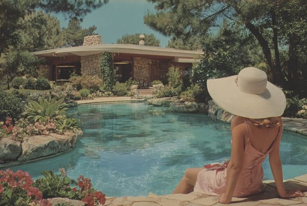
Be selective with imagery. Not every rendering needs cinematic drama. Not every lifestyle image needs to scream aspiration. A more controlled, editorial point of view usually ages better and feels more credible.
Finally, protect the brand after launch. This is where many teams fail. They commission strong foundational work, then slowly erode it through inconsistent execution, rushed vendor adaptations, and one-off decisions made for convenience. Premium is as much about stewardship as creation.
Why this matters more in real estate than in most industries
In some categories, brands can reinvent themselves quickly. Real estate doesn’t always have that luxury. Developments have long sales cycles. Properties live in public view. Leasing and sales materials circulate widely. Signage sits in neighborhoods for months or years. The visual and verbal decisions you make early can echo for a very long time.
That’s exactly why the distinction between merely professional and truly premium matters so much here. In real estate, brand identity isn’t just a wrapper for the marketing campaign. It becomes part of the asset’s perceived value. It affects how the market talks about the property, how brokers present it, how buyers compare it, and how confidently the team can defend pricing.
When the creative is only professional, it may support the launch. When it’s premium, it supports the life of the asset.
And that should be the goal. Not work that feels trendy for a quarter. Not work that looks expensive in a pitch meeting. Work that earns trust, reinforces quality, and stays recognizable long after the initial excitement wears off.
The projects that get this right usually share one belief: branding is not an ornamental exercise. It is an operational one. It clarifies how the project presents itself to the world and how consistently that promise is delivered. That’s why premium creative tends to feel calm, assured, and memorable. It’s not trying to compensate for uncertainty. It’s expressing conviction.
That’s the real difference. Professional creative says, “we’re ready to market.” Premium creative says, “we know exactly what this is, and the market will feel that.”
In an industry crowded with competent work, that difference is where lasting value gets built.