
Last Updated on April 20, 2026 by DSNRY
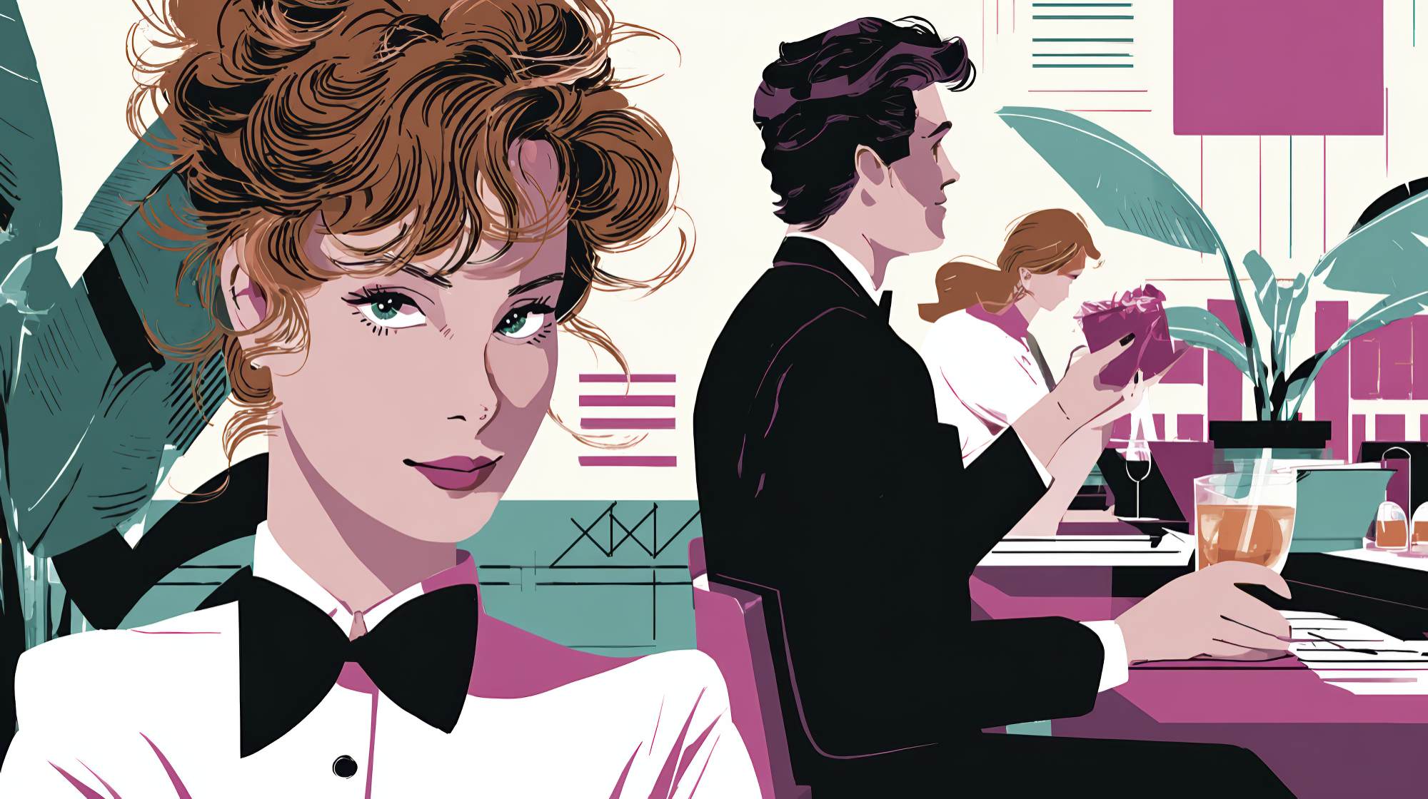
Explore interface details that build expectation before guests arrive.
Restaurant marketing often gets reduced to the loud stuff: paid ads, influencer drops, email offers, loyalty perks, grand-opening campaigns. Those things matter, sure. But the most underrated sales tool in restaurant marketing is still the website experience itself. Before anyone tastes the food, hears the playlist, or catches that first wave of heat and garlic when the plate lands, they’ve already started forming expectations. And increasingly, that moment happens on a screen.
That’s why restaurant websites shouldn’t just “provide information.” That phrase has done enough damage. A restaurant website should stage the emotional prelude to the meal. It should create a sense of pace, texture, confidence, and appetite. It should feel like the first course.
I think too many operators treat the website as a compliance document: hours, address, menu PDF, reservation link, done. Functional, yes. Memorable, not even a little. If your dining room is carefully designed but your website feels sterile, generic, or clumsy, you’re creating a brand gap right before the guest decides whether to book. That gap costs attention, and attention is expensive.
The better approach is to think about your website as an anticipatory environment. Good restaurant marketing doesn’t merely persuade people to visit. It builds expectation in a way that makes the visit feel inevitable.
The website is not separate from the restaurant experience
There’s still a lingering habit in hospitality of treating digital and physical experiences as separate departments. The restaurant is where the “real” brand lives; the website is just a utility. I don’t buy that. For many guests, the website is the front door. In some cases, it’s the host stand, the menu presentation, the first impression of service standards, and the final nudge before conversion—all at once.
If the homepage is slow, cluttered, confusing, or visually off-brand, guests feel that friction immediately. They may not articulate it in those terms, but they register it. A disorganized interface quietly suggests a disorganized operation. A dated design implies a dated experience. A hard-to-find reservation button makes booking feel oddly difficult, and difficulty is deadly in a category with infinite alternatives.
On the other hand, a website with intention does something subtle and powerful: it assures the guest that care exists here. Not just in the kitchen, but everywhere. In branding. In timing. In communication. In details. That feeling matters because restaurants are emotional purchases, not just practical ones. Even when someone is choosing where to eat on a random Thursday, they are still buying a mood.
The smartest restaurant marketers understand this. They know the site doesn’t need to do everything. It needs to do the right things with clarity and feeling. It should reduce uncertainty while increasing desire. That’s the sweet spot.
Design should create appetite, not decoration
One of my strongest opinions here: restaurant websites are too often either overdesigned or under-imagined. Some try to win with flashy motion, oversized transitions, and dramatic visuals that slow everything down. Others take the opposite route and feel like templated directories with no point of view. Neither is ideal.
Good interface design for restaurants should create appetite. That sounds obvious, but it’s surprisingly rare. Appetite isn’t just about food photography. It’s also about rhythm, spacing, typography, color, motion, and sequencing. The website should reveal just enough, just when the guest wants it, in a way that feels natural and enticing.
Think about how anticipation works in the dining room. A great restaurant doesn’t dump every sensory input on a guest at once. It layers the experience. The website should do the same. The hero image or opening frame should establish mood instantly. The navigation should feel effortless. The menu should be easy to scan but still expressive. Reservation pathways should be obvious without shouting. Photography should feel lived-in, not stock-polished into unreality.
And please, let’s retire the idea that more visuals automatically equal more impact. One excellent image with proper pacing can outperform a bloated gallery every time. Appetite comes from restraint as much as abundance. Show confidence. Let the food, room, and tone breathe.
I’d also argue that texture matters more than trend. Trendy interfaces age fast. Texture lasts. If your restaurant is warm, moody, intimate, energetic, refined, playful, or deeply local, the website should express that through the details: font choices, button styling, image treatment, copy voice, and micro-interactions. A polished site that could belong to any restaurant is still generic, and generic doesn’t build anticipation.
The practical details are part of the seduction
There’s a false divide between atmosphere and utility in web design. Marketers sometimes assume that the “romantic” parts of the experience live in storytelling and imagery, while the practical details are just back-end necessities. In restaurant marketing, the practical details are part of the persuasion.
Hours, location, parking notes, reservation policies, dietary accommodations, private dining information, happy hour timing, patio availability—these things are not boring. They are conversion points. They answer the tiny hesitations that keep people from committing.
When practical information is hard to find, guests don’t experience mystery. They experience friction. Mystery is great in a cocktail list. It’s terrible in reservation flow.
The best restaurant websites understand that anticipation grows when uncertainty shrinks. If guests know what to expect, they can focus on wanting the experience instead of decoding it. That means the interface needs to support decision-making gracefully.
Some practical guidance:
Make reservations visible above the fold on mobile and desktop. Not buried in a menu, not competing with five other calls to action, not styled so delicately that no one notices it. If booking matters, act like it matters.
Present menus natively on the site whenever possible. PDF menus still have their place, but they’re often clunky on mobile, harder to update, and disconnected from the overall brand experience. A native menu is easier to browse and easier to turn into a marketing asset.
Use location and access details intelligently. If parking is difficult, say so and offer guidance. If the entrance is tucked away, show it. If the neighborhood is part of the draw, frame it as part of the outing.
Clarify the format of the experience. Tasting menu? Walk-ins welcome? Counter service? Reservations recommended? Family-friendly before a certain hour? Guests appreciate cues. They help people self-select into the right experience.
That’s good marketing. Not because it “sells harder,” but because it sells smarter.
Microcopy and interface tone do more branding than people realize
If you want a website to build expectation, don’t obsess only over visuals. Pay attention to language at the smallest level. Buttons, labels, confirmation messages, reservation prompts, form instructions, waitlist notes—this is where a lot of restaurant personality either shows up or disappears.
Most websites default to bland UI language because it feels safe. “Submit.” “Learn more.” “Book now.” “Contact us.” Fine. Functional. Forgettable. I’m not saying every button needs to become a piece of performance art, but the interface should sound like your brand, not like software.
If your restaurant is elegant and understated, your microcopy can reflect that. If it’s lively and cheeky, let a little of that voice into the interface. If hospitality is central to your positioning, the site should feel hospitable in its wording. Even simple choices like “Reserve a table” versus “Book now” create a different emotional tone.
This matters because brand trust is built through consistency. If your Instagram voice is warm and distinct but your website sounds robotic, the transition feels off. People notice tone mismatches faster than marketers think.
I also believe confirmation experiences are underused. Reservation confirmations, waitlist sign-ups, event inquiries, newsletter forms—these are opportunities to continue the mood. A dry transactional message gets the job done. A thoughtful, branded confirmation extends the experience and reinforces confidence. Small details, yes. But restaurant marketing is full of small details that influence major decisions.
Mobile experience is the real test of whether anticipation survives contact
Let’s be honest: the mobile website is the main website. That’s where guests are making quick decisions, sending links to friends, checking menus in the car, looking up hours on the sidewalk, and booking tables between meetings. If your desktop experience is gorgeous but the mobile site is frustrating, your anticipation engine is broken where it matters most.
A strong mobile restaurant experience should feel immediate. Fast load times, thumb-friendly navigation, readable menus, tap-to-call functionality, integrated maps, visible reservation access, and clean image scaling are not “nice to have” features. They are baseline expectations.
But beyond baseline function, mobile still needs atmosphere. This is where many brands lose their nerve and strip everything down into utility. I understand the impulse, but a mobile site can absolutely preserve mood without compromising clarity. In fact, it has to. Because mobile users are often making more emotional, impulsive decisions. They’re not browsing in a vacuum. They’re actively choosing what kind of evening they want.
If I land on your mobile site and within five seconds I can sense the food, the room, the energy, the price tier, and the ease of booking, you’ve done your job. If I have to pinch, scroll, hunt, or guess, that anticipation starts leaking out fast.
A website should help guests imagine themselves there
This is the real goal. Not traffic for traffic’s sake. Not aesthetics for aesthetics’ sake. The website should help guests picture the version of themselves that belongs in your restaurant.
That’s where restaurant marketing becomes more than promotion. It becomes invitation. The right interface says, implicitly, this place is for your date night, your client dinner, your birthday toast, your solo bar seat, your spontaneous lunch, your Sunday reset. It gives people enough emotional and practical context to imagine the occasion clearly.
And when guests can imagine the occasion, booking gets easier.
That’s why specificity wins. Show the details that make the experience legible: a corner booth lit just right, a close crop of a signature dish with steam still visible, a concise line about seasonal changes, a private dining section that feels polished instead of hidden, a wine page that communicates seriousness without snobbery. These are cues that help guests place themselves in the story.
Broad, generic messaging rarely works here. “A unique culinary experience” tells me nothing. “Wood-fired seafood, low lighting, and a dining room built for long conversations” tells me something I can feel. Restaurant brands don’t need more inflated adjectives. They need sharper signals.
The restaurants that win online feel intentional before they feel impressive
If I had to sum it up, that’s the takeaway. The best restaurant websites don’t necessarily feel expensive or flashy first. They feel intentional. Every choice seems connected to the experience the guest is about to have. That alignment creates trust, and trust creates momentum.
From a marketing standpoint, this is incredibly valuable because it improves more than brand perception. It supports reservations, reduces drop-off, sharpens positioning, strengthens search traffic performance, and makes every other channel work harder. Social media gets people interested. PR earns attention. Ads generate visits. But the website is where much of that interest either deepens into expectation or dissolves into indecision.
So yes, invest in campaigns. Invest in content. Invest in partnerships and retention. But don’t neglect the interface where your restaurant begins for so many people.
Because by the time guests walk through your doors, they should already feel something. Hunger, curiosity, confidence, excitement. The website can spark that. And when it does, it stops being a digital brochure and starts acting like what it should have been all along: part of the hospitality.


