
Last Updated on April 20, 2026 by DSNRY
Low-quality visuals send the wrong message.
Restaurant owners spend a lot of time obsessing over the things that deserve obsession: food cost, labor, speed of service, reviews, consistency, and whether the Friday night rush is going to break the line. What often gets pushed down the list is design. Not “branding” in the abstract. Not some agency buzzword deck. I mean the actual visuals customers see every day: the menu, the logo, the website, the social posts, the photography, the signage, the takeout packaging, the in-store materials.
And yet those visuals are doing sales work whether you manage them or not.
That’s the part too many restaurants miss. Design is not decoration. It is communication. It tells people what to expect before they taste a single bite. It shapes whether your restaurant feels worth trying, worth sharing, worth trusting, and worth paying for. If the visuals feel rushed, dated, inconsistent, or cheap, guests don’t separate that from the rest of the operation. They assume it reflects the whole business.
That may feel unfair. It is also reality.
Restaurants compete in an attention economy first and a food economy second. Before someone experiences your product, they experience your presentation. If that first impression feels off, you are making the sale harder than it needs to be.
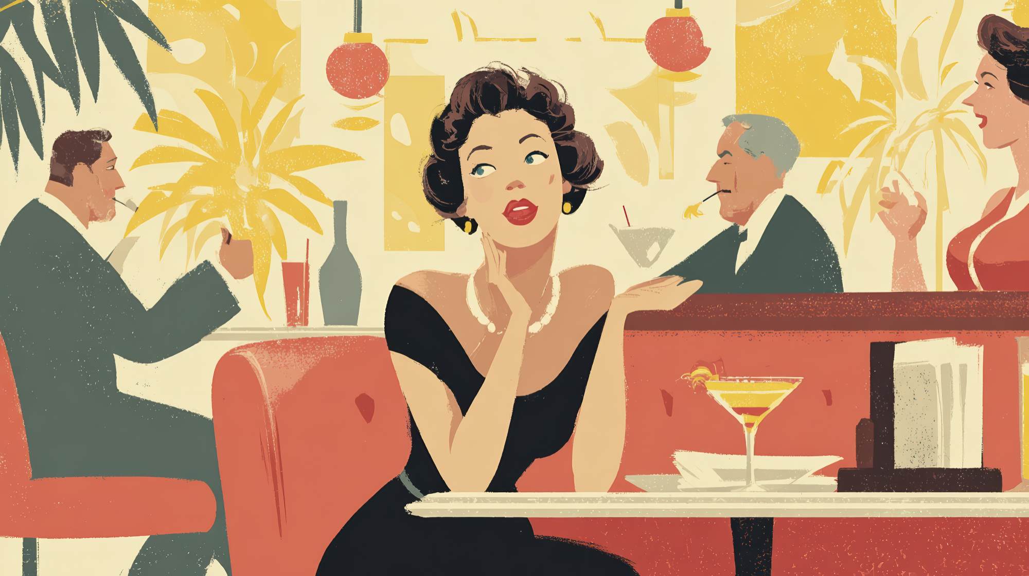
People judge your food before they taste it
Customers are not conducting a rational audit when they discover a restaurant. They are making fast emotional decisions with limited information. They see your Instagram grid, your Google Business photos, your online ordering page, your menu typography, your storefront sign, or the flyer taped to a local coffee shop window. From that, they build a story.
If the story says “careless,” “dated,” or “low effort,” that feeling sticks.
This is especially true in restaurant marketing because the product is sensory, but the decision often happens digitally. A guest can’t smell the food through your website. They can’t hear the dining room energy from your menu PDF. They can’t taste your signature dish from a social post. So they rely on visual clues to fill in the blanks.
Clean, confident design suggests quality control. Sharp photography suggests freshness. Thoughtful layouts suggest professionalism. Consistent branding suggests a business that knows who it is. On the flip side, blurry photos, mismatched fonts, poor spacing, cluttered menus, and generic templates suggest corners are being cut.
And once that perception sets in, your restaurant has to work harder to overcome it.
I’ve seen restaurants serve legitimately great food and still struggle to gain traction because their visual identity made them look less credible than they were. I’ve also seen mediocre operators punch above their weight because their presentation was polished enough to create curiosity and confidence. The food still matters most in the long run, of course. But design often determines whether you get the chance to prove it.
Cheap design quietly lowers what people think you’re worth
One of the most expensive consequences of weak design is not immediate lost traffic. It’s value erosion.
When your visual presentation feels cheap, customers become more price-sensitive. They question your pricing faster. They compare you more aggressively. They are less likely to see your restaurant as a place worth a premium, even if your ingredients, labor, and experience justify one.
This shows up everywhere.
A cluttered menu can make signature items feel less special. A generic logo can make a concept feel forgettable. Stock graphics can strip personality from a brand that should feel local and distinctive. Poor food photography can flatten dishes that are actually visually exciting in person. A badly designed website can make a good restaurant feel like a side project.
Design affects perceived value because it signals confidence. Good design says, “We know what we’re offering, and we know it matters.” Bad design says, “We just needed something up there.” Customers read that difference instantly.
For restaurants, perceived value is everything. It influences whether someone adds a starter, orders dessert, chooses dine-in over delivery, books for a birthday, recommends the place to friends, or posts about it online. If your branding makes you look like the cheap option, that may become the lane people put you in, whether you intended it or not.
And to be clear, “good design” does not mean “fancy.” A neighborhood burger spot does not need luxury hospitality branding. A casual taco concept should not look like a private members club. The goal is not expensive-looking for the sake of it. The goal is aligned, intentional, and memorable. Your visuals should match your concept and make your pricing feel believable.
Inconsistency is one of the biggest trust killers
Restaurants often think their design problem is quality when it’s actually inconsistency. The logo on the awning looks one way. The menu uses different colors. The website has a different tone. Social graphics feel unrelated. Delivery app photos are old. Printed materials come from three different eras of the business. Nothing is terrible on its own, but together it feels disjointed.
That kind of inconsistency creates friction.
Customers may not consciously identify the issue, but they feel it. Inconsistent branding makes a business look less established, less organized, and less trustworthy. If the visual identity keeps changing, customers assume the operation itself may be unstable too.
This is a bigger deal than many owners realize because restaurants rely heavily on repeat business and familiarity. People like knowing what to expect. Strong branding reinforces recognition across every touchpoint, from a street sign to a sponsored Instagram post to a catering page.
Consistency also makes your marketing more efficient. When your visuals are cohesive, each impression compounds. People start recognizing your brand faster. They remember your name more easily. Your promotions feel more legitimate. Your social content works harder because it actually looks like it belongs to the same restaurant.
If your current materials feel scattered, you do not necessarily need a full rebrand. Often you need discipline more than reinvention. Pick a type system. Set color rules. Standardize how your logo appears. Define a photography style. Establish templates for social, print, email, and in-store signage. Consistency is not glamorous, but it is profitable.
Your menu is a sales tool, not a document
If there is one restaurant asset that gets chronically under-designed, it’s the menu.
Too many menus are treated like simple lists: item, description, price, move on. But menu design has direct influence on what people order, how confidently they order it, and whether the entire experience feels polished or chaotic.
A cheap or badly structured menu creates cognitive load. Customers scan harder. They miss high-margin items. They ask more questions. They default to safe choices. They feel less guided. None of this helps revenue.
A well-designed menu, by contrast, does a few things at once. It makes the restaurant feel more put-together. It directs attention where you want it. It supports your positioning. It helps guests navigate quickly. And it subtly encourages better purchasing behavior.
That does not mean manipulative “menu psychology” tricks copied from the internet. It means practical clarity. Use typography people can actually read in your lighting. Create visual hierarchy so categories and featured items stand out. Keep descriptions concise but specific. Avoid overloading every section with too many choices. Make sure pricing presentation supports the experience you want to create.
If you operate across dine-in, takeout, and online ordering, the menu experience needs to hold up in all three places. This is where many restaurants fall apart. The in-house menu may be decent, but the online ordering interface is cramped, unappetizing, or confusing. That is not a small issue. For many brands, online ordering is now one of the primary revenue channels. If the design there feels weak, you are leaving money on the table every day.
Good photography is not optional anymore
There was a time when restaurants could get away with mediocre imagery. That time is gone.
Today, your food photography is often your product demo. It’s what stops the scroll, drives the click, earns the share, and tips a maybe into a yes. Bad photos do the opposite. They flatten texture, kill appetite appeal, and make your dishes look less distinctive than they are.
This is one of the most common “cheap design” mistakes because owners assume any photo is better than no photo. Not true. Poor photography can actively hurt performance, especially on social media, delivery platforms, and local search listings.
You do not need a giant production budget to fix this. But you do need standards. Prioritize natural-looking lighting. Shoot real portions that reflect the guest experience. Style the plate without making it fake. Capture a mix of hero shots, environment shots, detail shots, and people enjoying the space. If your concept is warm and high-energy, the photos should feel that way. If it’s refined and intimate, the visuals should reflect that instead.
And please retire photos that no longer represent the brand. If your dining room changed, your plating changed, or your quality improved, update the images. Outdated visuals are a subtle form of dishonesty, even when unintentional. They create expectation gaps, and expectation gaps damage trust.
Where restaurants should actually invest first
Not every restaurant needs a full-scale brand overhaul tomorrow. But almost every restaurant can improve a few high-impact assets that shape perception and sales.
If budget is limited, start here:
First, fix the logo and visual identity if they are actively undermining credibility. Not because logos are magical, but because they anchor everything else.
Second, invest in strong photography. Few assets have broader marketing utility.
Third, improve the website, especially mobile performance, menu presentation, and online ordering flow. Guests should be able to understand your concept and place an order with zero friction.
Fourth, clean up the menu design. This affects both experience and revenue.
Fifth, create a simple brand system so future materials stay consistent. Fonts, colors, image style, tone of voice, logo usage. Nothing fancy. Just enough structure to stop the chaos.
This is the part where a lot of operators hesitate because they’ve been burned before by freelancers, cheap templates, or one-off projects that looked decent but didn’t solve anything. Fair concern. The answer is not to spend blindly. The answer is to treat design like a business decision with measurable impact.
Ask practical questions. Does this make us look more trustworthy? Does it support our price point? Does it improve conversion? Does it reduce friction? Does it make us more recognizable? If the answer is yes, it is not vanity. It is marketing infrastructure.
The cheapest option usually costs more later
This is the uncomfortable truth: cheap design is rarely cheap in the long run.
You pay for it in lower conversion. In weaker first impressions. In more price resistance. In inconsistent branding. In forgettable campaigns. In social content that underperforms. In menus that don’t sell as well as they should. In websites that leak potential orders. In the gap between how good your restaurant actually is and how good it looks to the market.
Restaurants do not need performative branding. They do need visuals that match the quality of the experience they are trying to sell.
If your food is thoughtful, your service is sharp, and your concept has real character, your design should carry that same standard. Not because appearance is everything, but because appearance is often the first proof customers get that you care.
And in restaurant marketing, that first proof matters more than most owners want to admit.


