
Last Updated on April 20, 2026 by DSNRY
Perception drives pricing power.
One of the biggest mistakes restaurant owners make is thinking “expensive” is just a pricing strategy. It’s not. It’s a perception strategy. Guests decide what feels premium long before they look closely at the check. They’re reading signals: lighting, language, plating, music, pacing, uniforms, menu design, even the way the host says hello. If those signals feel intentional, guests assume value. If they feel sloppy, guests start mentally discounting everything.
That’s the real opportunity for operators who don’t want to raise prices but do want to strengthen margins, attract better-fit customers, and stop competing on discounts. You do not need a massive renovation. You do not need velvet banquettes and imported stone. What you need is consistency, restraint, and a point of view. Restaurants look more expensive when they stop trying to do everything and start acting like every detail was chosen on purpose.
I’ve seen modest concepts outperform flashier competitors simply because they understood one truth: guests pay for confidence. Not arrogance. Confidence. The feeling that this place knows exactly what it is, and everything in the room supports that identity. That is marketing, even when it doesn’t look like marketing.
Your brand should feel tighter, not fancier
If you want your restaurant to look more expensive, the first move is not adding more. It’s editing. Premium brands almost always feel more disciplined than budget brands. They use fewer colors, fewer fonts, fewer competing messages, fewer menu categories, fewer visual distractions. A lot of restaurants accidentally look cheaper than they are because they’re visually noisy.
Start with your brand presentation. Is your logo clean and readable? Does your website look current? Are your menus consistent with your signage, social profiles, and in-store experience? If your Instagram says “moody date-night spot” but your menu looks like it was made in a hurry on a home printer, the illusion breaks fast.
This is where operators often underestimate how much design affects perceived value. A clean menu layout with breathing room can do more for your pricing power than adding three new premium items. Cheap-looking typography, cluttered flyers at the host stand, laminated inserts, and inconsistent branding all communicate the same thing: this place is figuring it out as it goes. That may be true behind the scenes for every restaurant, but guests should never feel it.
A more expensive look usually comes from simplification:
Use one or two strong typefaces, not five. Tighten your color palette. Remove outdated posters from windows. Clean up tabletop clutter. Rewrite menu descriptions so they sound precise instead of padded. A premium restaurant does not beg for attention. It assumes it deserves it.
That’s an important distinction for marketing. Value-driven restaurants often shout. Premium-feeling restaurants curate. If your brand language is constantly pushing deals, combos, happy hour blasts, and “limited time only” callouts, guests will read you as transactional. That does not mean promotions are bad. It means they should be used carefully, so they don’t become the entire personality of the business.
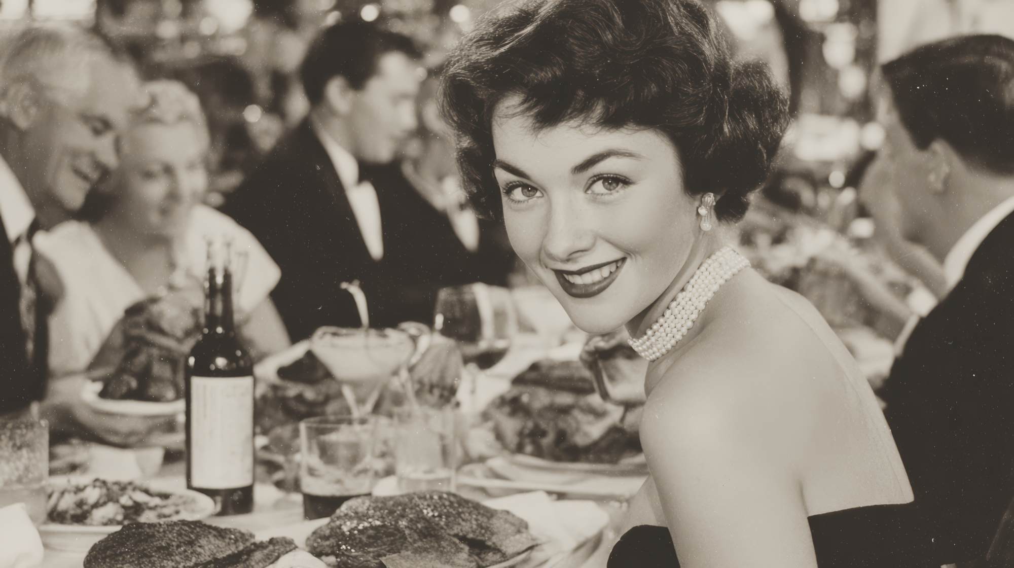
Atmosphere is pricing psychology in physical form
The dining room does not need to be luxurious. It needs to feel considered. Guests are remarkably forgiving of small spaces, old buildings, and simple interiors if the atmosphere feels cohesive. They are much less forgiving of spaces that feel accidental.
Lighting is the fastest win. Bad lighting makes everything look cheaper: the food, the furniture, the walls, the people. If your dining room is too bright, too cold, or inconsistent, fix that before you spend money elsewhere. Warm, flattering lighting creates instant perceived value because it improves the emotional texture of the experience. People linger longer in spaces that make them look and feel better.
Music matters just as much, and most restaurants either ignore it or overdo it. A thoughtful playlist shapes pace and mood, which shapes spending. The wrong playlist makes the room feel generic. The right one makes the restaurant feel authored. And that word matters: authored. Expensive-feeling places do not feel assembled from random decisions. They feel like someone had a clear opinion.
Then there’s cleanliness, which is non-negotiable but often misunderstood. Clean is not premium by itself; it is simply the baseline. What elevates perception is polished maintenance. Scuffed doors, wobbling tables, stained menus, chipped plates, and dusty corners are small details that quietly lower willingness to pay. Guests may not mention them, but they absolutely register them.
Pay attention to sensory consistency too. If the front entry smells amazing but the restroom smells neglected, that disconnect damages the entire premium story. If the dining room is beautiful but the takeout packaging is flimsy, same issue. Premium perception is built through continuity. The guest should feel the same level of care everywhere they interact with you.
Menu engineering is where “expensive” is often won or lost
Most restaurant owners think menu pricing and menu perception are the same thing. They’re not. A guest can see a $28 entrée and think, “That makes sense,” or “That’s ridiculous,” based largely on how the item is framed. Menu engineering is not manipulation. It’s context.
First, tighten the menu. Long menus often read as less premium because they suggest operational sprawl. Premium-feeling restaurants usually project confidence through selection. They don’t need to offer every possible variation because they trust their point of view. Cutting weaker items can raise the status of the entire menu.
Second, rewrite descriptions with specificity. Generic copy feels cheap. “Fresh grilled chicken with vegetables” says almost nothing. “Wood-grilled airline chicken, charred lemon, blistered broccolini, rosemary jus” tells a more vivid story and gives the dish structure. The goal is not to become pretentious. The goal is to sound intentional and sensory.
Third, design the menu so the eye moves naturally. If every item is fighting for attention, none of them feel premium. White space is one of the most underused tools in restaurant marketing. It signals confidence. So does category discipline. A menu that jumps from sushi to burgers to pasta to tacos almost always feels less expensive than one that clearly knows what it does best.
And yes, plating matters. Not in the over-styled, tweezer-food sense. In the sense that visual composition influences value perception immediately. A simple plate that looks balanced, clean, and deliberate reads better than a larger portion dumped carelessly onto the dish. Guests don’t just pay for quantity. They pay for care.
One more opinionated point: stop overexplaining low prices. If you are affordable, let the value reveal itself. The moment your menu starts screaming affordability, you shift the frame away from quality. You can be approachable without sounding cheap. That’s a language choice.
Service is the luxury signal most operators underinvest in
You can make a room look beautiful, but if the service feels rushed, uncertain, or disconnected, the premium effect collapses. Guests define “expensive” as much by how they are handled as by what they are served.
This doesn’t mean formal service. In fact, forced formality often backfires. It means composed service. Staff should sound informed, calm, and present. A host who greets with warmth and clarity does more for perceived value than an expensive centerpiece ever will. A server who can guide a guest confidently through the menu raises trust. Trust raises spending.
Training here matters enormously. If your staff describes dishes inconsistently, seems surprised by basic guest questions, or handles issues awkwardly, that uncertainty lowers the restaurant’s status. Premium-feeling restaurants make hospitality look effortless, even though it’s heavily practiced behind the scenes.
Uniforms are another underrated tool. They do not need to be formal, but they should be consistent and aligned with the brand. Matching aprons, clean sneakers, simple black layers, or polished casual wear can instantly make a restaurant feel more put together. Random T-shirts and inconsistent presentation do the opposite.
Pacing also affects whether a restaurant feels expensive. Guests should never feel ignored, but they also should not feel pushed. Premium experiences tend to feel well-timed. Water gets refilled before it’s awkward. Plates are cleared smoothly. Recommendations feel natural, not scripted. The bill arrives when it should. This creates the feeling that the restaurant is in control of the experience.
And that’s really what people pay for: the reduction of friction. Luxury, at almost every level, is just friction removed.
Your digital presence has to match the in-person promise
Here’s the uncomfortable truth: many restaurants spend money improving the dining room while leaving their online presence stuck in 2018. That mismatch is expensive. Today, “looking expensive” starts before a guest ever walks in. It starts on Google, Instagram, your website, your reservation profile, and your photos.
If your food photography is dark, inconsistent, or overly filtered, your restaurant will look less premium than it feels. If your website is slow, cluttered, or hard to navigate, same problem. A premium impression online comes from clarity: strong photography, simple navigation, current information, and copy that sounds like a real brand rather than a template.
Review management matters too. Guests read reviews to validate whether the premium cues they’re seeing are real. If your responses are defensive, robotic, or nonexistent, you miss a chance to reinforce brand confidence. Calm, thoughtful responses project professionalism. That matters more than most operators think.
Social media should also reflect restraint. You do not need to post every special, every team selfie, every vendor delivery, and every holiday graphic. Curate. Show your best angles. Show texture, mood, plating, people enjoying the space, details that communicate care. A premium-feeling feed is usually less crowded, more consistent, and more intentional.
This is where restaurant marketing often gets misunderstood. The goal is not to manufacture luxury. The goal is to remove signals that undermine quality. Marketing should amplify what is already true about the experience, not invent a false story. Guests can tell the difference.
The most expensive-looking restaurants have conviction
If I had to boil this down to one practical takeaway, it would be this: expensive is a byproduct of conviction. Restaurants that look premium tend to know what they are and commit to it fully. They are not trying to be upscale on Friday, family-friendly on Saturday, and discount-driven on Monday. They choose a lane and reinforce it across the brand, menu, service, and atmosphere.
You do not need a bigger budget to do that. You need better editing, better standards, and fewer contradictions. Look at your restaurant through a guest’s eyes and ask: what feels thoughtful, and what feels improvised? What feels clean and restrained, and what feels noisy? What supports our value, and what quietly discounts it?
Fix those answers one by one.
Because when a restaurant feels intentional, guests relax. They trust the experience. They order differently. They recommend it differently. They remember it differently. And that is the real advantage: not just looking more expensive, but earning the kind of perception that gives your brand more pricing power over time.
That’s the game. Not pretending to be something you’re not. Becoming more legible, more polished, and more confident in what already makes your restaurant worth choosing.


