Master the art of visual presentation to inspire consumer action.
Restaurant marketing has become a visual game, and not in a shallow, trend-chasing way. People decide where to eat with their eyes long before they read a menu, compare price points, or check your reservation policy. That’s the reality. Before guests taste your food, they encounter it on Instagram, Google Business, your website, delivery apps, email campaigns, and short-form video. If the imagery falls flat, the brand feels flat. If the imagery feels careless, people assume the operation is careless too.
I’ve seen restaurants spend heavily on interiors, menu engineering, and ad campaigns while treating food media like an afterthought. That’s backwards. Great food deserves great representation, and great representation drives demand. Strong visual media doesn’t just document dishes. It builds appetite, communicates quality, frames your brand identity, and creates the kind of desire that gets people to stop scrolling and make a plan.
The good news is that aspirational food media is not reserved for luxury brands with giant budgets. It’s mostly about discipline, consistency, and understanding what your audience wants to feel when they see your food. Not just what they want to know. Feel first, details second. That’s how attention works now.
Aspiration is not about perfection
Too many restaurant teams misunderstand what “aspirational” means. They assume it means overly polished, expensive-looking, or disconnected from the actual guest experience. It doesn’t. Aspirational media is simply media that helps people imagine themselves enjoying your food, your space, and your point of view. It invites them into a better moment.
For a neighborhood brunch spot, that might mean sunlight hitting a stack of pancakes, coffee steaming at the edge of frame, and a table that feels relaxed and social. For a high-end tasting menu, aspiration may come through restraint: moody lighting, quiet composition, fine detail, and confidence. For a fast-casual brand, aspiration might be speed, freshness, and color that signals craveability without looking manufactured.
The point is this: aspiration should match the brand, not imitate someone else’s aesthetic. One of the biggest mistakes in restaurant marketing is borrowing visual language from brands with entirely different audiences. A burger concept trying to look like a minimalist wine bar ends up feeling confused. A chef-driven restaurant using loud, over-edited social imagery can cheapen its own positioning.
Your food media should answer a simple question: what kind of experience are we promising? If the imagery can’t answer that, it’s not working hard enough.
Lighting is a branding decision, not just a technical one
Lighting shapes appetite more than most operators realize. It affects texture, temperature, mood, and perceived quality. And yet many restaurant shoots are still approached like casual documentation: turn on every light, snap a few plates, and hope for the best. That almost always produces content that looks flat, busy, or forgettable.
Natural light remains one of the best tools in food photography because it tends to make ingredients feel honest and alive. It brings softness to bread, brightness to produce, and dimension to sauces, glazes, and glassware. If your brand leans fresh, vibrant, daytime, or approachable, natural light is probably your friend. But natural light still needs direction. Window light can be beautiful; overhead spill and mixed indoor lighting can destroy the shot.
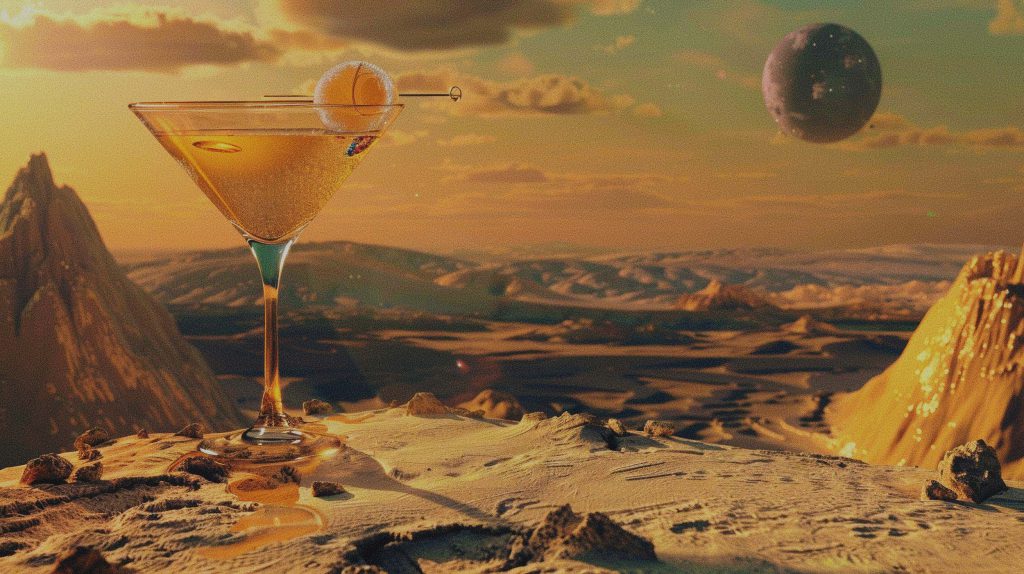
On the other hand, darker, more dramatic lighting can be incredibly effective for restaurants that want to communicate intimacy, craft, indulgence, or sophistication. Deep shadows can make a cocktail feel richer. Focused highlights can make seared proteins and plated desserts feel luxurious. Good low-light imagery creates intrigue. Bad low-light imagery just makes food look muddy.
This is where marketing teams need to have an opinion. Ask yourself: should our food feel bright and energetic, or intimate and transportive? Clean and modern, or warm and lived-in? There’s no neutral answer. Every lighting choice communicates something, whether you intended it or not.
A practical rule: choose one dominant lighting style for your brand library and stick with it. You can vary by season or campaign, but the overall visual system should feel cohesive. Consistency is what turns random content into a recognizable brand asset.
The lens changes the story
Lens choice is rarely discussed outside production teams, but it matters enormously in restaurant marketing. Different focal lengths create different emotional effects, and those effects influence how viewers perceive your food and space.
Tight close-ups are powerful because they create intimacy. They pull the viewer into texture: the crackle of fried chicken, the gloss on noodles, the air in a whipped topping, the char on a crust. This kind of imagery works especially well when the goal is craveability. If someone can practically taste the dish through the screen, you’re winning.
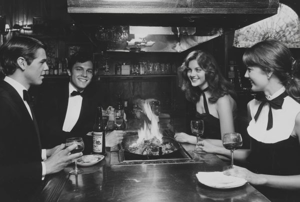
Wider shots do something else. They place the food in context. They tell a broader story about the table, the room, the occasion, the company. These are the images that sell atmosphere and occasion-based dining. A cocktail alone is a product shot. A cocktail on a candlelit table beside shared plates and soft conversation becomes a reason to book a night out.
The best restaurant media strategy uses both. You need the appetite trigger and the lifestyle frame. The food should look delicious, but it should also look like part of an experience worth choosing over every other option nearby.
One opinion I feel strongly about: many brands rely too heavily on overhead shots because they’re easy and familiar. Overhead has its place, especially for spreads and table narratives, but it can become visually repetitive fast. Angled compositions, close perspective, and selective focus often feel more immersive and emotionally persuasive. If your entire feed looks like a menu laid flat on a table, you are probably underselling the food.
Composition should guide desire, not just display the plate
A lot of restaurant photography still suffers from a “catalog” mindset. Center the plate, show everything clearly, move on. That may be functional, but it rarely makes anyone hungry. Good composition should lead the eye, create movement, and reveal what matters most.
You do not need every component visible in every image. In fact, showing less often makes people want more. A fork breaking into a yolk, sauce being poured, steam rising from a bowl, a hand reaching for a shared dish—these moments create narrative. They make the viewer imagine participation. That is a much stronger marketing tool than static presentation alone.
Negative space is useful too, especially for restaurants that want a refined, premium feel. Crowded frames can signal abundance, but they can also signal chaos. Again, this comes back to brand positioning. A lively taqueria may benefit from motion, color, and layered compositions. A fine dining concept may benefit from precision and breathing room.
Styling matters, but it should never become fake. Consumers are visually literate now. They can sense when a dish has been over-handled, over-garnished, or styled into something they won’t actually receive. Aspirational does not mean deceptive. The best food media preserves truth while elevating it. That balance builds trust, which is still one of the most valuable currencies in restaurant marketing.
People make food media more persuasive
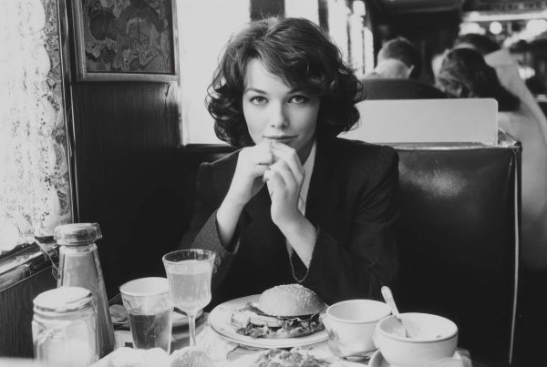
If your content library is nothing but isolated dishes, you’re missing emotional range. Hands, faces, gestures, pours, bites, clinks, and shared moments make restaurant media feel alive. Restaurants are social businesses. Even solo dining has emotional context. The food is central, but the experience is human.
Including people in your imagery helps solve a common branding problem: scale. Without a human reference point, dishes can look abstract or oddly proportioned. With people, food feels real and immediate. A hand lifting a dumpling or tearing bread creates action. A guest leaning into a plate communicates anticipation. A bartender’s motion adds theatre. A chef plating with focus adds authority.
This doesn’t mean every image needs smiling models pretending to have the best night of their lives. In fact, that kind of staged energy often feels dated. Modern restaurant media works better when it captures believable behavior. Casual, subtle, confident. Think less “campaign acting,” more “documented experience.”
For marketing purposes, this also gives you more usable content across channels. Human-centered visuals perform well in social, email, event promotion, recruitment messaging, and brand storytelling. They give the restaurant dimension beyond the plate.
Build a visual system, not a random content pile
One polished shoot is not a strategy. What restaurants actually need is a visual system: a repeatable approach to lighting, framing, color, styling, and subject matter that can scale across platforms. That’s how you create a brand that feels intentional rather than improvised.
Start with a shot list that reflects marketing priorities, not just menu categories. Of course you need hero shots of signature dishes. But you also need table scenes, detail shots, beverage moments, staff interactions, interiors, exterior cues, vertical video clips, seasonal assets, and content designed for specific uses like paid social or online ordering platforms.
Then think in content tiers. Your highest-production images should anchor your website, ads, and evergreen brand materials. Mid-tier content can support regular social publishing and email. Fast-turn content can document specials, events, and limited-time offers. Not every asset needs the same budget, but every asset should still belong to the same visual language.
This is where many restaurants lose momentum. They create nice media once, then revert to inconsistent phone photos that dilute the brand. If you want visual marketing to drive revenue, consistency matters more than occasional brilliance.
What actually moves people to act
Attractive food media is nice. Action-driving food media is better. The difference usually comes down to clarity of intent. Ask what each asset is supposed to make someone do. Book a table? Order delivery? Try brunch? Visit for happy hour? Share with a friend? If the answer is vague, the content usually is too.
The most effective restaurant visuals pair appetite with context and momentum. Show the dish, yes, but also show when to want it and why now. A bright seafood spread can signal weekend lunch. A martini and fries setup can own after-work indulgence. A close-up of a holiday dessert can support seasonal urgency without feeling salesy.
And don’t forget channel behavior. What works on a website hero banner may not work on Reels. What performs on Instagram may be too stylized for third-party delivery. Smart restaurant marketing adapts the same brand point of view to different user environments. That’s not compromise. That’s professionalism.
My strongest recommendation is simple: stop thinking of visual media as decoration. It is one of the clearest expressions of your restaurant’s value. In many cases, it is the first proof of quality the customer receives. When lighting, lens choice, composition, and human presence are handled with intention, the result is not just prettier content. It is sharper positioning, stronger desire, and better commercial performance.
Restaurants ask a lot of guests. Time, money, attention, trust. The least a brand can do is make the experience look as compelling as it truly is. When your imagery helps people picture the meal, the mood, and the moment they want to be part of, marketing gets easier. Desire does the heavy lifting.