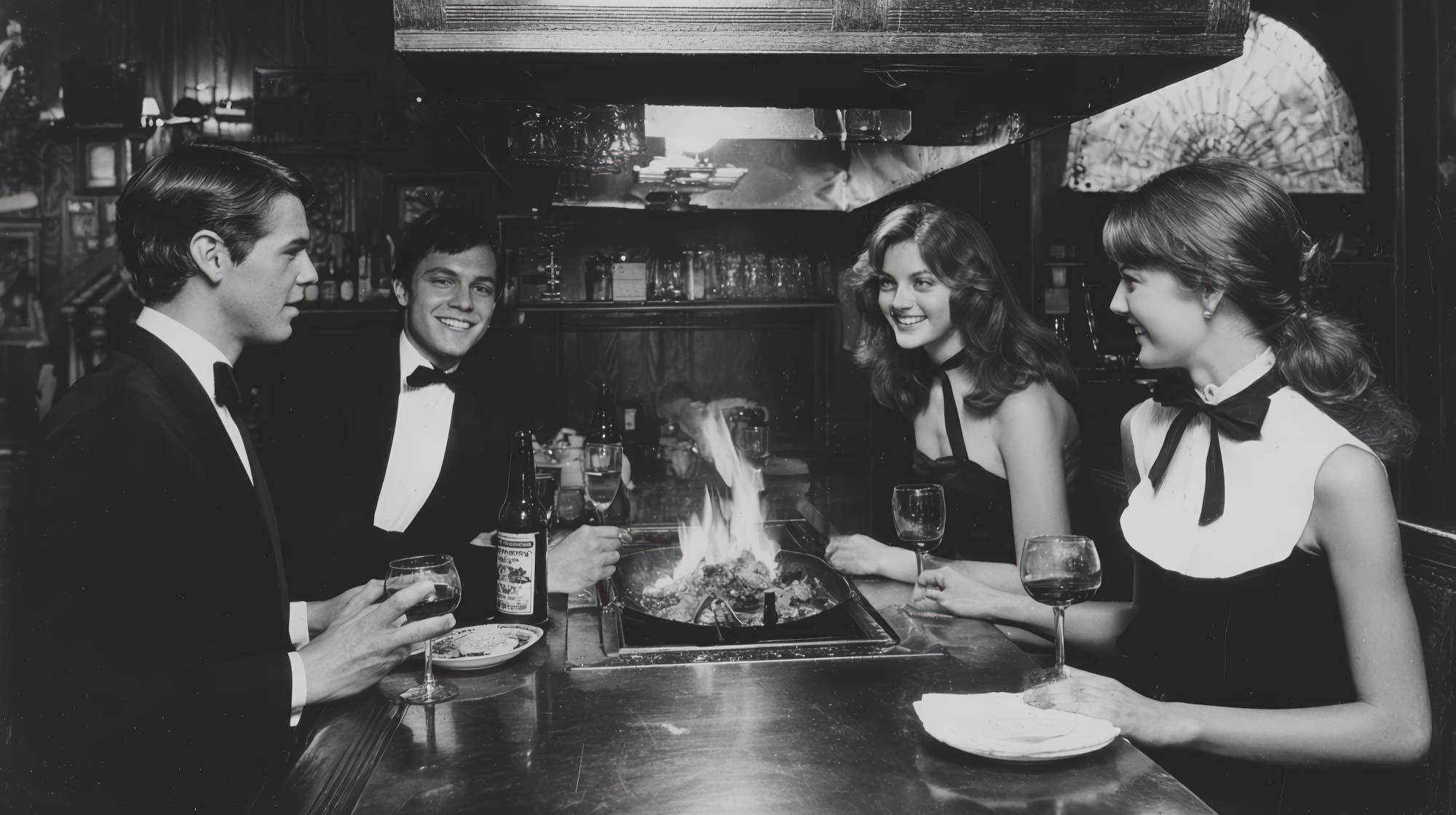
Refined type choices communicate a commitment to quality.
Restaurant marketing often gets reduced to the obvious things: photography, color palettes, social content, ad spend, seasonal menus. All of that matters. But typography is one of the most underused signals in a restaurant’s brand system, and it quietly does more persuasive work than most operators realize.
Before a guest tastes the food, they read the menu. They scan the website. They glance at the exterior sign, the reservation confirmation, the Instagram story, the printed wine list, the takeout packaging. In every one of those moments, type is shaping expectations. It tells people whether your restaurant feels polished or rushed, expensive or accessible, modern or dated, thoughtful or chaotic.
In restaurant marketing, that matters because dining is emotional. Guests are not just buying calories. They are buying atmosphere, confidence, status, comfort, discovery, nostalgia, or celebration. Typography helps frame all of that before the host ever says hello.
Typography is not decoration. It is positioning.
One of the most common brand mistakes I see in hospitality is treating typography like an afterthought. A restaurant invests heavily in interiors, plating, and photography, then defaults to whatever font “looks nice” in Canva or whatever came with the menu template. The result is usually a subtle mismatch between what the brand says it is and what it actually feels like in the market.
Type is not there to fill space. It is there to communicate personality and hierarchy. A tight, elegant serif can suggest heritage, precision, and restraint. A clean sans serif can feel contemporary, efficient, and confident. A high-contrast display face can imply luxury, but in the wrong setting it can also feel performative. A playful script can communicate warmth, but it can just as easily drift into amateur territory if overused.
For restaurants, that distinction is everything. If you run a chef-driven concept with a premium average check, your typography should reinforce care and discipline. If you run a neighborhood café, the type should still look considered, but it may need more ease and familiarity than formality. If you operate a fast-casual brand, clarity and speed probably matter more than ornamental flair.
The point is simple: typography should reflect the experience you want people to expect. Good restaurant marketing creates alignment. Great restaurant marketing makes the brand feel inevitable.
The menu is your most important typography test
If you want to know whether your restaurant’s typography is working, start with the menu. Not the logo. Not the Instagram grid. The menu.
The menu is where brand meets revenue. It has to persuade, organize, and reassure at the same time. Guests should understand what kind of place they are in, what’s worth ordering, and how to navigate choices without friction. Typography drives that process.
When menu type is too small, too ornate, too cramped, or too inconsistent, it creates stress. Guests may not consciously say, “This type hierarchy is weak,” but they absolutely feel the friction. They hesitate. They skim poorly. They miss profitable items. They assume disorder. In a restaurant setting, even minor confusion can lower perceived quality.
Strong menus usually do a few things well:
They use a primary typeface that is highly legible in low light. This sounds basic, but many restaurants still miss it. If guests need to squint, your menu is failing.
They create clear hierarchy through size, weight, spacing, and alignment. Section headers should actually look like section headers. Dish names should stand apart from descriptions. Prices should never compete with the food itself.
They avoid the trap of using too many fonts. Two type families are often enough. Sometimes one is enough. More than that, and the menu starts feeling indecisive.
They respect white space. Sophistication is often less about adding style than removing clutter.
And they match the concept. A tasting menu restaurant should not sound typographically like a sports bar. A rustic Italian restaurant should not read like a fintech startup.
This is where typography becomes practical, not precious. Better type choices do not just make the brand prettier. They make the menu easier to sell from.
Digital restaurant marketing lives or dies on readability
Restaurant brands now live across dozens of digital touchpoints, and typography has to perform in all of them. Website headers, reservation widgets, mobile menus, email campaigns, paid ads, Google Business updates, social graphics, SMS promotions, loyalty programs—every one of these channels puts type under pressure.
A font that looks elegant in a brand presentation may completely fall apart on a phone screen. A delicate display typeface may be beautiful for headlines but terrible for body copy. A condensed font may save space but reduce legibility when paired with long menu descriptions or small mobile layouts.
This is where experienced marketing teams make better choices than purely aesthetic ones. Restaurant branding is not a museum piece. It has to function in the real world, where people are distracted, hungry, scrolling fast, and often making decisions from a parking lot or rideshare.
If your homepage headline is stylish but hard to read, it is not sophisticated. It is inefficient. If your online ordering flow uses too many type treatments and confusing button labels, you are introducing friction where speed should win. If your Instagram quote graphics use fonts that don’t match your in-store materials, you are weakening brand memory.
The strongest restaurant brands use typography consistently enough that guests start to recognize the feeling of the brand before they consciously register the logo. That is a real marketing advantage. Familiarity builds trust. Trust increases conversion.
My opinion: restaurants spend too much time chasing visual novelty online and not enough time building readable, repeatable systems. Distinctiveness matters, but clarity comes first. Especially when the goal is getting someone to book, order, or show up.
Luxury is usually quieter than people think
When restaurant operators want to appear more premium, they often overcorrect. They choose fonts that are too dramatic, too thin, too stylized, or too self-aware. They confuse “fancy” with “refined.” These are not the same thing.
In hospitality, true sophistication tends to be quieter. It shows up in restraint, balance, spacing, confidence, and consistency. The typography doesn’t beg for attention. It earns it.
This matters for restaurants trying to elevate perception without alienating guests. You do not need an overly formal identity to signal quality. You need a disciplined one. Refined typography can make a casual concept feel more intentional. It can make a mid-market restaurant feel more premium. It can make a premium restaurant feel worth the price.
A few practical examples:
A well-chosen serif for headlines paired with a clean sans serif for supporting information can create a polished, editorial feel without becoming stiff.
Generous line spacing and margins on menus and printed collateral instantly improve perceived quality. Cheap brands crowd. Confident brands breathe.
Consistent capitalization rules, punctuation, and text alignment make a restaurant feel organized. Inconsistency reads as carelessness, even when the guest can’t quite explain why.
Better typography can also improve how food descriptions land. If your copy is thoughtful but the presentation feels chaotic, the message loses authority. Great branding lets the words and the design support each other.
Luxury is not just expensive materials and moody lighting. It is the feeling that someone paid attention.
How to choose type that actually fits your restaurant
If you are revisiting your restaurant brand, do not start by asking, “What font is trending?” Start by asking better questions.
What kind of experience are we promising?
Who are we trying to attract more of?
Where does our current visual identity feel mismatched with the actual quality of the food and service?
Do we want to feel more approachable, more elevated, more contemporary, more rooted, or more distinctive?
Once those answers are clear, typography becomes easier to evaluate. You are no longer shopping for style. You are selecting a signal system.
Here are a few useful filters:
Choose for legibility first. Your guests must be able to read comfortably across print and digital formats.
Build a small system, not a random collection. One headline font and one support font is plenty for most restaurant brands.
Test the type in real applications. Look at it on menus, table tents, websites, social graphics, and signage before approving anything.
Pay attention to numbers. Prices, hours, phone numbers, reservation times, and addresses need to read cleanly. Restaurants use numerals constantly.
Don’t underestimate tone. A font can be technically beautiful and still wrong for your concept. The question is not “Is this nice?” The question is “Does this sound like us?”
And if your concept is evolving, let typography help lead the shift. You can modernize a restaurant’s perception without blowing up every brand asset. Sometimes type is the cleanest way to signal that the business has matured.
Typography should connect the whole guest journey
The best restaurant marketing feels cohesive from discovery to follow-up. Typography can help create that continuity in a way few other brand elements can.
Imagine the guest journey: they see a paid social ad, tap through to your website, book a table, receive a confirmation email, arrive at the host stand, review the menu, notice the restroom signage, browse the dessert list, then get a post-visit email or loyalty offer. If the typography across those moments is coherent, the experience feels intentional. If it changes wildly from one touchpoint to the next, the brand starts to feel fragmented.
That fragmentation is more common than it should be. Many restaurants have one design style for social, another for print, another for email, and a website built from whatever template was cheapest five years ago. The guest may not articulate that inconsistency, but it weakens memorability and lowers confidence.
Strong typography creates continuity without monotony. It gives the brand a recognizable voice. In a crowded restaurant market, that consistency is not cosmetic. It is strategic.
If I were prioritizing restaurant brand improvements today, typography would be near the top of the list precisely because it touches so many revenue-driving moments. It influences first impressions, ordering behavior, perceived value, and brand recall. That is a lot of return for something many operators still treat as a minor design decision.
A better type system can quietly raise your marketing ceiling
Not every restaurant needs a full rebrand. But almost every restaurant can benefit from more intentional typography.
If your current materials feel generic, dated, cluttered, or inconsistent, type is often the fastest path to improvement. It can sharpen your positioning, improve your menu usability, strengthen your digital presence, and make the brand feel more premium without resorting to gimmicks.
And that last part matters. Restaurant marketing does not need more noise. It needs more signals of trust, taste, and care. Typography is one of those signals. When chosen well, it tells guests that details matter here. That standards matter here. That the experience has been considered.
In a category where perception shapes willingness to try, willingness to spend, and willingness to come back, that is not a small thing. It is brand strategy hiding in plain sight.
Refined type choices do, in fact, communicate a commitment to quality. For restaurants, that commitment should not stop at the plate.