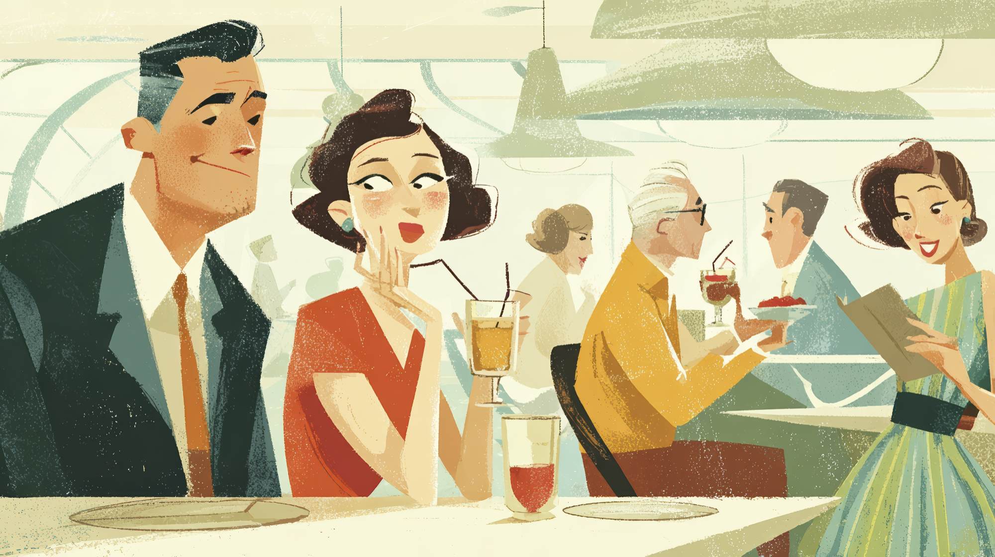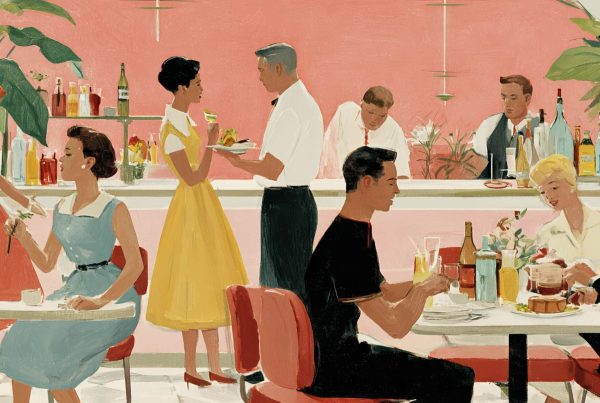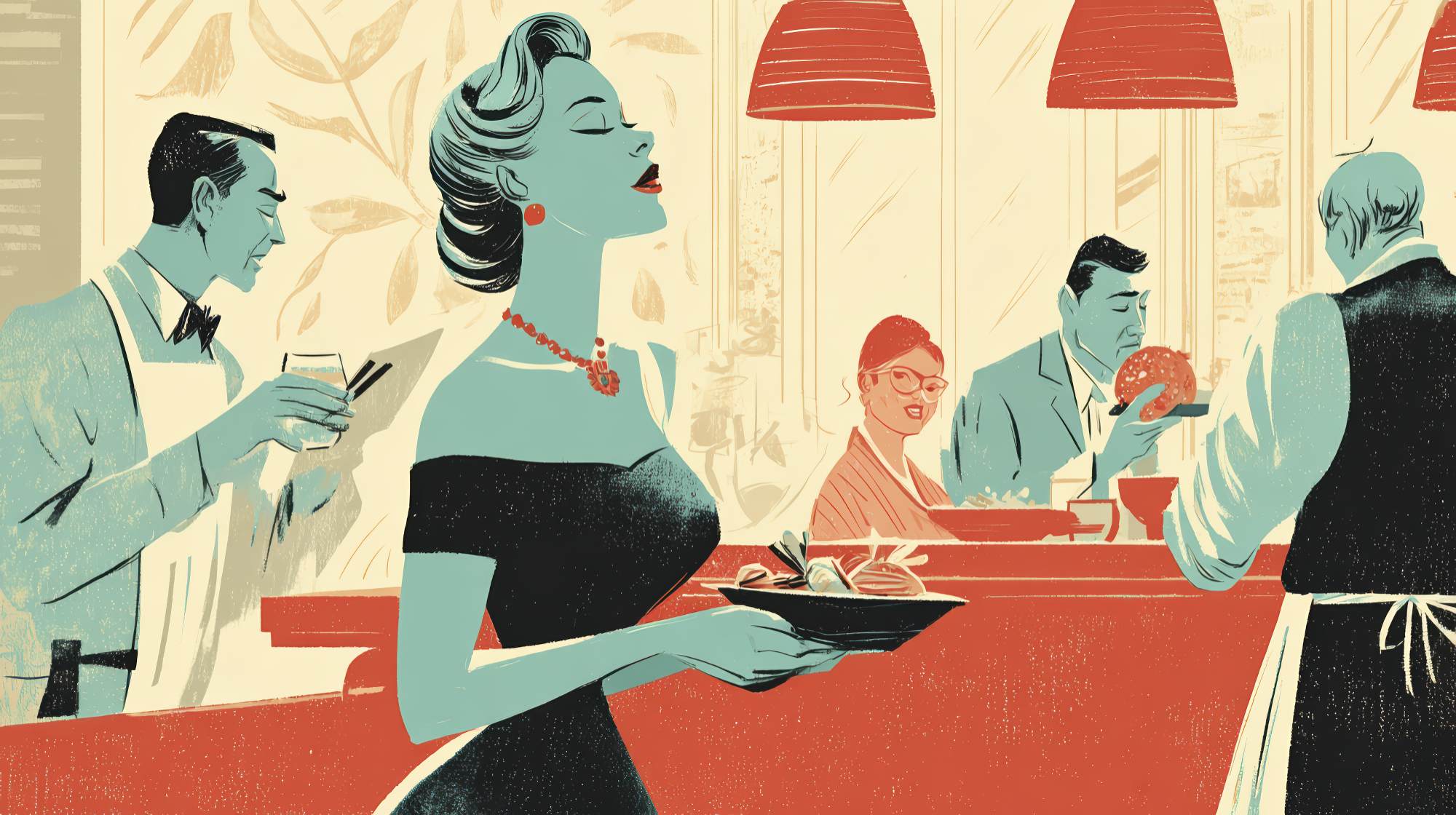
Strategic color palettes are essential for driving appetite and atmosphere.
Restaurant branding is often treated like a surface-level design exercise: pick a logo, choose a few colors, make the menu match, call it a day. I think that mindset leaves a lot of money on the table. Color is not decoration. In restaurant marketing, color is behavioral strategy. It shapes first impressions, signals price point, influences appetite, changes the perceived pace of a meal, and quietly tells guests what kind of experience they should expect before they even read a word.
If that sounds dramatic, good. It should. The strongest restaurant brands understand that people do not make dining decisions rationally. They react emotionally first, then justify later. Color sits right in the middle of that process. It can make a fast-casual concept feel energetic and convenient, or make a chef-driven dining room feel calm, refined, and worthy of a higher check average. Used well, it becomes one of the most efficient marketing tools a restaurant has. Used poorly, it creates friction that owners often misdiagnose as a food, service, or traffic problem.
Color Sets the Tone Before the Food Ever Does
A guest’s relationship with a restaurant starts long before the first bite. It begins with the sign outside, the website, the Instagram grid, the takeout packaging, the menu design, and the interior itself. Every one of those touchpoints carries a color message. The brain reads that message instantly.
Warm colors like red, orange, and yellow tend to create energy, urgency, and appetite. There is a reason they show up so often in quick-service and casual dining. They are sociable colors. They move fast. They help communicate familiarity, comfort, and momentum. If your business depends on volume, turnover, and impulse decisions, that matters.
Cooler colors like blue, green, charcoal, and muted neutrals create a different kind of message. They often suggest calm, cleanliness, sophistication, freshness, or restraint. Green is especially useful in concepts tied to health, sustainability, plant-forward menus, or natural ingredients. Deep blues and dark neutrals can work in upscale environments, but they need balance. Too much coolness can feel distant or suppress appetite if it is not warmed up with lighting, texture, or accent colors.
This is where I think many brands get lazy. They choose colors based on trends or personal taste instead of operational reality. A founder likes sage green, so everything becomes sage green. A designer loves minimalist black and white, so a family-friendly brunch concept suddenly looks like an art gallery. Taste is not strategy. The better question is always: what should a customer feel, and what behavior are we trying to encourage?
Different Restaurant Categories Need Different Color Logic
There is no universal “best” restaurant color palette. Anyone selling one is oversimplifying. The right palette depends on concept, audience, pricing, and pace.
For quick-service restaurants, bolder and higher-contrast palettes usually work because they support speed and recognition. These brands need to be visible from the street, memorable in delivery apps, and clear across digital ads. Colors that pop can help trigger immediate decisions. That does not mean every QSR should default to red and yellow, but it does mean subtlety is rarely the priority.
For fast-casual concepts, the challenge is often balancing convenience with quality. This is where earthy greens, terracottas, warm whites, muted oranges, and richer natural tones can be effective. They suggest freshness and intentionality without becoming too precious. A lot of fast-casual brands want to feel modern and ingredient-led, and color can do heavy lifting there.
For casual dining, color has to support comfort and repeatability. The brand should feel approachable, not exhausting. Mid-tone warm palettes, softened reds, wood-inspired neutrals, and friendly accent colors usually outperform anything too severe or too trendy. Guests should feel like staying, ordering another drink, and coming back next week.
Fine dining is a different game entirely. Here, color should reinforce exclusivity, confidence, and control. Deep neutrals, restrained metallics, cream tones, dark greens, burgundies, and low-saturation palettes often work because they communicate deliberateness. But restraint is not the same as blandness. Luxury brands still need contrast and signature. If everything is beige, nothing is memorable.
And then there are niche concepts: dessert bars, coffee shops, vegan cafés, sports bars, cocktail lounges, family buffets. Each has its own emotional job to do. A dessert brand can absolutely get away with playful pastels or high-energy pops because indulgence is the point. A cocktail lounge can lean moody because mystery sells. A health-focused café should not look like a burger joint unless it wants customers to feel confused.
Color Has to Work Across Marketing, Not Just Interiors
One of my strongest opinions on this topic: restaurant owners spend too much time thinking about wall paint and not enough time thinking about brand consistency. Your palette is not just for the dining room. It has to travel.
It has to work on your website, in your logo, on your menu, in paid social ads, on your loyalty emails, in delivery thumbnails, on staff uniforms, on exterior signage, on packaging, and on whatever cup ends up in someone’s hand on Instagram. If your colors look great in the dining room but collapse on mobile, they are not a successful brand system.
This matters because modern restaurant discovery happens visually and digitally. Customers are often deciding where to eat while scrolling quickly. Color helps stop the scroll, improve recognition, and reinforce memory. A consistent palette can make your content feel instantly familiar even before a user reads your name.
That consistency also builds trust. Restaurants that look visually coherent tend to feel more established and credible. Inconsistent color use, on the other hand, makes brands feel improvised. And in food service, improvised is not a great signal.
One practical tip: build a primary palette of two to four core colors, then a secondary support palette for seasonal campaigns, limited-time offers, and social content. This gives your team flexibility without turning every promotion into a branding detour. You want recognizable structure with room for creative variation.
Common Mistakes That Undercut Restaurant Brands
The first mistake is chasing trend colors with no regard for longevity. Restaurants are not fashion labels. Rebrands are expensive, signage is expensive, and customers need repetition to build memory. If your entire visual identity depends on what felt stylish on Instagram this year, you are probably creating future cleanup work.
The second mistake is using too many colors. More color does not equal more personality. Usually it creates visual noise. Strong restaurant brands tend to have disciplined palettes. They know where to be loud and where to be quiet.
The third mistake is ignoring lighting. Color does not exist in a vacuum. The same paint can feel warm and inviting in daylight, then muddy and unappetizing under poor artificial lighting. If your in-store experience is a core part of the brand, test colors in real conditions, not just on a screen or swatch card.
The fourth mistake is failing to account for cultural context. Colors carry different associations across different audiences and markets. If you are serving a diverse customer base or expanding into new regions, assumptions can backfire. Good branding is not just aesthetically sharp; it is context-aware.
The fifth mistake is forgetting readability. Menus, signs, and digital assets still need to function. I have seen beautiful restaurant palettes completely sabotage usability because contrast was too low or accent colors overwhelmed the hierarchy. If people struggle to read your menu board, your palette is not sophisticated. It is broken.
How to Choose a Palette That Actually Supports Revenue
Start with the emotional target. Not “what do we like,” but “what should guests feel?” Energized? Relaxed? Indulgent? Curious? Healthy? Celebratory? Premium? That emotional answer should lead the palette conversation.
Next, define the pace of the experience. Do you want people to move quickly or linger? Is this a lunch business, a date-night business, or an all-day neighborhood brand? Color can support tempo. Bright, warm palettes generally create momentum. Deeper, more muted palettes can encourage slower, more immersive experiences.
Then consider the food itself. Your branding should flatter what you serve. If your dishes are colorful and fresh, a natural or restrained palette may help the food become the hero. If your menu is comfort-driven and familiar, a warmer, more appetite-forward palette may create better alignment. The brand and the plate should feel like they belong to the same business.
After that, test in the real world. Mock up social posts. Print menus. Put the palette on packaging. View it on mobile. See it under restaurant lighting. Look at it from the sidewalk. Too many brand decisions are approved in boardrooms and then underperform where they actually matter: in public.
Finally, commit. A palette only gains power through repetition. Don’t keep reinventing your look every quarter because someone got bored. Brand equity comes from consistency, not novelty.
The Best Restaurant Colors Are the Ones Customers Can Feel
The smartest restaurant brands use color with intention, not instinct alone. They know color can sell speed, comfort, freshness, luxury, indulgence, or trust without ever saying those words out loud. That is why this topic matters so much in marketing. When the palette is right, customers feel like they understand the brand immediately. And when people feel that kind of clarity, choosing your restaurant gets easier.
That is the real goal. Not prettier branding for its own sake, but a tighter connection between perception and purchase. A restaurant that looks right for its audience has an advantage before service begins. It attracts the right customer, frames the right expectations, and makes every other marketing effort work harder.
In a crowded market, that kind of alignment is not cosmetic. It is competitive.